• Guest, you're invited to help build our new TBT time capsule! It contains three parts, with some of its elements planned to open in 2029 and others not until the distant future of 2034. Get started in 2024 Community Time Capsule: Blueprints.

3 new sigs

Lone_Wolf

Senior Member
Joined
Jun 3, 2005
Posts
1,681
Bells
1,427
Carnival Coins
0
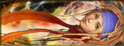
yunasig.png


rikkusig2.png


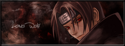
ninjasig.png
 
(in order)

Top One: 8/10 its sidewys soo that doesnt work, but awsome nonetheless
Middle One: 6/10 Blurry AND sideways
Bottome One: 7/10 A bit boring really, and I hate Naruto
 
The bottom one seems the best for me, but I can see where you were going with the renders sideways. In order

9/10
7/10
9.5/10
 
I like the bottom one but not the top too because they are sideways.
 
yunasig.png

Hokay, dis one is obviously trying to appeal to the sexually-charged weirdos on the internet. Good ploy, but it don't work on me, homez.


;) Can't really see the background, so I can't tell how it was made nor tell you what I think of it. Just next time, do a little of that good 'ol rotate canvas.

rikkusig2.png

same comments as above, but the render is *inserts finger in mouth*.

ninjasig.png

Nice job, points off for the border on all of them, it looks bad, espeshully on dis one.


;) I like the dots, though. And the background. Naruto sucks.

I like the bottom one but not the top too because they are sideways.
Spellcheck, homez.


:)
 
Lone_Wolf...in order:

The top one: 8/10
The middle one: 6.5/10
The bottom: 7/10 (Because I'm no Naruto Fan)

You really gotta calm down with all of these Final Fantasy girls, Lone_Wolf.


:p
 
I like the bottom one the best becuase it is NOT sideways and it isn't blurry at all.
But still, I like them all.
Good job! :jay:
 
Back
Top