You are using an out of date browser. It may not display this or other websites correctly.
You should upgrade or use an alternative browser.
You should upgrade or use an alternative browser.
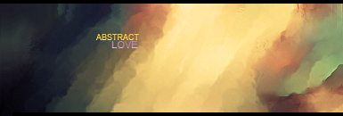
Abstract Love Signature
- Thread starter NikoKing
- Start date
Yeah, the green does look bad :O .Muffun said:The text needs work and the green on the side doesn't look too good. But the smudging is great.
SilentHopes
Swag Master
I'm not a big fan, just because there isn't much in it, but that is probably what you were looking for. And the green doesn't really fit.
I've seen you do better.
I've seen you do better.
bittermeat
Senior Member
Love almost everything about it. The colors and the smudging is great.
While the text 'Abstract' looks nice, 'LOVE' isn't as good.
While the text 'Abstract' looks nice, 'LOVE' isn't as good.
I actually like the style and colours but the green kind of killed it, The text is okay but like what Bit said, I hate the "LOVE"'s colour ect..
I would have liked it even more better if you tried to add a render, I know it's the type of signature that shouldn't include it but I can imagine that it would look good.
I would have liked it even more better if you tried to add a render, I know it's the type of signature that shouldn't include it but I can imagine that it would look good.
I love it! The smudging is brilliant, colors are good, aswell as the text, great job, NikoNikoKing said:CnC?

This is my first abstract signature in a while, so it's not amazing.
Looks nice and everything, with cool smudging and stuff. Problem is, I don't really see how it relates to love at all. If anything the colours should be dark red, crimson and purple. But then again you may associate love with different colours, so it's cool.
As soon as you put a render on it, you make it objective. Pretty redundant for something supposed to be abstract.SAMwich said:It looks more like it should be the background to a sig, like you should place a render over it. Not enough is happening in it in my opinion.
EpicGamer12
Senior Member
I don't know much about abstract, but the text is rough or something, if it's not supposed to be like that.
Yeah, looking over it the focal point is non-existentSab said:smudging is nice. doesn't really have a focal tho. text needs work as well. kiu