You are using an out of date browser. It may not display this or other websites correctly.
You should upgrade or use an alternative browser.
You should upgrade or use an alternative browser.
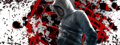
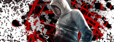
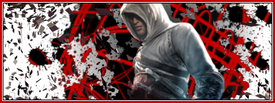
Assassin's Creed effect signature.
- Thread starter NikoKing
- Start date
Lol, without a border it would lose some of it's flow, but yeah, I want to add a border on it since I'm like you with having borders. xD.Numner said:I like it!
It'd be more awesome, with my name on it.
But the no border is driving me crazy, but I'm like that :\
You better.Nikoking said:Lol, without a border it would lose some of it's flow, but yeah, I want to add a border on it since I'm like you with having borders. xD.Numner said:I like it!
It'd be more awesome, with my name on it.
But the no border is driving me crazy, but I'm like that :\
But I don't know anything about flow :'(
Numner said:You better.Nikoking said:Lol, without a border it would lose some of it's flow, but yeah, I want to add a border on it since I'm like you with having borders. xD.Numner said:I like it!
It'd be more awesome, with my name on it.
But the no border is driving me crazy, but I'm like that :\
But I don't know anything about flow :'(
Mmm.Nikoking said:Numner said:You better.Nikoking said:Lol, without a border it would lose some of it's flow, but yeah, I want to add a border on it since I'm like you with having borders. xD.Numner said:I like it!
It'd be more awesome, with my name on it.
But the no border is driving me crazy, but I'm like that :\
But I don't know anything about flow :'(Lol, now I made a border and I made some lighting differences.
Brighter?
Notice how it's lighter at the top of the signature? That's the difference I made and I added like one more little C4D on a blank spot... felt like it needed something in that spot.Numner said:Mmm.Nikoking said:Numner said:You better.Nikoking said:Lol, without a border it would lose some of it's flow, but yeah, I want to add a border on it since I'm like you with having borders. xD.Numner said:I like it!
It'd be more awesome, with my name on it.
But the no border is driving me crazy, but I'm like that :\
But I don't know anything about flow :'(Lol, now I made a border and I made some lighting differences.
Brighter?
Mhm, I do.Nikoking said:Notice how it's lighter at the top of the signature? That's the difference I made and I added like one more little C4D on a blank spot... felt like it needed something in that spot.Numner said:Mmm.Nikoking said:Numner said:You better.Nikoking said:Quoting limited to 5 levels deep
But I don't know anything about flow :'(Lol, now I made a border and I made some lighting differences.
Brighter?
bittermeat
Senior Member
I don't like them much. The background effects are bland, and the render doesn't fit quite well, imo.
Meh, the effects are supposed to be simple and clean, but I used an alternative.bittermeat said:I don't like them much. The background effects are bland, and the render doesn't fit quite well, imo.
Similar threads
- Replies
- 28
- Views
- 2K
- Replies
- 8
- Views
- 364
