You are using an out of date browser. It may not display this or other websites correctly.
You should upgrade or use an alternative browser.
You should upgrade or use an alternative browser.
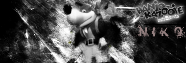
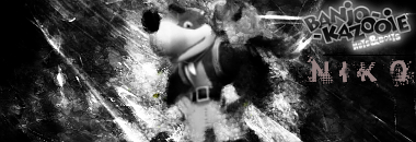
Banjo-Kazooie: Nuts & Bolts Signature [CnC Please!]
- Thread starter NikoKing
- Start date
Uh... I don't think it should be downgraded for color, this is a Black and White themed signature :\ .Zexion said:Uhhh. 7/10
Put color into it. Then it could go up a point.
Yes yes.Nikoking said:Uh... I don't think it should be downgraded for color, this is a Black and White themed signature :\ .Zexion said:Uhhh. 7/10
Put color into it. Then it could go up a point.
I just think it would look better.
(Aka your sigs look better in color then black and white)
Meh, sometimes I guess. If I kept some color in though, the sig would look messy IMO, so I just did a destruated signature, I'd use a gradient or something but the colors won't correspond as well honestly lul. But still, an honest score.
But eh, I don't think this is a perfect signature, I did follow a Photoshop CS4 Tutorial when using Gimp 2.6, it's bound to be far from the outcome xD.
But eh, I don't think this is a perfect signature, I did follow a Photoshop CS4 Tutorial when using Gimp 2.6, it's bound to be far from the outcome xD.
It's the theme of the sig.Zexion said:Yes yes.Nikoking said:Uh... I don't think it should be downgraded for color, this is a Black and White themed signature :\ .Zexion said:Uhhh. 7/10
Put color into it. Then it could go up a point.
I just think it would look better.
(Aka your sigs look better in color then black and white)
Most sigs do look better in colour. But oh well, he's gone for something different.
And I'd say I perfer the blur sig.
Thanks for the feedback. Anyone else?Mr_Hobo said:I can say this is a pretty good signature. What AndyB said was said very good. Personally I would like the blur one then the sharp one. 3.5/5
bittermeat
Senior Member
The render is blurry in both versions. Color would help like the others said.
I think if you made that ver. a little.... pailer(sp?) it might look a bit better.Nikoking said:You guys want color? You get color:

The color blend sucks, but what do you expect from the signature's orgin to be black and white?
GetSumSunBK
Senior Member
nice job. i like the version with color
It was Trashco, nice job recognizing ;o . I'd do a pale gradient or something crash, but eh I'm done with improving this signature to be honestSAMwich said:The font's called Trashco or something, right? I used to use the hell out of it ^_^
I like it and I agree that a few hints of colouring wouldn't do any harm but for a b&w sig it looks really good!
Yep, looks much better with colorNikoking said:You guys want color? You get color:

The color blend sucks, but what do you expect from the signature's orgin to be black and white?
10/10
Similar threads
- Replies
- 2
- Views
- 292

