You are using an out of date browser. It may not display this or other websites correctly.
You should upgrade or use an alternative browser.
You should upgrade or use an alternative browser.
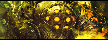
BiOsHoCK TaG
- Thread starter NikoKing
- Start date
It shows for me :O .Magibelly said:First one won't show.
NOW it shows, but they look exactly the same.Nikoking said:It shows for me :O .Magibelly said:First one won't show.
V1 has more contrast, while V2 has more brightness. It's easy to notice if you've seen lots of graphicsMagibelly said:NOW it shows, but they look exactly the same.Nikoking said:It shows for me :O .Magibelly said:First one won't show.
On the circles in the sig I can tell they are brighter, but nothing else D:Nikoking said:V1 has more contrast, while V2 has more brightness. It's easy to notice if you've seen lots of graphicsMagibelly said:NOW it shows, but they look exactly the same.Nikoking said:It shows for me :O .Magibelly said:First one won't show..
True, but there are also some other spots :3 .Magibelly said:On the circles in the sig I can tell they are brighter, but nothing else D:Nikoking said:V1 has more contrast, while V2 has more brightness. It's easy to notice if you've seen lots of graphicsMagibelly said:NOW it shows, but they look exactly the same.Nikoking said:It shows for me :O .Magibelly said:First one won't show..
bittermeat
Senior Member
It's hard to judge it on my mobile browser, but they look awesome. 
Thanksbittermeat said:It's hard to judge it on my mobile browser, but they look awesome.
Thanks :O . That's quite an accomplishment for me.#karma said:This is the best work I've seen from you. Ever.
10/10, amazing job.
Filter>Decor>Add Border, X Size 1, Y Size 6pizzaSlyze said:How do put the black bars in your signature?
And it's awesome btw. :J
That's for GIMP, dunno with Photoshop.
Make a new layer, grab the marque(sp?) box tool and drag a little bit on the top of the signature. When it's flashing grab the paint bucket tool and select black, after that fill it with black. Next, copy it and paste it onto the bottom and there ya gopizzaSlyze said:How do put the black bars in your signature?
And it's awesome btw. :J
Yeah, but it has a lot of Photoshop only features on it plus it's an advanced tut. If you still want the ]http://www6.picfront.org/picture/q7tMVq2D2/img/VengenceTut.png[/url]Zexion said:Did you use a tut?
I of course went my own way with the C4Ds and sharpening.
Similar threads
- Replies
- 15
- Views
- 388
- Replies
- 3
- Views
- 595

