coloring tips?

princesse

Ball is life :)
Joined
Aug 12, 2014
Posts
3,719
Bells
158
Pavé
Mother's Day Carnation
Tasty Cake
Pikachu Easter Egg
Astral Inner Planet Floating Gold #10
Red Candy
Yellow Candy
Yellow Candy
So recently I made an art shop, and I was wondering if anyone could give any tips (mainly on coloring ) for my drawings :)
I also want to do better so my art isn't worth 30 per like I'm selling them for
1465934201700.jpg1465868754625.jpg1464740321296.jpg

Thank you!
 
Last edited:
guuurl you are improving so fast :3
as for coloring it's looking pretty good right now -- I would suggest working on your textures like clothing folds and more hair strands before you can add more shading to it because it looks pretty good to me o 7o ♥
but tbh i'm still learning to color too so what do I know /rip

Ty c: how are clothing folds on chibis work? Are they like less complicated Manga folds?
 
Ty c: how are clothing folds on chibis work? Are they like less complicated Manga folds?
yea pretty much, just start small, something like creases on tops where they taper in at the waist or inner elbows. or folds in bows where the knot gets tied -- nothing too big? ; 7;
 
yea pretty much, just start small, something like creases on tops where they taper in at the waist or inner elbows. or folds in bows where the knot gets tied -- nothing too big? ; 7;

Oh OK ty!

- - - Post Merge - - -

Depends on the fabric, and your style I suppose, try analyzing other peoples works, and take notes on how they do it, and maybe check out some youtube channels such as Mark Crilley, for tutorials.
https://www.youtube.com/watch?v=a39qbfsPwYU

Oooh I'll check it when I get home
 
I think that you might be over-blending the shading. Try using just the paint brush tool and its blending option and go minimal on the water tool/air brush/blur too. Also try using different colors for shading instead of just shading with a darker/lighter version of one color.
 
I think that you might be over-blending the shading. Try using just the paint brush tool and its blending option and go minimal on the water tool/air brush/blur too. Also try using different colors for shading instead of just shading with a darker/lighter version of one color.

I tried shading the skin with purple in other drawings but I always have to undo because it doesn't look right
 
I think that you might be over-blending the shading. Try using just the paint brush tool and its blending option and go minimal on the water tool/air brush/blur too. Also try using different colors for shading instead of just shading with a darker/lighter version of one color.

Owh yeah forgot to mention that, definitely do that.
 
Wow these are really helpful! Tysm! Someone told me to shade with dark purple does that actually work?

colour varies in lighting :x so it really depends on the colouring/lighting of your picture.

purple would work for sunsets/darker images, i think.


edit: this guide (a bit dated) helped me change how I saw colour (if that makes any sense). I hope it helps you too!
 
Last edited:
Wow these are really helpful! Tysm! Someone told me to shade with dark purple does that actually work?

Sure it could, but it depends on your style, here's what I've made so far this year, I don't draw that much sadly, I need to start drawing more.

piggy_girl_and_chocopa_by_markskristensen-d9obowd.png

marika_tachibana_by_markskristensen-d9pf9he.png

adventure_time_flame_princess_by_markskristensen-d9qp2u1.png

muffet_by_markskristensen-d9sl8h6.png
I'm still a beginner myself, I've been drawing for years, but I keep quitting, so I've only made around 20 drawings in total, the ones I posted here were drawings that I made on my ipad pro with the apple pencil, hopefully I can get myself to start drawing more soon.

- - - Post Merge - - -

Oh yeah and it can be hard to see, but flame princess's hair is red, with orange to the left, and purple to the right, I shaded it in to give it a warm color from the left where the light is supposed to come from, and a cool shade to the right where the light isn't hitting (even though her hair is a giant flame), and I did the same with her skin, it's brighter to the left, and less to the right.
 
Last edited:
Sure it could, but it depends on your style, here's what I've made so far this year, I don't draw that much sadly, I need to start drawing more.

piggy_girl_and_chocopa_by_markskristensen-d9obowd.png

marika_tachibana_by_markskristensen-d9pf9he.png

adventure_time_flame_princess_by_markskristensen-d9qp2u1.png

muffet_by_markskristensen-d9sl8h6.png
I'm still a beginner myself, I've been drawing for years, but I keep quitting, so I've only made around 20 drawings in total, the ones I posted here were drawings that I made on my ipad pro with the apple pencil, hopefully I can get myself to start drawing more soon.

- - - Post Merge - - -

Oh yeah and it can be hard to see, but flame princess's hair is red, with orange to the left, and purple to the right, I shaded it in to give it a warm color from the left where the light is supposed to come from, and a cool shade to the right where the light isn't hitting (even though her hair is a giant flame), and I did the same with her skin, it's brighter to the left, and less to the right.

Ohhhh I see I see. Tyvm!
 
Ok, tis gon be long.

Coloring tips are basically endless, but I'll be basing these off your work. Also, I'll be using my own work as an example, granted I too make mistakes so please bear with it, but I don't want to post other people's work in case they wouldn't like that.

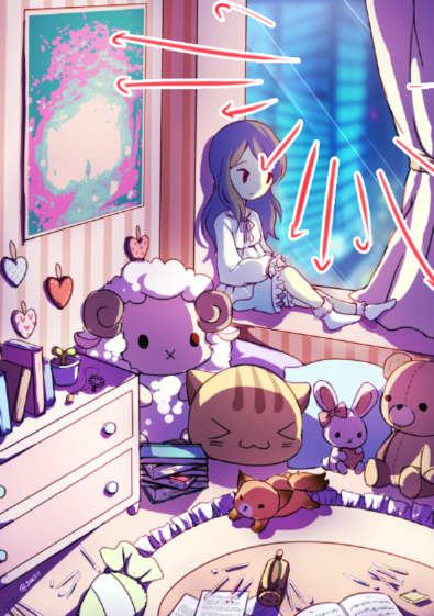
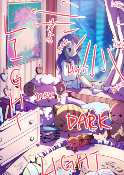
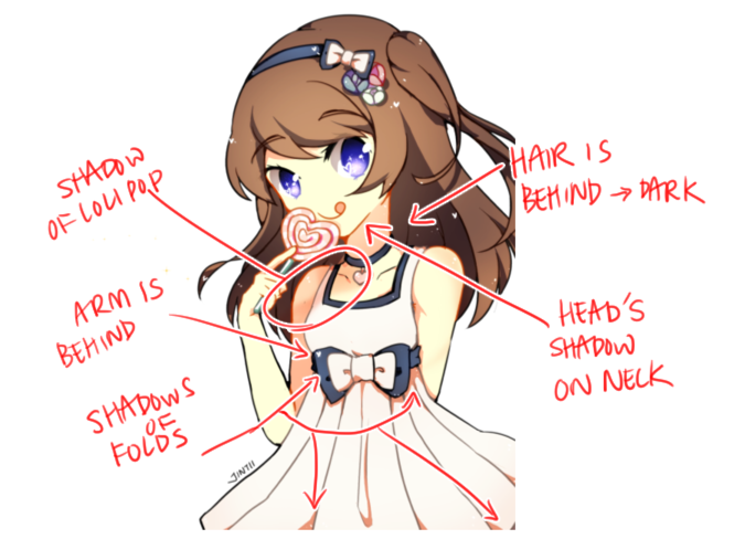
1. Define your light sources. So far, I noticed you're doing something that is commonly called "pillow shading" in the artist community, aka you just put random shadows next to your lines. It's very clear when an artist has little understanding of light, as shadows don't make sense on their picture and people will sadly notice that. Make sure to define your light source before you shade, then draw accordingly. Think of a lightbulb being next to your character (heck, even draw one next to it, so it helps you remember where your source is) and shade with that in mind. Is it on the left, right, above or below? Or even somewhere else? Maybe there are 2 light sources or more?

For example, in this picture, the light source is on the left side. You can clearly see it especially around his face and hands. Since light is on the left, anything that is on the right gets darker.
united_we_bleed__by_vexnir-da6f4yj.png

2. Contrast, contrast, contrast. So far your chibis look as if they hardly have any shading due to lack of contrast. The shadows not only are all very light, but they're also all very soft, which makes the pictures look as if they lack definition. I suggest you make harder shadows as well, especially around the places that would be the darkest. But first of all, don't be afraid of using darker colors or else everything comes out like milk. Don't worry though, you're not alone, it's a very common thing beginner artists do (I've done it too!) because they're scared of adding too much contrast not to ruin their picture. Think in 3D, shadows give characters form. Also, don't just shade the base color, add lights too.

Also, if you struggle with contrast, it is not a bad idea to draw your picture in grayscale first and then use layers on overlay/soft light/other mode of your choice to colorize that. When coloring, inexperienced artists tend to focus on the colors themselves and forget about values (shadows) so it's a really helpful technique. And it's nothing to be ashamed of either, many pros use it too!

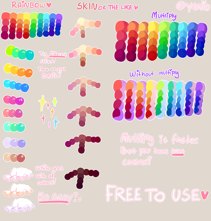
3. Colors. As it has been mentioned, you use darker shades of the same color to shade. This in most cases, trust me, doesn't look well. Same goes for shading with black or grey - that's an ultimate sin. I am not sure if you do that, but please never do that.

- Embrace color theory. Learn the basics of it, embrace them, eat them for breakfast. I cannot stress this enough! Once you get even one of the basic rules down, such as what complimentary colors are, you will be able to wing most of your color compositions on a whim. I am not exaggerating. It really is that helpful. Here is a great video that taught me a lot, it's a bit lengthy but worth every second of your time. https://www.youtube.com/watch?v=Qj1FK8n7WgY

- A few good rules to go by (of course, you don't have to stick to them but they help a lot) is that for example, shadowed areas will be usually less saturated than the bright ones. So remember to tone down your shadows a bit instead of making them very colorful. The other tip that I freaking love and it was really groundbreaking for me when someone told it to me: in nature, under most circumstances, if light is warm toned, shadows will be full of cold tones. And vice versa - if your light is cold toned, then your shadows will be warm toned. I think this has yet to fail me when picking my color palettes.

- You asked what colors do people use for skin. ANY. I mean it - any. It depends on the mood of your picture, and honestly, if you pick the right shade, you can use some wacky combinations. Perhaps the purple you tried using was too saturated and that's why it didn't look right.

Here is some examples of the colors I use to paint skin. First is shaded with mostly brown and blue, the second is mostly purple and reddish tones, and the third uses a totally different palette for the skin overall (ignore the anatomy and such though, that one is from last year.)

sven_by_vexnir-da4j73n.png

away_from_the_light_by_vexnir-da5nmrq.png

hug_by_vexnir-d9iia5q.jpg


Ok, I think this is all I have in mind now, at least before I get my nap. I hope this helps you and I wish you lots of luck with art.
 
Last edited:
uh for me i just kinda use orangey red hues and change it until it looks decent

im a bad painter
 
from kawacy @ dA
normal_vs_my_shading_by_kawacy-d8pnrfa.jpg


from yamio @ dA
tutorial___free_to_use_palette_by_yamio-d8ljukl.png


for skin tones, these are some colors that I typically use ' v '
93cdc3e87a5d5f0d88925be420a76a0c.png


I think vexnir's covered a lot of tips on coloring, but here's a few things that I thought would be helpful to add, too!

On contrast: I recall finding it hard to use colors with a huge contrast at first, but what I did was use the multiply layer mode for shading a lot!! It's not exactly the best solution for it, but it's something that would be easy to use to begin with ' v '
without multiply (shading on the same layer as base color)
sweet_ichigo_by_chemienibs-d3lh21f.png


with multiply (various layers of shading)
stormy_s_horror_circus_by_chemienibs-d5poke5.png

another thing to think about is using multiple layers of shading - you can use the same shading color, but with more multiply layers on top, the colors overlap and add on onto the contrast:

d6b35ebb0a43b16d141776c2a49af5f2.png
fa3e7c203e1127c56887fe479a262edc.png


also, a really old speedpaint of mines but it shows how putting multiple layers of shading can make the picture pop out!!

On light sources:
I'm definitely not the best person to talk about this lmao but!! I thought something like this might help in understanding:
cdb56ea7a35617609d651fc3838e833d.png

ba6713772c5f77d23103198c86828912.png

alternatively, you can start out by trying to think about where shadows normally are. When I shade, I like to think about which spots would usually induce a shadow, like so:

ce6f61faa2c0589b03d9116b40150b30.png


I'm a bit tired so my thoughts are probably all over the place,, but hopefully some of this helped!
 
Back
Top