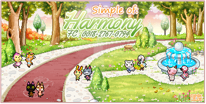
Hi ! First off I like the clean look you're going for, and the choice of font. 2 things I would say are that the villager pixels appear to be blown up? As if you've enlarged them and it stands out quite a bit - make them a bit smaller. The second is that that particular shade of blue/violet (for the mayor and town name), clashes with the pink background quite a bit in my opinion. It would be good to get second opinions on that as it may just be my eyes!
Resizing
It appears that the background has been resized somewhat, along with the pixels. They are fuzzy, and honestly I would advise never resizing any images that you use.
If your chosen images won't fit correctly, it's best to just find a high resolution image and size DOWN instead, as the quality will not be compromised that way. You will want to make sure you resize the height and width as the same ratio.
Color palette
It's important to choose colors that are complimentary to the background they are on. You don't want anything clashing. The red on your sig makes the blue look out of place. You always want to use colors that are included in the background images, so that your text looks like it was meant to be there and that it is a part of the image
If you are having trouble with your text showing clearly, you might want to consider adding a border of some type. I typically use a white border and an undershadow that compliments the background, but some times I use a darker/lighter color or a gradient.
Here is a gradient text/border that blends enough with the bg for it to not clash, but the borders help the text become easier to read
This text has a simple white border, but the text is of varying colors taken from the background that still helps it tie in with the overall image.
Placement
This is a little trickier to explain, but you want to make sure that your signature text has the viewer's eye flow around the whole signature. You did a good job with placement for your "rainwood"/"Mayor Bee" section with the cherries in the middle, but the information below feels a little boxy.
If you wanted it to read like an information sheet, you can make it look more organized by using some sort of translucent white/complimentary colored gradient behind the sections of text that you have.
Think about how the TPC cards in animal crossing have their information laid out.
For this sig, the text is centered in an area that makes it the focal point, and easy to read.
For the background image, I have the villagers interacting with the surroundings and they occupy areas that i would like to draw attention to.
Size You should consider what size you want your signature to be before you even start planning where things go. Remember that the signature MAXIMUM is 250px high, so usually it is good to keep your signature image around 200px. If you do have a lot of information you need to put in it, then only try to take up extra space that is needed to hold your information. Your signature currently could be about 50-75px smaller just by condensing the information a bit more.
Here is a rather large sig I did. The information is centered and takes up a good amount of space, and is fitting for the size.
Here's my current sig, it is only as large as it needs to be to have basic town and villager information, and is small enough to keep another sig beside it
Another important size factor to consider is your font. You do NOT want to use the same font size for everything. I usually have fonts around 30-36pt for the town name and mayor name, and other information is of size 18. (Villager names are usually 10pt, but that is a different story)
You want to make sure that only the important things like town names and headings are large sizes, while the text inside is smaller than it by some degree. (Otherwise, it reads and flows like a sentence)
I am sorry if this is a lot of information to digest, but I tried to give you all of the advice I could think of! (A lot of it is tips as well, so please don't think I found THAT many things wrong with your sig. I was just listing of helpful things lol)
You did a really cute job with your sig, and I think you could easily sell for around 50-60tbt per sig right now
alright if you want a really honest opinion I'll give you mine~
I love the colors in your sig however I would've preferred it a bit smaller and the lines are a bit on the blurry side so resizing would help! I really like the font and villager sprites (did you make them yourself?) but honestly I have a thing against going over the white lines so maybe if you made the font a tiny bit smaller it would look more appealing. all of this is my honest personal opinion I hope it wasn't harsh and I hope it helps in anyway
You've definitely improved, especially with colour scheme, mayor art, etc.
Just a couple of things though:
- It's still quite blurry from resizing, try making the image itself smaller or saving the image in a better quality if possible.
- There's a bit too much empty space, try either decreasing the size of the image, or adding more information. Add your town name, mayor name, friend code, dream address, etc. But if you are going to add extra info, remember to keep the placing, colour, and font in mind!
Hope this helps, but again, you've improve quite a bit from your last one!
I would price it at 5-10 tbt? I'm not really good at pricing, but I've seen some really great GFX that go for free around here.
I agree with the others saying that the villagers are kinda blurry. It's also a bit plain. Some form of motion, lighting, filters, effects, direction and etc could work rather well.
They probably don't need to be so big, but that is always up to preference
Also, maybe because of how big it is, the quality of the images in it and the sig in general isn't very high
They seem pretty simple, as the first one in particular is mainly just text, so I think the pricing could be from 5tbt up to 40tbt possibly. You may even want to do freebies to get started and so you can practice too, as this will help you with pricing also!


") , I think I'd pay between 70 and 150 TBT for one.
, I think I'd pay between 70 and 150 TBT for one.