mayor-essy
Senior Member


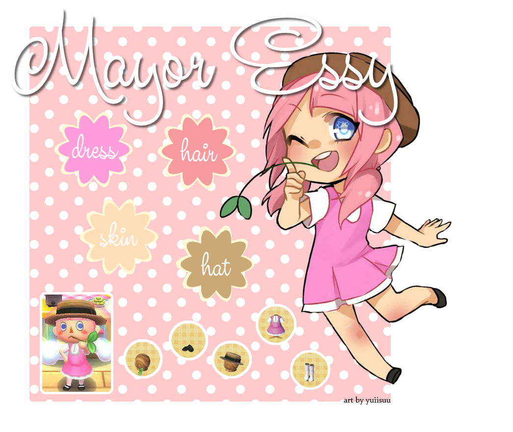
I made this ref sheet on pixlr.. but it looks horrible. >.<
Can anyone give me advice on making one that doesn't look messy?

Can anyone give me advice on making one that doesn't look messy?


")