• The 2025 limited edition candy cane is now available! This sparkling moonlight-blue candy cane wrapped in a glowing purple ribbon fastened by a golden star ornament can be found in the shop through December 26th. In related news, our upcoming New Year’s event will begin one day later than previously announced, starting Sunday, December 28th.

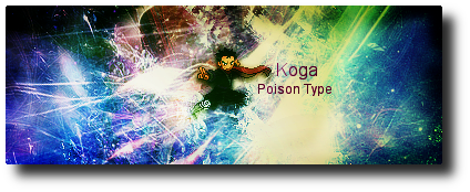
Koga Sprite Signature

NikoKing

Da Biggest Bears Fan!
Joined
Nov 12, 2008
Posts
6,756
Bells
1,078
Avatar Height Extension
Avatar Width Extension
KogaFinalSignature.png


Thoughts? I kind of messed up the flow a bit, but the tutorial I used didn't focus on flow, but more depth and detail. So honestly, I didn't check for flow a lot like I normally do, so if it's bad cut me some slack at least, not all signatures need flow to be good.
 
I love the background but it needs a bit more.
Why not use Koga's Sugimori?

Also, I love your signatures. I want one.
 
RockmanEXE said:
I love the background but it needs a bit more.
Why not use Koga's Sugimori?

Also, I love your signatures. I want one.
Sugimori? This was the only sprite I had lol.

When I make my next signature, I'm giving this one away, I give all my signatures away except for the one I'm currently using, so you could use the M&L one if you want to lol.
 
Oh, Pretty colors. Love the BG. I don't see anything wrong with the signature. I love it. :}
 
xeladude said:
Nikoking said:
Paradox said:
Not bad, 'cept the text doesn't exactly match
Yeah, I can't find any good fonts to use for my signatures other then Arial really :\ .
Trebuchet MS

Kinda hurts my eyes for some reason :/
Your computer brightness? I made the lighting dark so it won't hurt anyone's eyes :\ .
 
I don't like it but you know me: ixnay on the abstractay.

But what I don't like about this signature, is the sprite it just seems; out of place.
 
I love the background, but my attention isn't on the sprite for the most part.

Tut please. :3
 
most of your sigs are starting to look the same.
with that scratchy effect or something
but i like the colors in this one.
but the picture is small (i guess its supposed to be like that?)
6/10
 
kalinn said:
most of your sigs are starting to look the same.
with that scratchy effect or something
but i like the colors in this one.
but the picture is small (i guess its supposed to be like that?)
6/10
Scratchy? It's just because I oversharpened a tad too bit, my old signatures were the really scratchy ones lol.

The sprite is supposed to be small for the tutorial, I think I chose a bad one tbh, at least it blends in well with the colors.
 
Back
Top