JavaScript is disabled. For a better experience, please enable JavaScript in your browser before proceeding.
You are using an out of date browser. It may not display this or other websites correctly.
You should upgrade or use an
alternative browser .
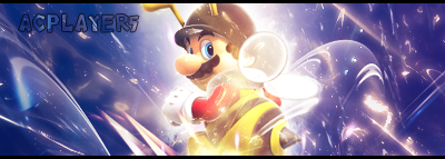
just something I threw together in like 20 min for a SOTW I just entered
Wow! That's actually really good. Most "noobs" around here 90% of the time wouldn't even be able to make a decent userbar. /no offense to anyone. D:
I'm not digging the text and part of the blue c4d you used flows in a direction opposite of the sig itself, which messes up the flow altogether. Either way, it's one of your best, if not your best and I really like it. Good job.
It'd be nice if the colouring wasn't so awful
^That's what I was thinking
9/10