• TBT's 2026 New Year's Party has started! Join us from now until January 11th in eight fun New Year's activities. Earn currency to spend on collectibles and raffle tickets. Get started in The Bulletin Board event thread. Happy New Year!

mmmm

ƒish

Retired Staff
Joined
Feb 6, 2005
Posts
8,281
Bells
1,340
Countdown Coins
0
Lucky Tickets
0
silas.png


Silascode.PNG

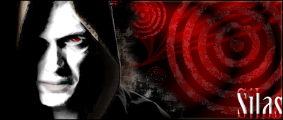
Thats the first image, I edited it to make it more albino-like, and blurred it a bit because it looks better.


:P

the background is meh... I was just messing with blending options... as usual. >.>

Tell me what you think. : D


If I ever edit this, i'll give it a background it deserves, I promise.


:P
 
On the edge of the hood, it shows a rendering line. =O Other than that, it's sweet.
 
That's pretty awesome. Besides the render line like fly pointed out, I like it. Your improving. Nice text! :lol:
 
I feel like the render doesn't fit with the background. Maybe it's the spiraling circle-target thing, but that's just my opinion.
 
I think the background is need, but I hate what you did with the render. It would look really cool if it was smoother and more vector, but instead it just looks brushed. ( I know you tried to do that though)
 
JJRamone2 said:
I think the background is need, but I hate what you did with the render. It would look really cool if it was smoother and more vector, but instead it just looks brushed. ( I know you tried to do that though)
I had it just plain white with no brushing, but it just looked kinda dumb... the version you see looked a lot better than it did when it was just white skin... it brings out the features in his skull, and makes him look like he is in the book. : o

But yeah, i can understand that its kinda gross seeing him look like a painting, but eh, its just better.


:P


and that renderline... I could have done something about that, but I didn't. If I ever edit it, I will.
 
Back
Top