My Art Homework.

merinda!

Senior Member
Joined
Jun 23, 2009
Posts
1,290
Bells
53
Switch
4766-8592-5202
Yellow Candy
Cake
This is the most creative thing I've ever done in a while. This is the first thing actual thing I've done in PS. (Besides editing images.)

So basically the criteria was, your favourite band is due to release a new single and you had to recreate an album cover and an album name.


<div class='spoiler_toggle'>City and Colour</div><div class="spoiler" style="display:none;">
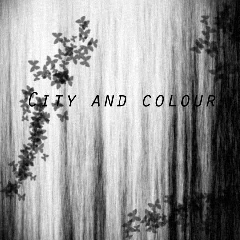
CityandColourAlbumncoverdraft.jpg
</div>
It's not finished, but I didn't know what else to add/improve, so constructive comments would be nice.
 
Why do you put the word's so small you do know that there are people that
can't see very well.
 
The text seems a little plain, what'd you use to edit this?
 
web master said:
Why do you put the word's so small you do know that there are people that
can't see very well.
wtf, the words are huge.
 
Lewis said:
web master said:
Why do you put the word's so small you do know that there are people that
can't see very well.
Get glasses you blind ****.
OMG!! and you call me stupid did i say it was me that could not see well
anyway i half to go to the eye doctor once again so i can have my glaces
 
Master Crash said:
The text seems a little plain, what'd you use to edit this?
PS.
My sister said to blur and add noise.
Doesn't look all that great now.

EDIT; Now that I think of it.
It looks REALLLLLLLLY bad.
/:
 
Emerald. said:
Master Crash said:
The text seems a little plain, what'd you use to edit this?
PS.
My sister said to blur and add noise.
Doesn't look all that great now.
Oh, why not give the words a clipping mask? Just find a nice stock to use, and it'll come out better.
 
Master Crash said:
Emerald. said:
Master Crash said:
The text seems a little plain, what'd you use to edit this?
PS.
My sister said to blur and add noise.
Doesn't look all that great now.
Oh, why not give the words a clipping mask? Just find a nice stock to use, and it'll come out better.
.......
I think I'll just draw the album cover instead.
 
Emerald. said:
Master Crash said:
Emerald. said:
Master Crash said:
The text seems a little plain, what'd you use to edit this?
PS.
My sister said to blur and add noise.
Doesn't look all that great now.
Oh, why not give the words a clipping mask? Just find a nice stock to use, and it'll come out better.
.......
I think I'll just draw the album cover instead.
xD In simpler terms, get a nice looking HQ image.
 
Master Crash said:
Emerald. said:
Master Crash said:
Emerald. said:
Master Crash said:
The text seems a little plain, what'd you use to edit this?
PS.
My sister said to blur and add noise.
Doesn't look all that great now.
Oh, why not give the words a clipping mask? Just find a nice stock to use, and it'll come out better.
.......
I think I'll just draw the album cover instead.
xD In simpler terms, get a nice looking HQ image.
You can't use things from the internet. Except the actual band members.
It has to be your own entirely.
 
Emerald. said:
Master Crash said:
Emerald. said:
Master Crash said:
Emerald. said:
Quoting limited to 5 levels deepPS.
My sister said to blur and add noise.
Doesn't look all that great now.
Oh, why not give the words a clipping mask? Just find a nice stock to use, and it'll come out better.
.......
I think I'll just draw the album cover instead.
xD In simpler terms, get a nice looking HQ image.
You can't use things from the internet. Except the actual band members.
It has to be your own entirely.
Really? That sucks :/

Have fun drawing it :p
 
web master said:
Why do you put the word's so small you do know that there are people that
can't see very well.
Go get an eye appointment or something.


I think it's fine, parts of the text blend in with the BG a lot though.
 
Lewis said:
web master said:
Why do you put the word's so small you do know that there are people that
can't see very well.
Get glasses you blind ****.
On the contrary, The words take up too much space IMO

put maybe 1 picture with color in it so it stands out. Maybe a flower or something. Or a butterfly in the herd of grey ones. I don't know
 
Palad said:
[n,Nov 6 2009, 09:38:21 PM]
Lewis said:
web master said:
Why do you put the word's so small you do know that there are people that
can't see very well.
Get glasses you blind ****.
On the contrary, The words take up too much space IMO

put maybe 1 picture with color in it so it stands out. Maybe a flower or something. Or a butterfly in the herd of grey ones. I don't know
(Sorry to quote you, your name messes quotes up but I need to explain)

He meant the text she uses on here, on the forums.
 
web master said:
Lewis said:
web master said:
Why do you put the word's so small you do know that there are people that
can't see very well.
Get glasses you blind ****.
OMG!! and you call me stupid did i say it was me that could not see well
anyway i half to go to the eye doctor once again so i can have my glaces
And you need to go to school to get better Grammar son.
 
Back
Top