You are using an out of date browser. It may not display this or other websites correctly.
You should upgrade or use an alternative browser.
You should upgrade or use an alternative browser.
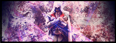
My first Sigs using Gimp
- Thread starter MasterC
- Start date
Psychonaut
Senior Member
practice makes perfect, good start i suppose (i'm no critic, and don't care much for the blocky/rectangular sigs, myself)
but i fixed your sig, for you:
reverse the [ and ] characters, and it should work. i hate this forum software's [ code ]
but i fixed your sig, for you:
Code:
]url=http://www.belltreeforums.com/showthread.php?58302-My-first-Sigs-using-Gimp[ Please let me know. ]/url[reverse the [ and ] characters, and it should work. i hate this forum software's [ code ]
Slifer Slacker
Senior Member
nice, where can i get a link to download it, i cant find it :/, i want to test out my art skills on a good system..
Thanks,you can find a button to download Gimp at this link http://www.gimp.org/nice, where can i get a link to download it, i cant find it :/, i want to test out my art skills on a good system..
The URL just takes me to this thread.practice makes perfect, good start i suppose (i'm no critic, and don't care much for the blocky/rectangular sigs, myself)
but i fixed your sig, for you:
Code:]url=http://www.belltreeforums.com/showthread.php?58302-My-first-Sigs-using-Gimp[ Please let me know. ]/url[
reverse the [ and ] characters, and it should work. i hate this forum software's [ code ]
Psychonaut
Senior Member
that's the point.. they let you know in this thread. change the url to whatever way you'd like them to contact you, i guess.Thanks,you can find a button to download Gimp at this link http://www.gimp.org/
The URL just takes me to this thread.
The render is terrible, The background is worse and the text isn't the best. Doesn't really stand out, the colors just don't look good at all epically with the text. Don't worry though, You'll improve. You normally make a good signature by playing around with the tools, looking at tutorials or most importantly, Be inspired.
I have to agree on Josh with the rendering. For renders for pretty much anything, go here: http://planetrenders.net/
You have to make an account, but it's quick and free.
You have to make an account, but it's quick and free.
I have,it's that I didn't know how to open the render with Gimp,but I got it sorted out and I'm going to view a Gimp tutorial soon.I have to agree on Josh with the rendering. For renders for pretty much anything, go here: http://planetrenders.net/
You have to make an account, but it's quick and free.
I have,it's that I didn't know how to open the render with Gimp,but I got it sorted out and I'm going to view a Gimp tutorial soon.
You should be able to right click and select "open with..." regardless of the computer you have.
Psychonaut
Senior Member
drag and drop it into the window to make it the background
if you already have an image opened in gimp, drag and drop it onto that window (with the image in it) and mess with the layers to make it below the image
if you already have an image opened in gimp, drag and drop it onto that window (with the image in it) and mess with the layers to make it below the image
crazyredd45
DJ. Atomika
The top one is quite good
but the bottom ones colours are two vivid and doesn't fit, but i do like the 3d affect of the purple rays
but the bottom ones colours are two vivid and doesn't fit, but i do like the 3d affect of the purple rays
Psychonaut
Senior Member
see? you're improving, already.
top one is better of the new two, imo. smoother & cleaner, which is better, imo
top one is better of the new two, imo. smoother & cleaner, which is better, imo
They look pretty good imo. I'm still learning too, by watching tutorials and playing around with the tools. But imo I think that experimenting with everything is more effective.
Edit: the banner in my sig is my most recent. My 3rd one I think. Just keep making new ones and you'll get better in no time. ;3
Edit: the banner in my sig is my most recent. My 3rd one I think. Just keep making new ones and you'll get better in no time. ;3
Last edited:
Needs alot of work really blurry the bgs look bad and the characters have white around them which makes the whole thing look bad
Are you referring to the ones on the first post? Or the ones on the 12th post?
Similar threads
- Replies
- 4
- Views
- 311
- Replies
- 12
- Views
- 295


