I think this one is a bit better than my first one. I used GIMP but i dont know if it has a border, i went to select all, then border then 2 pixels. anyway here it is.
Well, the computer I'm on can't click spoilers, so could you remove it please?
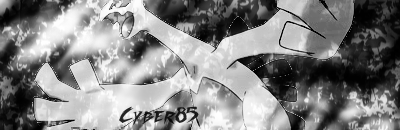
My thoughts:
The render quality is really bad.
The focal point needs to be much more clean, not bombarded with effects.
Have you tried erasing some parts of the effects off your render? Of course, make sure to make a new layer each time you do an effect, or put a render on.
The text is hard to read/doesn't match the style of the signature.
And last, not a whole lot of depth, but there's some.