• The first day of our new Mushroom Season event has passed, but things are just getting started. Read the update about changes made to the schedule, starting with day two. Be careful foraging and good luck!
  • Come and see the official gallery showcasing all of your creative entries from The Bell Tree Fair 2024. In addition, the winners for the final raffles have been drawn! Click here for the event's final closing announcement.

New Grunge Sig

Kiro

Senior Member
Joined
Mar 13, 2006
Posts
313
Bells
1,334
Sautéed Mushrooms
0
Spores
0
Ok so after pondering and pondering on what to do with these new brushes I found, I decided to make a grunge sig. I found I nice render and I think it fits. It's from Kill Zone. Here's to the new grunge sig! Comments are welcome!

GrungeSig.png


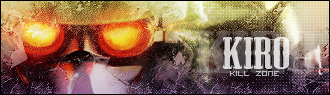
Update: Ok so now I've updated the Text with a great text effect! Cheers!
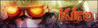
GrungeSig-1.png


An extra one:

GrungSig2.png
 
It looks very proffesional. My only suggestion is doing somethingmore appealing with the text. =D
 
Flygon said:
It looks very proffesional. My only suggestion is doing somethingmore appealing with the text. =D
Ya I didn't spend that mutch time with the text. Don't worry I'll post and updated version.


:D

Edit: I didn't spend mutch time on it because I wanted it to get published so quickly :lol:
 
text is very nice, (could you tell me what font that is?) but I just think its too distorted around the render, I would have also made the render a bit smaller. But good job.
 
JJRamone2 said:
text is very nice, (could you tell me what font that is?) but I just think its too distorted around the render, I would have also made the render a bit smaller. But good job.
Thanks everyone! The font is called: Rough Linen. You can pick it up at Dafont. :lol:
 
The render's just a bit too big, and I think you brushed too much around the render, but the rest is good. The new text effect is really nice, but as dragonflamez said, the purple is kind of clashing.
 
Ascendancy said:
dragonflamez said:
The text is nice, but the effect is ugly.
Also, the text color and the purple really clash.
It's supposed to be "ugly", it's grunge.
I think by ugly he meant that he doesn't think it looks good even though its grunge. ALso grunge is suppost to look messy not ugly.
That isn't my oppinion though, I like it.
 
JJRamone2 said:
Ascendancy said:
dragonflamez said:
The text is nice, but the effect is ugly.
Also, the text color and the purple really clash.
It's supposed to be "ugly", it's grunge.
I think by ugly he meant that he doesn't think it looks good even though its grunge. ALso grunge is suppost to look messy not ugly.
That isn't my oppinion though, I like it.
Thanks!


:D
 
Ascendancy said:
dragonflamez said:
The text is nice, but the effect is ugly.
Also, the text color and the purple really clash.
It's supposed to be "ugly", it's grunge.
No, he means ugly. Dragon always has a different view of things.
 
Without making another thread "this is the last before I make a gallery" here's a new one!

GrungSig2.png
 
Kiro said:
Without making another thread "this is the last before I make a gallery" here's a new one!

GrungSig2.png
It's hard to see the face at first glance. I also think this sig needs a different style of text. =)
 
Back
Top