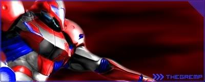
this is for the SOTW on Graphic Concepts
V1:

V2:

V3:

V4:

not a big fan of this one... I couldn't think of anything better than a smudged background, and it doesn't really look that great, I think V4 is my favorite because you can see everything better
:-/
V1:

V2:

V3:

V4:

not a big fan of this one... I couldn't think of anything better than a smudged background, and it doesn't really look that great, I think V4 is my favorite because you can see everything better
:-/