-
 The first day of our new Mushroom Season event has passed, but things are just getting started. Read the update about changes made to the schedule, starting with day two. Be careful foraging and good luck!
 -
Come and see the official gallery showcasing all of your creative entries from The Bell Tree Fair 2024. In addition, the winners for the final raffles have been drawn! Click here for the event's final closing announcement.
You are using an out of date browser. It may not display this or other websites correctly.
You should upgrade or use an alternative browser.
You should upgrade or use an alternative browser.
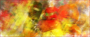
New Samus Sig
- Thread starter DarthGohan1
- Start date
Propaganda Man
Senior Member
It needs a border and just isn't that good.
The overall attractiveness of it isn't that high.
The overall attractiveness of it isn't that high.
What can be done to make a sig more attractive?
Propaganda Man
Senior Member
Change the style. And text.DarthGohan1 said:What can be done to make a sig more attractive?
Any specific tips?
if you'd made it transparent, so that it would be just open in some places you could get away with half a boarder.
All this really looks like is someone playing with filters... you should try to make parts more sharp and do something different from what you see everywhere else.
All this really looks like is someone playing with filters... you should try to make parts more sharp and do something different from what you see everywhere else.
Ah I see ur starting working on gfx.Its a pretty good job.
The border needs a little more like a stroke.
I'am guessing u smudge and use overlay on it.
Work on the font also.
Here's a tip (for photoshop) after u finish ur sig make a new layer,go to image>apply image.Then you go to filter>blur>gaussian blur,put on 2.5.Then u change the layer style expample screen,overlay,softlight.It make ur sig shiny
Well I like it. While I have to say it isn't that hardest thing to make it still looks fine.
Same reason why Monet while making generally messier strokes than other artists of the time still made great works and helped start the impressionist movement..... sorry I was just reading for my Art History Class tonight.
Same reason why Monet while making generally messier strokes than other artists of the time still made great works and helped start the impressionist movement..... sorry I was just reading for my Art History Class tonight.
I'm a Gimper.Lone_Wolf said:Ah I see ur starting working on gfx.Its a pretty good job.
The border needs a little more like a stroke.
I'am guessing u smudge and use overlay on it.
Work on the font also.
Here's a tip (for photoshop) after u finish ur sig make a new layer,go to image>apply image.Then you go to filter>blur>gaussian blur,put on 2.5.Then u change the layer style expample screen,overlay,softlight.It make ur sig shiny
I'll go open it up and see what a Gaussian blur would've done.
*It just made it really blurry.
No apply image option in Gimp.
Similar threads
- Replies
- 3
- Views
- 151
- Replies
- 2
- Views
- 142
- Replies
- 1
- Views
- 105