You are using an out of date browser. It may not display this or other websites correctly.
You should upgrade or use an alternative browser.
You should upgrade or use an alternative browser.
New Sig. : D
- Thread starter ƒish
- Start date


dragonflamez
God
Brush-tastic.
And the border pretty much ruins the entire effect.
And the border pretty much ruins the entire effect.
ƒish
Retired Staff
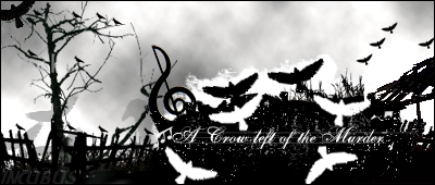
Yes... both brushes I used, how horrible. What does everyone even have against brushes, there is nothing wrong with using a brush, does it make you feel better to create art by limiting yourself?dragonflamez said:Brush-tastic.
And the border pretty much ruins the entire effect.
and about the boarder... yeah... i'm not done there yet. >.>
@shadow link - It's not supposed to be the most visible thing, if it were it'd take your eyes off the focal point, which isn't a good thing. : (
dragonflamez
God
[quote author="
Grawr
Retired Staff

I think it's awesome. Did your last sig have the same top and bottom border thing? Cuz' i think thats kind of a cool effect, especially with the name "fish"...cuz' in a good way, they kinda look like fishtank sigs.

ƒish
Retired Staff
Yeah, I changed the color and some stuff in it, but its basically the same thing.Gengar said:I think it's awesome. Did your last sig have the same top and bottom border thing? Cuz' i think thats kind of a cool effect, especially with the name "fish"...cuz' in a good way, they kinda look like fishtank sigs.
ƒish
Retired Staff
Alot of it is actually images, I basically googled a lot of stuff, then cut it all out and make it look pretty. >.>Ascendancy said:That render is great! You rendered that yourself correct?
And about the boarder, I'm just trying to do something different.
Similar threads
- Replies
- 16
- Views
- 354
- Replies
- 1
- Views
- 152