::New Signature::

Resonate

Senior Member
Joined
Jan 2, 2009
Posts
2,217
Bells
1,883
With the signature craze going on all over TBT, it shouldn't surprise you that I've been reading up on some tutorials. I had nothing to do so I put about an hour aside this afternoon (after reading some tutorials) and came up with this:
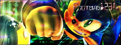
SonicSig.jpg


So uhhh, just tell me what you think, and any Constructive Criticism would really be greatly appreciated.

Re-Did the Font and got...<div class='spoiler_toggle'>Spoiler: click to toggle</div><div class="spoiler" style="display:none;">
OKFINALLYSONIC.jpg

This^</div>
 
bittermeat said:
Awesome! The font bothers me though.
8/10
Yeah I wasn't really pleased with the font. I think I should probably remove the gradient or at least try to lighten it up a lot. I'll probably go back in and fill it with white and set it to overlay.
 
pootman1234 said:
ricano4life said:
pootman1234 said:
ricano4life said:
lol whatd you make this with? it looks really good
<big><big>Adobe Photoshop Elements <big><big>3.0</big></big> Baby.</big></big> :p
Ohh no wonder rofl

good work
Thanks. Elements 3.0 was released in like 2004. =P

Oh well, but it gets the Job done.
how much did you buy it for, and when did you buy it?

nice job btw.
 
I don't like the effects in front of Sonic. They would look a lot better if you put them behind them and were just able to see the on the sides. Or, if possible as I don't know which way you took for this, make Sonic less opaque.

Remove the text you have right now and go with something really small in the top left hand corner.
 
It's nice, but it kind of seems like you've tried too hard. Sometimes it's best just to keep things simple.

I agree with fullofmyself on everything but I've got one thing to add, wth is that upside down car looking thing in the bottom left? :p
 
Jas0n said:
It's nice, but it kind of seems like you've tried too hard. Sometimes it's best just to keep things simple.

I agree with fullofmyself on everything but I've got one thing to add, wth is that upside down car looking thing in the bottom left? :p
Sonic's shoe.
 
Nice :D . I think it's awesome ^_^ .
That thing in the bottom left is his shoe o_O .
I like the picture of Sonic XD .
 
@John: I got it for free because my Photography teacher was going to go throw it away and I somehow got it to work on Vista. :)
<small>I'd rather have CS2... >_<
</small>
@Fullofmyself: Yeah I was trying to go for a more "Computer Chip" (almost like Matrix) kind of deal, but I still wanted to be able to see him. I might've been able to blend Sonic into the background and give him a more "faded in" effect, oh and thanks for the CC.

@Jas0n: I agree, sorta. My next one I want to focus on being subtle. Oh and that thing isn't his shoe, it's a board from Sonic Riders. At first I wanted to get rid of it, but I like how it looks with the top layer effect going over Sonic so I just let it be.

@Lewis: Yes. No brushes whatsoever.

@IceZtar: Why Thank'ya. ;)
 
Back
Top