You are using an out of date browser. It may not display this or other websites correctly.
You should upgrade or use an alternative browser.
You should upgrade or use an alternative browser.
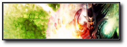
Nikoking - Warrior Signature
- Thread starter NikoKing
- Start date
yianni1578
Senior Member
I think it's awesome. 
The "up-ish" feel is like a 3D effect, you drop the shadow of the signature and get something similar to it. I tweaked it a little bit. Thanks for the rating as wellNumner said:I love how it's up-ish.
I like it in general @.@
9/10
Kanye Omari West
Senior Member
Text :X
I like the rest :3
I'm not a fan of editing renders :3
I like the rest :3
I'm not a fan of editing renders :3
coffeebean!
Senior Member
It's too bright....something there is going on and it's not balancing well. 7/10
Ah... ok thanks. I made it bright because I wanted the flame the render have to be more effective, so I thought it would be fun to add a lighting source near the fire, so excuse me for the brightness xDD.coffeebean! said:It's too bright....something there is going on and it's not balancing well. 7/10
@pear40: The outcome in the tutorial is much more better, but I went my own way, I'll ]http://shallowmede-x.deviantart.com/art/GIMP-signature-tutorial-88683063[/url]
Thanks. I've been looking for some new good tuts.Nikoking said:Ah... ok thanks. I made it bright because I wanted the flame the render have to be more effective, so I thought it would be fun to add a lighting source near the fire, so excuse me for the brightness xDD.coffeebean! said:It's too bright....something there is going on and it's not balancing well. 7/10
@pear40: The outcome in the tutorial is much more better, but I went my own way, I'll ]http://shallowmede-x.deviantart.com/art/GIMP-signature-tutorial-88683063[/url]
bittermeat
Senior Member
Text is horrible, again. Other than that, it's cool.
Alright, thanks sab. Anyone else?Sab said:+ good colors
+ depth
- render seems stretched oddly
- too light/bad contrast
- effects need work
Yeah, I set it on overlay too much lol.Mr_Hobo said:Text is just way to blend in. You can see it but just it is hard to see it.
Similar threads
- Replies
- 13
- Views
- 417
- Replies
- 16
- Views
- 409
