Rexy's art dump! [Critique welcome!]

freqrexy

Senior Member
Joined
Nov 7, 2015
Posts
607
Bells
108
Mailbox
Hello! I don't know if this is the right place to do it, but I thought I'd see if I could do a digital art dump in here and see if I can get some critique back for my work.

I often did a lot of traditional drawing when I was a teenager, but now I'm getting well into adulthood and all of my drawings nowadays are done exclusively with the ProCreate software for the iPad. After dabbling as much as I can into the software and doing as much pushing as I can to get the best results out of it, I just feel as if looking back at what I have is really nice but needs more suggestions on how to push about it to make it really stand out among all the good-looking fanart on the web.

Anyway, here's some past AC villagers all drawn through the software:

* Puck (yes, too inspired by the Hulk for this one xD)
* Sprinkle
* Kyle
* Ribbot
* Molly (cute as she is, her face was really hard...)
* Lolly

I'm actually working on one of T-Bone at this moment in time as well, and will share when finished.

So yes, me at the time of working these felt really good to draw these out and share with good friends of mine. But I still want to push myself further, so any critique - especially from those that have had experience with the software or anything similar - will be extremely welcome.

Thanks so much in advance x)
 
Hey there! Your art is quite cute! I see a lot of potential in your drawings! Keep working at it, improvement comes to those who practice.
Now this is just a suggestion, feel free to totally block me out here XD, but i actually used to use procreate. However, when i invested in another program that was more suited for proffesional use called Paint tool sai, i saw a ton of improvement with my work. Don't get me wrong, procreate is pretty good for starting digital art. However, there are several functions that i feel somewhat limits ones art.

If you don't want to make an investment in a $40 program though i've heard plenty of good things about free softwares online such as firealpaca. But again, its totally up to you and what you feel most comfortable with!

One thing you could try to push yourself on is shading. I actually love the lineart of your pieces and the poses, they look quite nice! But the shading could maybe use a little improvement. Thats the thing that will set you apart from other artists on the web. For practice shading theres plenty of tutorials that i found usefull on deviantart. Also, i found it a little helpful to watch speedpaints of popular artists and study how exactly they make their pieces so lifelike. You have the dark tones in your shading, but how about adding highlights based on a lightsource too? It gives the picture more depth and light. Also i could talk about color theory for hours but Yamio can probs explain it better so i'll link her video on choosing colors here: http://youtu.be/4KYPjVQEndU

I think you have plenty of potential! Keep working and doing your best and i'm sure you'll do great! Good luck ( ? ▽ ` )ノ
 
It's very cute! Very clean and vaguely simplistic, but also colorful and lively!

Some things I would recommend:

1. Your shading is clean and you have the right idea, but I think you could work a little more on making it so that the shading corresponds with the light source. For example, in your Lolly drawing, the window in the back brings light into the room; however, the shading is almost backwards, as if there is a brighter light source coming from inside, like a lamp or a fireplace (if this was your intention, though, ignore this, haha).

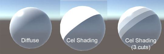
Also, there are different types of shading -- for example,
tumblr_inline_nqtgw1fo3n1ri0s9d_540.jpg


2. You could definitely integrate more dynamic poses into your drawings. Here's a guide that I think was done really well -- take a look if you want! Though don't feel like you have to follow everything it says, just focus on the main points.

3. Angling -- honestly, getting the right angle comes with practice and can't really be taught by a guide. Though I will say, when you draw characters' heads at a 3/4 angle, the eye further away from the front doesn't necessarily have to be drawn smaller -- it's usually just done narrower with no change to its height.

sorry if none of this made sense lol
 
Wow, thanks for the feedback! I'll need to address these one by one x)

@Mewmewmewm: It's funny you brought up an investment on art software for desktop computers, because I have GIMP on mine that's primarily used for non-drawing purposes. I've dabbled in creating artwork with it before and am aware of plenty of useful tools in there that aren't in ProCreate, though I'm curious if there's anything in Sai that would end up blowing BOTH of them out of the water. Is there? XD

As for shading, yes there are highlights but just not very much in comparison to the shade; otherwise I'd look back and see it more as a fancy beveled button rather than a figure on a screen. XD Basing it on a light source rather than putting the shade away from it sounds like something to consider - in hindsight, that's something that Molly could have had more of with the shade at the back getting drastically cut to better fit the scene.

Either way, yep, to me the shading is the hardest thing to get right. At least I know the lineart is on the right track, which I thought would get picked on under a microscope even though it would take me several attempts just to get certain lines right xD

@teshima: Wow, the dynamism tutorial looks like a helpful one to experiment with! Once I'm done with T-Bone, I'd love to see if I can experiment with some of the pointers there. The thing for the narrow-rather-than-small eye view at 3/4 view also sounds like something to look at too down the line. But still, heck yes to the dynamism and seeing what I can do with that.

I'm also aware of the different kinds of shading and have dabbled with soft shading techniques on the software before. While it is indeed a lovely one to work with, I also found my methods to be rather messy and having me spend more time erasing some of the 'shade' that went outside the lines. Hence this is something I often tend to save for something that doesn't really want to feel 'cartoony', so to speak.

Nonetheless, this has given me more confidence x) I'm actually more of a musician rather than an artist, but I'd still like to keep pushing and learning new skills along the way. Thanks so much!
 
Last edited:
Back
Top