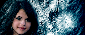
Jun 24, 2009 #1 Y YOUGETPWND Senior Member Joined Jan 28, 2009 Posts 145 Bells 1,317 Just made this for someone over on another forum
Jun 24, 2009 #2 Gnome the poster formerly known as AverageSean Joined Dec 27, 2008 Posts 6,686 Bells 496 *dies*
Jun 24, 2009 #3 Ricano Senior Member Joined Dec 30, 2008 Posts 5,674 Bells 613 lol the background looks like a dried ground cracking...how does that match? xD doesnt go together with selena
lol the background looks like a dried ground cracking...how does that match? xD doesnt go together with selena
Jun 24, 2009 #4 Y YOUGETPWND Senior Member Joined Jan 28, 2009 Posts 145 Bells 1,317 well not everything has to match sure in ur sig the kid doesnt exactly go with the background,
Jun 24, 2009 #5 Josh Senior Member Joined Mar 7, 2009 Posts 6,735 Bells 2,837 Oooerr, the background.. And u need to add a name but its not the best... 2/10
Jun 24, 2009 #6 Ricano Senior Member Joined Dec 30, 2008 Posts 5,674 Bells 613 YOUGETPWND said: well not everything has to match sure in ur sig the kid doesnt exactly go with the background, Click to expand... erm... do u noe who ness is? xD
YOUGETPWND said: well not everything has to match sure in ur sig the kid doesnt exactly go with the background, Click to expand... erm... do u noe who ness is? xD
Jun 24, 2009 #7 Josh Senior Member Joined Mar 7, 2009 Posts 6,735 Bells 2,837 YOUGETPWND said: well not everything has to match sure in ur sig the kid doesnt exactly go with the background, Click to expand... ?
YOUGETPWND said: well not everything has to match sure in ur sig the kid doesnt exactly go with the background, Click to expand... ?
Jun 24, 2009 #8 Anna Senior Member Joined Oct 12, 2008 Posts 4,101 Bells 2,961 much to plain and the background doesn't really match
Jun 24, 2009 #9 Y YOUGETPWND Senior Member Joined Jan 28, 2009 Posts 145 Bells 1,317 ah Screw it then i give up on graphics, might as well stick to my day job instead being a cop lol
Jun 24, 2009 #10 Jas0n Retired Staff Joined Nov 4, 2008 Posts 8,716 Bells 4,738 One problem with your sigs is the fact that you make it seem as though you've just plopped the render onto a background and done a few things to it. You need to make it seem as though the render is a part of the background.
One problem with your sigs is the fact that you make it seem as though you've just plopped the render onto a background and done a few things to it. You need to make it seem as though the render is a part of the background.