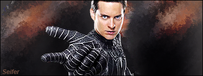
Spiderman

YOUGETPWND

Senior Member
Joined
Jan 28, 2009
Posts
145
Bells
1,317
just made this

Spiderman.png
 
I like it
the hint of orange/bronze in the background with hints of blue in the suit and eyes work well togethere
you did the complemetary colors-scheme! :D
 
YOUGETPWND said:
i just dont like the background to be to busy, it takes attention away from the render
Which is why you depth and lighting rather than just plopping a render on a terrible background.
 
dude what is ur problem, because u obviously have beef with me somehow, im not being funny but i made that background and and spent time on it for you to come and say its crap
 
Well IMO you cant go a post without only spamming with a 3 word sentence, but please guy if you not gonna critic it with explaining how i can make it better please dont post in my threads

thanks :)

@ JOJO thanks
 
YOUGETPWND said:
dude what is ur problem, because u obviously have beef with me somehow, im not being funny but i made that background and and spent time on it for you to come and say its crap
Well it is crap, whether you spent time on it or not.

Honestly, if you're going to upset every time someone says they don't like your signatures then you shouldn't post them.
 
no its called having tact but from now on im going to be really really really honest on peoples work, if peoples work is *censored.2.0* from now on im gonna say it, i guess im fed up with having tact,
 
YOUGETPWND said:
no its called having tact but from now on im going to be really really really honest on peoples work, if peoples work is *censored.2.0* from now on im gonna say it, i guess im fed up with having tact,
Good.

If you say that they're good or even decent when they're not, they're going to think that they're doing something right and continue doing it.
 
It is extremely amateur. You didn't blend the render in or anything. You just plopped it on a background and put your name in text and a border.
 
YOUGETPWND said:
dude what is ur problem, because u obviously have beef with me somehow, im not being funny but i made that background and and spent time on it for you to come and say its crap
olololol
Jason has beef with you? olololol

Anyways, the render is okay but you should have added some more effects. You can add more effects and make it look better without changing the focus of the sig.
 
i dont like it you should have gotten a better picture

edit: you got pwnd or whatever your name is has an awesome sig! GO BLAZERS! hahah
 
coffeebean! said:
YOUGETPWND said:
dude what is ur problem, because u obviously have beef with me somehow, im not being funny but i made that background and and spent time on it for you to come and say its crap
olololol
Jason has beef with you? olololol

Anyways, the render is okay but you should have added some more effects. You can add more effects and make it look better without changing the focus of the sig.
^ exactly
 
Back
Top