You are using an out of date browser. It may not display this or other websites correctly.
You should upgrade or use an alternative browser.
You should upgrade or use an alternative browser.
Vert
- Thread starter TheGremp
- Start date
dragonflamez
God
*steals*
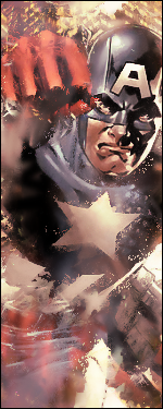
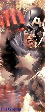
Oh, that doesnt mean that I like it. That just means that I'm gong to sell it to people because there's no name on it.
Oh, that doesnt mean that I like it. That just means that I'm gong to sell it to people because there's no name on it.
dragonflamez
God
It's good to stop people stealing.TheGremp said:yeah so? not every graphic needs a name.
dragonflamez
God
No, I bother him about other things.TheGremp said:let me get this straight...
Swancheese always makes a version with and a version without text
you could go annoy swan about it
yet you choose not to, but then, you choose to bug the crap out of me.
He overreacts a lot. It's quite funny.
S'true.dragonflamez said:No, I bother him about other things.TheGremp said:let me get this straight...
Swancheese always makes a version with and a version without text
you could go annoy swan about it
yet you choose not to, but then, you choose to bug the crap out of me.
He overreacts a lot. It's quite funny.
dragonflamez
God
Duh.Bulerias said:Guys, not all graphics are supposed to have text... :\
It's merely from copyright reasons.
no one said it had to.dragonflamez said:Duh.Bulerias said:Guys, not all graphics are supposed to have text... :\
It's merely from copyright reasons.
DF was useing a copyright example.
and pointing this out helps?Pichubro said:FIRST 2 SECONDS... And there's an fight about text... Wow.
and UB is right. Try a tut to learn it, but don't claim it as you're own work, even if you give credit to the tut.
There's nothing wrong with it. Of course, you don't want to rely on tutoorials forever, and alays posting it, but it's nice to post your own creation and get others opinions, so it helps the tut user and the tutorial maker.OddCrazyMe said:and pointing this out helps?Pichubro said:FIRST 2 SECONDS... And there's an fight about text... Wow.
and UB is right. Try a tut to learn it, but don't claim it as you're own work, even if you give credit to the tut.
for one thing it's my first time with this style so it would suck if I didn't use a tut, I'd just be randomly spewing crap onto my canvas and not getting anywhere, since I had no clue how swan made them
and please don't go through that freakin "gremp posts too many threads" thing again, been there, done that, I've made 7 and not made any posts about them, now I posted one. ONE. Other people post one graphic and it's not mentioned... There can't be a graphics section where nobody is allowed to post...
and please don't go through that freakin "gremp posts too many threads" thing again, been there, done that, I've made 7 and not made any posts about them, now I posted one. ONE. Other people post one graphic and it's not mentioned... There can't be a graphics section where nobody is allowed to post...
This is what I do with a tut.TheGremp said:for one thing it's my first time with this style so it would suck if I didn't use a tut, I'd just be randomly spewing crap onto my canvas and not getting anywhere, since I had no clue how swan made them
First, I make a sig with the tut. Then, I make another sig, adding in my own elements and taking out tutorial elements. That way, it doesn't seem like someone else's art.
ouch...lolUltraByte said:It seems you're using the tutorial too much, and it looks like one of swan's sigs (not a compliment). Text would be nice in the sig, but pick a color and font that atually fits with the sig.
anyway, not too bad, seems kinda blank in spots tho, and some spots are too grainy.
Similar threads
- Replies
- 29
- Views
- 655
- Replies
- 13
- Views
- 387

