Well....uh....Is this art alright? xD {Critique + Pricing?}

Nightmares

( ̄。 ̄)~zzz
Joined
Jun 3, 2015
Posts
23,324
Bells
45,022
Red Holiday Candle
February Birthstone (Amethyst)
New Leaf Token
Pink Hybrid Cosmos
Blue Candy
Yellow Candy
Tasty Cake
Happy Home Designer Token
Red Candy
Green Candy
I only have 1 drawing so far, but I'll add more soon ^.^

I was wondering if this drawing was ok?
I know it's not that great, but I know I've definitely improved...

I was hoping to get some critque (maybe not too harsh xD) and possible pricing?
If I were to sell them...would like...20TBT be alright?

Also, what do you think of the character design?
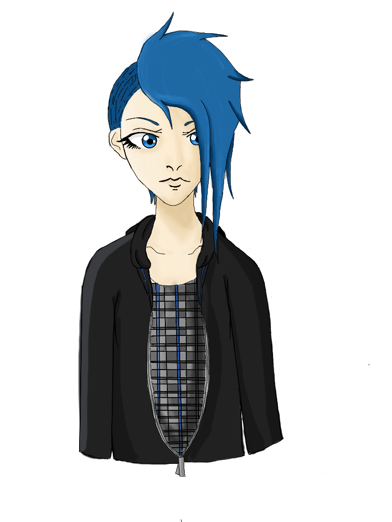


Thank you <3
 
Last edited:
looks like you already got the basics down. your art is worth way more than 20 tbt though; i'd buy it for at least 200. i love the design on the shirt. you got the hang of how to shade/highlight in the right places, so that's good too. to build onto that, i'd suggest experimenting a bit and try getting more detailed and complex with clothing folds, hair, and don't be afraid to slap some complimentary colors on there too. like if i want the drawing to be more appealing, i'd use a darker shade of blue or purple in moderation for the hair. i can see the shading you did to outline the nose and such, but try making it more noticeable and darker by just coloring in gradually darker colors. in most cases, you'll want to start off by just dumping colors around and blurring it out to make the base color look less flat, add on top of that with a semi darker color and blur a little, and keep going until you feel like its enough. to top it off, i'd be more precise on the shading and not blur it. but of course, everyone has their own way of shading - this is just how i'd do it. also, try not to use white for lighting and never use black/gray for shading (unless the base color is black). it'll look much more appealing if for shading, you use a darker color than the base and for lighting, go as bright as you can yet make sure the color is still visible, if that makes sense
 
looks like you already got the basics down. your art is worth way more than 20 tbt though; i'd buy it for at least 200. i love the design on the shirt. you got the hang of how to shade/highlight in the right places, so that's good too. to build onto that, i'd suggest experimenting a bit and try getting more detailed and complex with clothing folds, hair, and don't be afraid to slap some complimentary colors on there too. like if i want the drawing to be more appealing, i'd use a darker shade of blue or purple in moderation for the hair. i can see the shading you did to outline the nose and such, but try making it more noticeable and darker by just coloring in gradually darker colors. in most cases, you'll want to start off by just dumping colors around and blurring it out to make the base color look less flat, add on top of that with a semi darker color and blur a little, and keep going until you feel like its enough. to top it off, i'd be more precise on the shading and not blur it. but of course, everyone has their own way of shading - this is just how i'd do it. also, try not to use white for lighting and never use black/gray for shading (unless the base color is black). it'll look much more appealing if for shading, you use a darker color than the base and for lighting, go as bright as you can yet make sure the color is still visible, if that makes sense

Oh wow really o_O

And thank you so much for this! I know shading is kinda my weak point though aha
 
Last edited:
This is actually pretty good.

I like the way you drew the face, and I especially like the obvious care you took in creating the eyes

The only things I have problems with are the shading and the details on the jacket.

The shading - You definitely have a direction you want light to hit the character from, but I feel the shadows / highlights aren't really expressed in any good ways except for some shade/highlights on the edges of things. This brings me to my next point.

The jacket - The jacket has a fairly well done outline, but it doesn't have any details draw onto it which can make it very hard to shade/highlight, as mentioned before. With clothing about half of the detail comes from the color detail, and you can't really get much color detail without anything to detail. You should definitely practice fabric folds - they're hard to do but they're worth it.


I'm not the best with pricings, but I'd pay somewhere around 200-300 for this maybe? Take this with a grain of salt though.

Thank youu! :)
And yeah...I got kinda lazy at the end, and didn't even attempt the jacket details....

And I didn't realise it's be worth this much wow
 
Back
Top