Wesley11293
Senior Member

This is a signature that I made. What do you guys think? I know it's horrible. Can you give me some tips on how I can improve?


Wesley11293 said:http://i825.photobucket.com/albums/zz173/Wesley11293/toon]
This is a signature that I made. What do you guys think? I know it's horrible. Can you give me some tips on how I can improve?[/quote]From the looks of it... It kinda looks like you just smudge a copy of link for the background :L and the text is a little plain. The lighting is alright. Try experimenting with things like brushes, clipping masks, c4ds. Most of what M12 mentioned.


")
Spend more than 5 minutes on them ploxWesley11293 said:
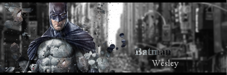
Thank you Muffun. Here's another one I made. I did the clipping masks technique in this one
At least you're branching out! It's a good start, but the text is pretty bad and could be worked upon. Lighting could be improved, and bring a little more flavor into your sigs if you know what I mean. Something that makes it a bit more unique, and in a good way.Wesley11293 said:
Thank you Muffun. Here's another one I made. I did the clipping masks technique in this one
A lot better than your first! Keep experimenting!Wesley11293 said:
Thank you Muffun. Here's another one I made. I did the clipping masks technique in this one


