Hi, I decided to open one. (yay, not really) Prepare to burn your eyes with this demonic app called Microsoft Paint. Basically us as kids messing around with it and having our parents pretend to like it. Yep. I'm poor af so I don't have any actual software. ;w; So...here it is.
Really, I'm trying to actually get better. This is not like Van Gogh art, more like...trash. Please roast my art as much as you want
Also, I'm obsessed with drawing bugs and stuff. :/ Will add more art later. Might do that when I'm free or next weekend.
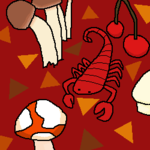
So, this sucked. The pear sucked, the peach had no effort and that scorpion does not look anywhere near the one in Animal Crossing. 0/10 stars.
Sucks again! That scorpion is inconsistent by having the last one have a darker red. That tarantula's color is too dark that you can't see it's :3 face.
Otherwise, 0/10 stars
Ugh! This took me so many hours and it sucks! Franklin's shadow clips into the counter awkwardly and his shading isn't consistent. Drift's proportions are extremely off. Clouds look grainy. Water looks bleached and someone tossed their vinegar in there. That fish looks burnt. The salad doesn't look like the actual in game salad. The soup is off. His cabinet doesn't have proper shading. My hand is awkwardly placed weird. The counters are too beige. The lining of the counters blend in too much. That stove only has one since I was lazy.
-10/10 stars
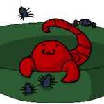
REET! Another one! To be honest, so...let's stop my joking hate. If I actually rated this, this would get a mediocre 5. The shading under the spiders are a bit off and that scorpion's head is a bit too big. But...:] It's good enough.
5/10 stars! :/
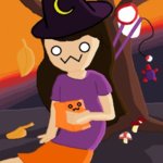
Ok, so...I hate drawing my character. I like my avatar but it looks cringy. This would get a sad 3. The shading is HORRIBLY OFF! The sunset is facing east but my shadow is facing west. HOW!? Even the sunset looks so fake and obviously me moving the color bar too far. :[
3/10 stars. >:[
Hey, this is owo spoopy. I wanna say, the coloring. Decent. It ain't good, but it's not bad. STILL THE BAD SHADING, THE SUNSET!? REEEEEEEEEEEET! Sorry, for that. I'm just pissed at that and it's too much to change. :[
Last one...
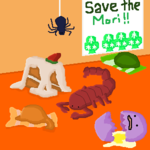
So, these are from when I decided to recolor the collectibles. Some were nice. From the start, that blizzard candy, it was horrible. Eventually, I found my technique and now I kinda have the hang of it. That mori and tsu looks legit. Like, that could be an April Fool's Prank on everyone's collectibles. Ooh, staff ideas.
8/10 stars. It depends, but the average I rated was a 8.
Hope you can pay your eye doctor after all that. Once again, feel free to roast my art.
Really, I'm trying to actually get better. This is not like Van Gogh art, more like...trash.
Also, I'm obsessed with drawing bugs and stuff. :/ Will add more art later. Might do that when I'm free or next weekend.
So, this sucked. The pear sucked, the peach had no effort and that scorpion does not look anywhere near the one in Animal Crossing. 0/10 stars.
Sucks again! That scorpion is inconsistent by having the last one have a darker red. That tarantula's color is too dark that you can't see it's :3 face.
Otherwise, 0/10 stars
Ugh! This took me so many hours and it sucks! Franklin's shadow clips into the counter awkwardly and his shading isn't consistent. Drift's proportions are extremely off. Clouds look grainy. Water looks bleached and someone tossed their vinegar in there. That fish looks burnt. The salad doesn't look like the actual in game salad. The soup is off. His cabinet doesn't have proper shading. My hand is awkwardly placed weird. The counters are too beige. The lining of the counters blend in too much. That stove only has one since I was lazy.
-10/10 stars
REET! Another one! To be honest, so...let's stop my joking hate. If I actually rated this, this would get a mediocre 5. The shading under the spiders are a bit off and that scorpion's head is a bit too big. But...:] It's good enough.
5/10 stars! :/
Ok, so...I hate drawing my character. I like my avatar but it looks cringy. This would get a sad 3. The shading is HORRIBLY OFF! The sunset is facing east but my shadow is facing west. HOW!? Even the sunset looks so fake and obviously me moving the color bar too far. :[
3/10 stars. >:[
Hey, this is owo spoopy. I wanna say, the coloring. Decent. It ain't good, but it's not bad. STILL THE BAD SHADING, THE SUNSET!? REEEEEEEEEEEET! Sorry, for that. I'm just pissed at that and it's too much to change. :[
Last one...
So, these are from when I decided to recolor the collectibles. Some were nice. From the start, that blizzard candy, it was horrible. Eventually, I found my technique and now I kinda have the hang of it. That mori and tsu looks legit. Like, that could be an April Fool's Prank on everyone's collectibles. Ooh, staff ideas.
8/10 stars.
Hope you can pay your eye doctor after all that. Once again, feel free to roast my art.
Last edited:


