Worst villager design

ScaryGhosts

stump maker
Joined
May 4, 2019
Posts
1,258
Bells
543
Switch
5994-8809-5956
Lobo
Pumpkin Cupcake
This thread probably exists somewhere, but I just started thinking about it when I realized that the back of Frista?s head is a burger. I?m outraged by this and would like to know who you think has the worst design. There are many that I don?t like just because of personal taste that I know other people love, and many that I don?t like and are generally considered ugly, but Frita takes the cake for worst design in my opinion (unless I remember someone else).

Who do you think is the worst designed villager?
 
Easily Rilla.

kNB9xTh.png


Whoever made this design should be ashamed of making such a cute character as Hello Kitty so ugly and horrifying.
 
Whenever i see him i imaging that the dark part is his open mouth and the light part is his tongue. Males him a little cuter but eek, he’s not good to look at.

it does make him slightly cuter, but I cant force my brain to see it for more than a few seconds xD
 
Bitty, my archnemesis

ZZ1Pq0y.png


This monstrosity not only chose a very lame spot in my original Gamecube town to move into early on, she was also rude and REFUSED to leave. She stuck around for a good year and a half of constant net beatings before finally leaving one day.

Easily Rilla.

kNB9xTh.png


Whoever made this design should be ashamed of making such a cute character as Hello Kitty so ugly and horrifying.

Jesus. It's too bad there aren't like, cat villagers that they could have used or something...
 
Last edited:
I know you asked for one, but I want to list a few just for fun.
I will say the worst to me as well.

200px-Coach_NL.png

Coach
His 5 o'clock shadow makes him look really bad.

150px-Elise_NLa.png

Elise
Her whole face design is just terrible.


200px-Huck_NL.png

Huck
I really don't like the mouth. It just throws me off since other villagers don't usually have something like that.

175px-Jambette_NLa.png

Jambette
Her big lips and eyelashes and color.

175px-Limberg_NLa.png

Limberg
He looks like a mixture of a clown and a 5 o'clock shadow. I can't really tell which one it's trying to go for.

175px-Moose_NLa.png

Moose
His curly hair going around his face + his face, knowing that it's always stuck looking that way unless you talk to him. Constantly raised eyebrow man.

175px-Nate_NLa.png

Nate
I really don't care for his color scheme with his pickle-colored unibrow.

150px-Prince_NLa.png

Prince
Another 5 o'clock-looking villager... his eyes don't look that great to me either.

150px-Puddles_NLa.png

Puddles
Such a basic, boring design. She looks like she's trying to stare into your soul as well.


175px-Quillson_NL.png

Quillson
His green color is fine, but I don't think it goes well with that yellow hair + the style of it.


200px-Rocket_NL.png

Rocket
The whole thing about lips on villagers is just unpleasing to look at, besides that I'm not a fan of the sporty look with that pink color.


175px-Paula_NLa.png

Paula
I really hate her color with her hairstyle. I have a thing against this villager because I really hated her design since I first saw her in New Leaf and she was in my first town for that game and she would not leave.

175px-Freckles_NLa.png

Freckles
Her eyes being far apart and her hairstyle and her color scheme are all terrible.


175px-Harry_NLa.png

Harry
I really, really hate his mouth with the hair all around it. I know he's called Harry for that reason, but it's just so ugly. Harry and Freckles are the ugliest to me.


There are more that I don't find pleasing to look at, but those are ones that I really don't like looking at and would never, ever want as villagers in my town.
 
Last edited:
Jesus. It's too bad there aren't like, cat villagers that they could have used or something...

You would think they would've stuck with a cat. Who in the right mind thought it was a good idea to put the Hello Kitty design on a gorilla????
 
Last edited:
Monkeys; they look like furry babies.. ew

Hippos: Just ugly and way too large face

Birds; basically coloured stick figures for most parts.. there are some nice but a lot are just uhm okay lol

Mice; a lot of them looks really bad like those mentioned, and that Bella with eczema on her face like?? why ninty and the male's voice sounds creepy like hell
 
Last edited:
latest

I think the worst design for both a villager and their house is Al.I don't have anything against the gorillas specifically but Al looks like he has jaundice and his lips look like a big rubber doughnut that's stuck to his face.His house is furnished with a lot of athletic gear leading you to believe he's a jock but he's actually a lazy.Geez,Nintendo should have made him a jock so at least his personality would match his house.
 
It's a shame that some of the base designs are inherently unappealing. Hippos, Gorillas, and the Mice in particular. You'd think Mice would be among the cutest, but instead their heads are disproportionately large and shaped like an upside-down pear!

Most disappointing design goes to Kiki though. Definitely nowhere near ugly, and overall adorable - if it weren't for her nose (or lack of one). I just can't see it as anything other than a hole in her head, and it's quite unsettling. If she and Rover* had kittens they'd produce Cat Voldemort, I'm sure of it!

* to be clear, I love Rover and would let him settle down in my town in a heartbeat

Easily Rilla.

kNB9xTh.png


Whoever made this design should be ashamed of making such a cute character as Hello Kitty so ugly and horrifying.

THIS, the absolute worst hands down. An amalgamation of villager design sins:
gorilla - check! fleshy skin tone - check! hair - check!
To top it off, below her shirt she's basically the reverse of Beardo and has a shaved skin patch. Why?!?
I actually appreciate that they chose species that didn't correspond with the original Sanrio characters, but...this? Just no

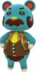
None of y?all said Beardo and u should be ashamed of yourselves hahaha
Beardo's one heck of a dapper dude! Sure, his...nether hair is a tad unfortunate, but I think all in all it's a solid design with nice colors. I like the contrast between the blue and brown, especially if he's still in his original shirt
 
None of y’all said Beardo and u should be ashamed of yourselves hahaha

latest

Yeah,he's creepy looking to some(ok...probably a lot more than just some)but I've always liked his Dr.Watson vibe and his comfy house.He just needs a belly shave.
 
This is a perfect place for my first post because OH MY GOSH.

Hopkins. I can't stand how he is an inflatable. It actually gives me the creeps. His colour is nice, but the racer tee looks so bad.
 
I know you asked for one, but I want to list a few just for fun.
I will say the worst to me as well.

200px-Coach_NL.png

Coach
[FONT=&]His 5 o'clock shadow makes him look really bad.[/FONT]

150px-Elise_NLa.png

Elise
Her whole face design is just terrible.


200px-Huck_NL.png

Huck
I really don't like the mouth. It just throws me off since other villagers don't usually have something like that.

175px-Jambette_NLa.png

Jambette
Her big lips and eyelashes and color.

175px-Limberg_NLa.png

Limberg
He looks like a mixture of a clown and a 5 o'clock shadow. I can't really tell which one it's trying to go for.

175px-Moose_NLa.png

Moose
His curly hair going around his face + his face, knowing that it's always stuck looking that way unless you talk to him. Constantly raised eyebrow man.

175px-Nate_NLa.png

Nate
I really don't care for his color scheme with his pickle-colored unibrow.

150px-Prince_NLa.png

Prince
Another 5 o'clock-looking villager... his eyes don't look that great to me either.

150px-Puddles_NLa.png

Puddles
Such a basic, boring design. She looks like she's trying to stare into your soul as well.


175px-Quillson_NL.png

Quillson
His green color is fine, but I don't think it goes well with that yellow hair + the style of it.


200px-Rocket_NL.png

Rocket
The whole thing about lips on villagers is just unpleasing to look at, besides that I'm not a fan of the sporty look with that pink color.


175px-Paula_NLa.png

Paula
I really hate her color with her hairstyle. I have a thing against this villager because I really hated her design since I first saw her in New Leaf and she was in my first town for that game and she would not leave.

175px-Freckles_NLa.png

Freckles
Her eyes being far apart and her hairstyle and her color scheme are all terrible.


175px-Harry_NLa.png

Harry
I really, really hate his mouth with the hair all around it. I know he's called Harry for that reason, but it's just so ugly. Harry and Freckles are the ugliest to me.


There are more that I don't find pleasing to look at, but those are ones that I really don't like looking at and would never, ever want as villagers in my town.

Ah man, I think a lot of these are cute! Lol

- - - Post Merge - - -

This is a perfect place for my first post because OH MY GOSH.

Hopkins. I can't stand how he is an inflatable. It actually gives me the creeps. His colour is nice, but the racer tee looks so bad.
I never noticed he was an inflatable. Ive never had him in my town, but that kind of ruined him for me. I think he’s cute otherwise
 
Beardo is lif y'all wym.

I have to agree with Rilla as well and most gorillas though monkeys are worse lol. I mean I love the Hello Kitty items..this villager though is just why am I alive lol
 
Back
Top