You are using an out of date browser. It may not display this or other websites correctly.
You should upgrade or use an alternative browser.
You should upgrade or use an alternative browser.
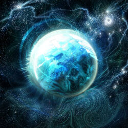
I make planet
- Thread starter «Jack»
- Start date
It's called a shadow.pokeboy said:its alrigt to dark for me.
Light source is from the top left.
Therefore, a shadow is created.
D
Deleted User
Nice, but for some reason, it reminds me of Phaaze...


BY POPULAR DEMAND:
<div class='spoiler_toggle'>Spoiler: click to toggle</div><div class="spoiler" style="display:none;">
 </div>
And no, I'm not making the shadow any smaller, because I feel that would take a way from the realism. Plus I'm lazy.
<div class='spoiler_toggle'>Spoiler: click to toggle</div><div class="spoiler" style="display:none;">

And no, I'm not making the shadow any smaller, because I feel that would take a way from the realism. Plus I'm lazy.
Well...Numner said:Could someone say, live on it?
Would that person need oxygen?
shadow is way to strongnephewjack said:It's called a shadow.pokeboy said:its alrigt to dark for me.
Light source is from the top left.
Therefore, a shadow is created.
and don't ask for constructive criticism if your not willing to take it
The shadow is wayyyy too dramatic, it would be a more calm change. Also I HIGHLY suggest you move the light source around so that the shadow is smaller, it's kind of pointless making half your image a black circle :S
Ummmmm.... No idea what you are trying to say... He is not trying to show the light source slowly moving... he is trying to use a completely different placed light source.Sab said:sry for double post but i didn't see ur v2 before and like the shadow area is good but its a too sudden change. make it more gradual
All of the people negatively responding to this just don't know what art is. If he wants to show the dark side of the planet, GREAT!
VERY NICE!!!
D
Deleted User
But it's too dark. Even the dark side of the moon isn't that dark.Lion Crossing said:Ummmmm.... No idea what you are trying to say... He is not trying to show the light source slowly moving... he is trying to use a completely different placed light source.Sab said:sry for double post but i didn't see ur v2 before and like the shadow area is good but its a too sudden change. make it more gradual
All of the people negatively responding to this just don't know what art is. If he wants to show the dark side of the planet, GREAT!
VERY NICE!!!
1st off were not negatively responding were giving constructive criticismLion Crossing said:Ummmmm.... No idea what you are trying to say... He is not trying to show the light source slowly moving... he is trying to use a completely different placed light source.Sab said:sry for double post but i didn't see ur v2 before and like the shadow area is good but its a too sudden change. make it more gradual
All of the people negatively responding to this just don't know what art is. If he wants to show the dark side of the planet, GREAT!
VERY NICE!!!
2nd i'm trying to say that the shadow needs to be toned down b/c it compromises the art
3rd off i know what he is trying to do and i'm not an idiot. don't be so biased and try to at least listen to what other people have to say
If you understood what he was doing you wouldn't have said, "its a too sudden change" (Sab). Ignoring your grammar mistake, that doesn't make sense if you understand what he is trying to do. I also never insulted anyone. I just stated their ignorance.
Negatively responding? It's called serious concrit. Don't expect super happy comments on a bad image (not saying this image is bad).Lion Crossing said:Ummmmm.... No idea what you are trying to say... He is not trying to show the light source slowly moving... he is trying to use a completely different placed light source.Sab said:sry for double post but i didn't see ur v2 before and like the shadow area is good but its a too sudden change. make it more gradual
All of the people negatively responding to this just don't know what art is. If he wants to show the dark side of the planet, GREAT!
VERY NICE!!!
Similar threads
- Replies
- 5
- Views
- 362
- Replies
- 39
- Views
- 2K
- Replies
- 2
- Views
- 479
- Replies
- 4
- Views
- 322
