bittermeat
Senior Member
They're decent. You will eventually get a lot better if you keep practicing. 
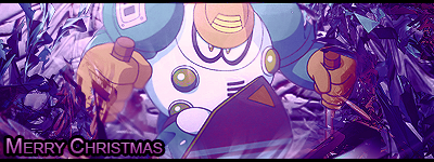
The render is blurry and very distant looking.Zexion said:Meh.


Yea. I tried to fix it, but I had to render it myself. It was hard, and I had no idea how to do it. By the end it looked really choppy, so I blurred it. It looked better that way.bittermeat said:The render is blurry and very distant looking.Zexion said:Meh.


Zexion said:Yez this is my real name.
Simple, but I like it.
http://i645.photobucket.com/albums/uu178/zex1on_bucket/red][/quote]:D
CHASECHASECHASE
Hai do you have a card? :3

https://www.chase.com/credit-cards.htmZexion said:
Thanks. That makes a lot of sense. Ill try it next time.Nikoking said:Yeah, well I'm not downgrading you on the render part since you don't know how, I know many great graphics makers that don't even know how to render at the least bit, and you should at least be given a transparent one and not once with a background. You could also use it as a stock, but even that kind of image would serve for a crappy stock because of its lack of flow or depth. It's nice, but I suggest for the BG next time you should try a stock image, and put the render over it. You could even use a nature stock, here I'll show you:
I used this stock as my background for this signature:

You hardly notice the tree stock I used, because I smudged it and then put on some C4D's. I hope this helps you.
KK ty.Muffun said:I like the Roxas one, but it could use some work.
Muffun doesn't feel like concritting now
Nope. Don't understand why everyone thinks so.Gnome said:Aren't you Roxas in the first place?
He's nooot because I amm. =pZexion said:Nope. Don't understand why everyone thinks so.Gnome said:Aren't you Roxas in the first place?
Mhm!Roxas said:He's nooot because I amm. =pZexion said:Nope. Don't understand why everyone thinks so.Gnome said:Aren't you Roxas in the first place?