My Realistic Headshots

biibii

pudding dog.
Joined
Mar 25, 2014
Posts
5,173
Bells
332
Switch
0713-6060-7729
Rainbow Star Fragment
Spring Sakura
Dreamy Easter Egg
Spring Sakura
Flower Glow Wand
Ice Cream Swirl (TBT Beach Party)
Popsicle (TBT Beach Party)
Ice Cream Swirl (TBT Beach Party)
Popsicle (TBT Beach Party)
Ice Cream Swirl (TBT Beach Party)
I have a week with my Wacom or so, and these are a couple of headshots ive doodled up.
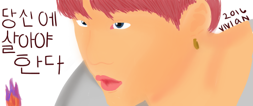
Today:
suga_zpsc53iq0yp.png


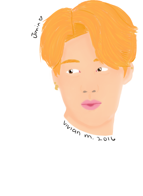
Two or Three days ago:
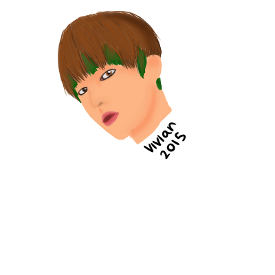
taehyung_zpseuqklo0v.png

Sunday:

jimin_zpsxqsrhzek.png

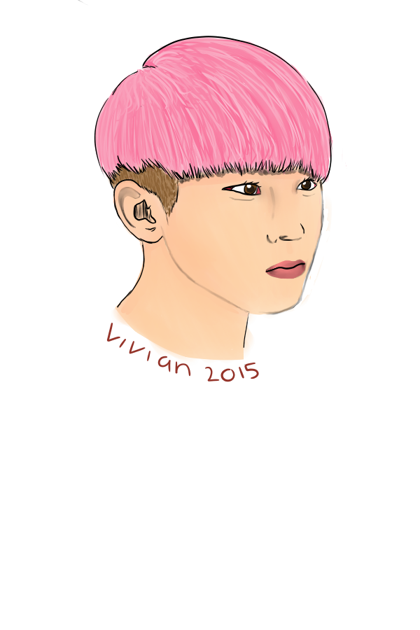
First headshot (before new years):
realistic_zpsinj22nxn.png


I stopped using lines and started coloring in a more painted style recently :)
leave opinions and advice below! BE KIND.
 
WOW! Omg, all these look really pretty~! <3 and you made Jimin bae look exceptionally cute d(>//U//<)b
..Jimin is my bias btw xD *sighs* I hate being a noona..

Please keep up the awesome work!!
 
The linework/anatomy is quite good. Im assuming you used a reference for those and that's fine.

One thing I noticed tho is you don't use enough dark shades where you should be. Try using much much darker colors and blending them into the other colors. If you move the blend tool from dark to light, it blends it fairly nice.


Edit: forgot to mention, when shading skin, use a red tint.
 
Last edited:
The linework/anatomy is quite good. Im assuming you used a reference for those and that's fine.

One thing I noticed tho is you don't use enough dark shades where you should be. Try using much much darker colors and blending them into the other colors. If you move the blend tool from dark to light, it blends it fairly nice.


Edit: forgot to mention, when shading skin, use a red tint.

ahh i only used a reference for the last one, the rest were kind of like oH THIS HEAD SHAPE LOOKS LIKE THIS ONE PERSON
 
they are AMAZING!

I love the Suga one c:
 
also i use fire alpaca since i cant afford another program! that means i dont have a blending tool so i kinda have to use the blur tool r i p .and afTer i thiught it looked someone i looked at pictures of my phone for the rest of the drawing :)

- - - Post Merge - - -

they are AMAZING!

I love the Suga one c:

tysm!! ily ella :)
 
I agree, the anatomy and proportions look good, but they need a little more contrast. If you can put some darker shades into the shadows and get some light highlights, they'll be much more readable images. It's something I'm working on myself :). You have a good base, they just need pushed a little further
 
Yes! More contrast! I would put more definition on the nose; I cold barely see it. They also seem to be turning more orangey? The skin tone for the bottom one is good, but the top two look too orange (unless you were going for that). Some eyelashes on the top and third one would be cool too.
 
The linework/anatomy is quite good. Im assuming you used a reference for those and that's fine.

One thing I noticed tho is you don't use enough dark shades where you should be. Try using much much darker colors and blending them into the other colors. If you move the blend tool from dark to light, it blends it fairly nice.


Edit: forgot to mention, when shading skin, use a red tint.

Not necessarily red tint. When shading skin, use colours from whatever environment the character is in. Outside under the blue sky? Mix some grey-blue with a darker skin tone for accents. In a bedroom at sunset? Use more red, orange and purple tones in your shading.

But I definitely agree with using darker colours - don't be afraid to drift far from your original base colour.


This is a quick reference I had drawn up before regarding shading and blending (using SAI brush as examples), hopefully you can find it useful :)
uPXHIyb.png
 
ahhh i cant blend as i said before! tysm for the help but please keep in mind my program has a few limitations! :) also i do see the oraNge TINt IM CRYIBG
 
Not necessarily red tint. When shading skin, use colours from whatever environment the character is in. Outside under the blue sky? Mix some grey-blue with a darker skin tone for accents. In a bedroom at sunset? Use more red, orange and purple tones in your shading.

But I definitely agree with using darker colours - don't be afraid to drift far from your original base colour.


This is a quick reference I had drawn up before regarding shading and blending (using SAI brush as examples), hopefully you can find it useful :)
uPXHIyb.png

Today I learned something new.

ahhh i cant blend as i said before! tysm for the help but please keep in mind my program has a few limitations! :) also i do see the oraNge TINt IM CRYIBG

Blur might work just fine.
 
they said not to use blur! bump! :)

Yea exactly, you should avoid the blur tool because it washes out the colours into an indecipherable mess and takes away the form of whatever you are colouring, making it look flat.
 
i need to find a new program ahh, unless you can download brushes on firealpaca? if you can ill find some blending somewhere
 
Back
Top