SilentHopes
Swag Master
Avatar:

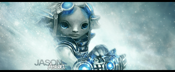
Signature:

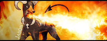
Thoughts? I finally got some better c4d's.
Signature:
Thoughts? I finally got some better c4d's.
")
Most of what I see from you is a render, background with similar colors, and a few effects.Jas0n said:Same old, same old. Render, background, outer glow on render.
I don't care what I've done, I'm not comparing it to my work, nor are we talking about my work here. I know my work isn't fascinating, but that doesn't mean I don't know what's good and what isn't.Rorato said:Most of what I see from you is a render, background with similar colors, and a few effects.Jas0n said:Same old, same old. Render, background, outer glow on render.
So...
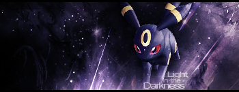
And for your information, this signature was 16 layers. It has much more on it than you can see.
It's also insignificant to try and explain what a good signature is to you, because you clearly don't knowRorato said:You're completely missing my point, although it's insignificant to try to explain it to you.
No. It's because you have to be so stingy about what appeals to you or not. I wouldn't even be talking about my signatures not changing much, as you have done the same.Jas0n said:It's also insignificant to try and explain what a good signature is to you, because you clearly don't knowRorato said:You're completely missing my point, although it's insignificant to try to explain it to you.


As I've already said, I know my signatures aren't amazing, but that does not mean I don't know what is good and what is not, and yours clearly aren't.Rorato said:No. It's because you have to be so stingy about what appeals to you or not. I wouldn't even be talking about my signatures not changing much, as you have done the same.Jas0n said:It's also insignificant to try and explain what a good signature is to you, because you clearly don't knowRorato said:You're completely missing my point, although it's insignificant to try to explain it to you.
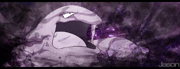
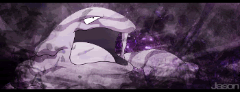
Your signatures all follow a pattern. A render, some equally colored c4d's, and a similar colored background, occasionally though, a few messy brushes are applied.
I've also noticed that nearly every signature you've made has your name on it.
<div class='spoiler_toggle'>Examples</div><div class="spoiler" style="display:none;">
</div>
But, whatever you're too busy being a babbling buffoon to inconvenience yourself to give beneficial criticism.


I like that you replied to none of my points, instead you just call me a total *censored.4.0*. You asked me to give constructive criticism, I did, and now you're telling me to shut up? How classy.Rorato said:Hey Jas0n, why is it so hard just to drop the subject? Or is it easier to be a total *censored.4.0* about it?
You have your likes, I have mine. Now quit arguing about it.
Muffun said:Experiment a little. Please.


