You are using an out of date browser. It may not display this or other websites correctly.
You should upgrade or use an
alternative browser.
What do you think of it? criticism is appreciated
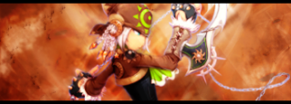
It's alright I guess, But either the render isn't too good or it's been blurred to much. Other than that not bad, Maybe add some text.
6/10
7/10
good except its too blured
likey likey
")
nice but a little more work will make it awesome.
Nothing is standing out from anything else because the character in the signature is blurred.
Yeah you need to get rid of the blur on the character so he can stand out.
The render doesn't stand out at all :|
The colors are well but there's some line coming out of the axe. What is that?
5/10
Your other one is better.
No focal point. The character shouldn't be blurred.
Otherwise it's good.