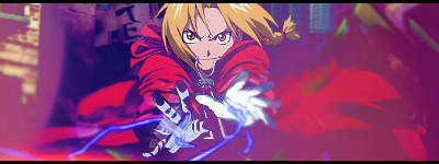
New Tag

SIG_15.png

Recolored it, now I'll use Sab's tut link to attempt to incorporate text.
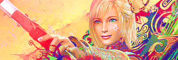
 
SIG_16.png

New. Well, old actually. Started this one a long time ago and picked it up again.

@Numner: The line looks kind of odd to me, shouldn't have added it.
 
Awesome, but the depth is pretty screwed up. His right hand is blurred while his left is not, but they're adjacent to each other.

At least, that's how I see it.
 
Muffun said:
Awesome, but the depth is pretty screwed up. His right hand is blurred while his left is not, but they're adjacent to each other.

At least, that's how I see it.
 
SIG_18.png

This was for a request from jim128.

I think I did well with the text.
 
Color scheme is awesome and the smudging is pretty good. Otherwise it's basic and it looks like Porygon Z was slapped onto a background, blend Porygon into the background a bit more. The text doesn't really work.
 
i love the smudging, also i think the text is pretty well done, you are definitely improving your text skills XD maybe i would suggest adding some bubble c4ds to add some subtle effects and maybe use the burn/dodge tool to help with the lighting. kiu m8
 
Back
Top