


Comments please.

My little secret.Bulerias said:Where did you get that render? DO TELL. <3
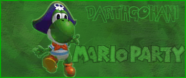
Not bad. However, I think the text you used to write your name with doesn't fit with the overall sig and Mario Party font. It just doesn't blend in very well... You could have accented the render a tad too, so it stands out a bit.
But overall not bad.


I don't think the font is a problem.DarthGohan1 said:My little secret.Bulerias said:Where did you get that render? DO TELL. <3
Not bad. However, I think the text you used to write your name with doesn't fit with the overall sig and Mario Party font. It just doesn't blend in very well... You could have accented the render a tad too, so it stands out a bit.
But overall not bad.
I thought the font was a fun-looking one, appropriate for Yoshi & MP.
I agree that I should've brought Yoshi out a bit more.
Right, I think it's just that the two fonts clash together.STORMCOMMANDER said:I don't think the font is a problem.DarthGohan1 said:My little secret.Bulerias said:Where did you get that render? DO TELL. <3
Not bad. However, I think the text you used to write your name with doesn't fit with the overall sig and Mario Party font. It just doesn't blend in very well... You could have accented the render a tad too, so it stands out a bit.
But overall not bad.
I thought the font was a fun-looking one, appropriate for Yoshi & MP.
I agree that I should've brought Yoshi out a bit more.
Yes...DarthGohan1 said:Does anyone recognize the font I used to write my name?

