Normally I would put something like this into the Blog Tree, but... the blog tree no longer exists. So instead, I'm putting it here. So as I'm sure you all know, the texture resolution on the N64 was very poor, so when the museum's paintings were converted into textures on Animal Crossing on the Gamecube (originally an N64 game), naturally they look really poor in quality.
But don't underestimate the ridiculously poor quality of these texture paintings. The reason why I've created this thread is to show you all how truly awful the original painting textures were. It gave me a great laugh, and hopefully it brings you a laugh as well.
So let's go down the list. I'll put up a picture of the original, and to the right I'll put an enlarged version of the texture. Something to keep in mind is that part of the way that the N64 was able to get away with these hideous textures was by blurring the pixels so that they seemed to "blend" together. So looking at the actual texture might be a bit different than looking at it in-game. With this in mind, I'll also supply an in-game picture of it.
Amazing Painting (A Sunday Afternoon on the Island of La Grande Jatte - Georges Seurat)
| Actual Painting: | In-game Screenshot: | Texture: |
|
| | |
(Note that in the newer Animal Crossing games, this is called the "Calm Painting" and a different piece of art has been dubbed the "Amazing Painting.")
So we're already off to a great start. If you weren't already aware of what this painting looked like then the texture on the far right would simply look like a jumbled mess of random bright colors. Let this set the stage for the rest of the paintings which I'll show here.
The only slightly noticeable figure in the texture is the woman holding a parasol on the right side of the print. You can kind of make out the black dog and the other people in the foreground but it takes a lot of creativity to see that in the texture version (I have to admit that the texture blurring does help a bit here). The rest of the texture actually looks like jumbled pixelated garbage (no offense to the creator of the texture; at least they tried).
Basic Painting (The Blue Boy - Thomas Gainsborough)
| Actual Painting: | In-game Screenshot: | Texture: |
| | |
This one is... okay. The painting itself has a pretty dull-colored background so I can excuse the background of the texture. But what happened to his face?? The face of the boy in the texture version is actually indistinguishable. The only redeeming factor of the texture is that it captured the basic shape and color of the figure pretty well, and it looks a
lot better in-game, so I'll give this one a pass.
Moving Painting (The Birth of Venus - Sandro Botticelli)
| Actual Painting: | In-game Screenshot: | Texture: |
| | |
Oh no... look at what they've done to the beautiful Venus Anadyomene!
Similar to the Basic Painting, this texture does well in that it gets the basic colors and shapes correct. However, that cannot deter from the absolutely
awful quality of the texture. The figures are drawn out
just well enough that they can be perceived as human figures, but this texture truly stretches that limit as far as it can go.
Flowery Painting (Sunflowers - Vincent van Gogh)
| Actual Painting: | In-game Screenshot: | Texture: |
| | |
This seems to be one of the only "decent" textures, although that's not saying much given that the original painting is rather mute in its color diversity. Nonetheless, I think that this one looks okay in-game.
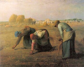
Common Painting (The Gleaners - Jean-François Millet)
| Actual Painting: | In-game Screenshot: | Texture: |
| | |
I appreciate that the figures within the print are easily distinguishable in the texture but oh my lord those colors. Did the artist of this texture really have to go with multiple shades of
puke light green? The original print shows muted and very natural tones, which are a solid representation of the quiet countryside. But the texture is very bad at this. How difficult could it have been to use the correct colors?
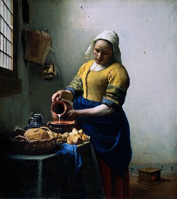
Quaint Painting (The Milkmaid - Johannes Vermeer)
| Actual Painting: | In-game Screenshot: | Texture: |
| | |
This painting is a great example of how texture blurring can really do justice to an otherwise nasty looking texture. This texture actually doesn't look too bad, but the blur effect makes the painting quite distinguishable in its form and color.
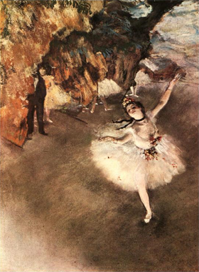
Dainty Painting (The Star/Dancer on Stage - Edgar Degas)
| Actual Painting: | In-game Screenshot: | Texture: |
| | |
This is undoubtedly the worst texture out of the bunch. When I initially took a look at the actual painting I had to do further research on it online because I thought that the Animal Crossing Wiki was playing a joke. No, they weren't; the texture is legitimately that horrible. The colors are
way off. You can barely make out that there is a dancer in the bottom corner, and it's nearly impossible to tell what her positioning is. In general the texture is very ugly; it barely seems to understand what it's trying to represent at all. Now that I've taken a look at the original painting I can appreciate how truly terrible the texture version of it is.
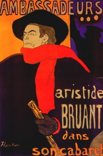
Strange Painting (Strange Painting (Ambassadeurs/Aristide Bruant - Henri de Toulouse-Lautrec)
| Actual Painting: | In-game Screenshot: | Texture: |
| | |
This is actually the print that prompted me to create this thread. When comparing the original with the texture version I can't help but laugh. I don't know if it's because of the ridiculousness of the texture itself or because I'm surprised that this painting could be turn into...
that. I have to give them credit for trying their hardest to write out those words, not to mention that the colors in the texture are actually pretty decent. I think that this has always been one of my favorite paintings in AC:GCN simply because it's always been so bizarre to me, and now that I've seen the actual print I appreciate it a lot more. And, unlike the Basic Painting, the face is actually really distinguishable here!
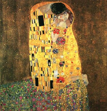
Rare Painting (The Kiss - Gustav Klimt)
| Actual Painting: | In-game Screenshot: | Texture: |
| | |
Ever since I was a kid this painting had been a mystery to me. I've mentioned that a few other paintings are
almost indistinguishable, but this one actually
is indistinguishable! I'm not even kidding, without looking at the actual painting could you tell me what that texture is supposed to represent? Like the Amazing Painting it's basically a colorful jumbled mess of pixels that, honestly, doesn't make any sense at all without the original reference to compare it to.
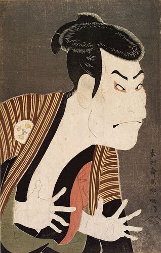
Scary Painting (Actor Otani Oniji III as the Yakko Edobei - Sharaku)
| Actual Painting: | In-game Screenshot | Texture: |
| | |
This was always one of my favorite paintings in AC:GCN because Otis had it in his house and he lived in my town for many, many years. The texture looks okay, the only comments I'll make are that the colors are a bit off (idk how purple got in the texture lol) and it actually looks a bit messy. Notice the fringe of pixels outlining parts of the figure in the texture. There had to have been a better way to represent the highlights from the original picture. It just doesn't look good at all, even in the blurred version.
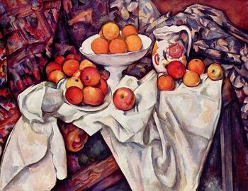
Perfect Painting (Apples and Oranges - Paul Cézanne)
| Actual Painting: | In-game Screenshot: | Texture: |
| | |
This is another one that always confused me as a kid. Looking at it after seeing the original, it makes sense. It's just a bunch of apples and oranges. But the younger me didn't know that, and so my imagination went crazy trying to figure out what the texture was supposed to represent. I think my longest-standing belief was that it was a picture of two people (the bowl of ranges on the top was a lady's hat and she was facing away from the viewer; the pitcher is someone else's head). Besides that, based on the original print this texture looks pretty decent, especially in its blurred form.
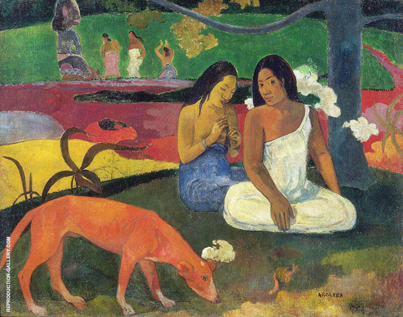
Fine Painting (Joyousness - Gauguin)
| Actual Painting: | In-game Screenshot: | Texture: |
| | |
I believe whole-heartedly that this is the best looking painting out of all of them. Pretty much all of the colors are correct and there is no confusion about what the texture is supposed to represent. The figures are drawn very well in the texture, which is really surprising considering how low-quality these textures are.
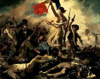
Worthy Painting (Liberty Leading the People - Eugéne Delacroix)
| Actual Painting: | In-game Screenshot: | Texture: |
| | |
The blurred version of the texture actually looks very good when compared to the original print. The figures are surprisingly very distinguishable; I think part of this may be because each texture had a limited color pallet and this texture happens to use mostly brown colors. The texture itself, however, doesn't look quite as well. This is a texture that basically
needs the benefit of blurring in order to look good. If it was only the original texture then I wouldn't be quite so kind about it.
Classic Painting (Washington Crossing the Delaware - Emanuel Leutze)
| Actual Painting: | In-game Screenshot: | Texture: |
| | |
This is also a very good representation of the original print. I have to comment that the texture looks incredibly clean; it's almost as if the artist whom made these textures spent all of their time on this painting and the Fine Painting, because they both look really great. This is one of my favorite pieces of art in the game as well.
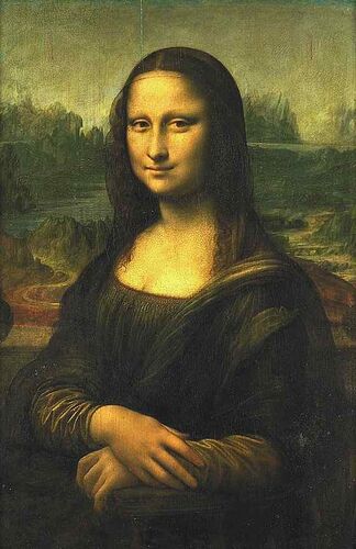
Famous Painting (Mona Lisa - Leonardo da Vinci)
| Actual Painting: | In-game Screenshot: | Texture: |
| | |
What better way to end this thread than on a bad note? Not that the texture of the Mona Lisa is necessarily bad; it's actually quite good, especially in its colors and overall form. But there's one thing that seriously irks me about this texture, and it's actually been bothering me since I was a kid: The little patch of pixels below her nose look like a mouth to me. I don't know why, but I really cannot unsee this and it makes the texture look really bad and hilarious to me. I can't be the only one who sees this??
Did you make it to the end? Terrific! I know this was a very long-winded post, but I really wanted to share this with all of you who appreciate Animal Crossing on the Gamecube as much as I do. Also, comparing these textures to their original paintings has been a fun experience for me. Leave any questions/comments below!
")