Megamannt125
Senior Member
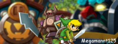
Well, what do you think for a first signature?
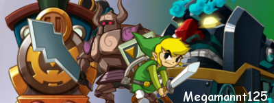
Improved version:


Improved version:


What do you recommend for a better background? I'm fairly new to GIMP.Bacon Boy said:Too busy. Background too bland.
Renders are good though.
My first sigs are theese:bittermeat said:It does not fail like most first signatures. It does not look horrible, it's fairly decent.


You took 2 images and slapped your name on them. Pretty fail.Pyrozanryu said:My first sigs are theese:bittermeat said:It does not fail like most first signatures. It does not look horrible, it's fairly decent.
---- [ Set 1]
----
[ Set 2]
Fail or not?
Yeah, boy adding text sure is hard work.Pyrozanryu said:My first sigs are theese:bittermeat said:It does not fail like most first signatures. It does not look horrible, it's fairly decent.
Fail or not?
bittermeat said:It just takes time to learn new techniques and doing that gives you experience. Starting out with a render(s) on top of a background is the first step with it.
And you used PNG format.
But even so, it's not a real signature. A real signature would have some kind of material to it, you just edited an image.Pyrozanryu said:Actually with the triforce one i edited the colour ratios, made it brighter, made it a different colour, THEN added text...
I'd like to see the first copy of the image then I'll tell you my review about it.Megamannt125 said:Made an improved version.
It's there on the first post.Mr_Hobo said:I'd like to see the first copy of the image then I'll tell you my review about it.Megamannt125 said:Made an improved version.
I blurred them just a tiny bit to fit into the overall image more.bittermeat said:Looks better. The character renders make need sharpening though.
Link and the knight need to be the sharpest things....Megamannt125 said:I blurred them just a tiny bit to fit into the overall image more.bittermeat said:Looks better. The character renders make need sharpening though.
Pyrozanryu said:]They are the sharpest things, but if they were too sharp it wouldn't look as good.Megamannt125 said:I blurred them just a tiny bit to fit into the overall image more.bittermeat said:Looks better. The character renders make need sharpening though.
Don't use that strong of a blur, make it so it's blurred but not as obviously noticeable. Make Link and the other person sharpened so they stand out more, and that's all I can say for a newbie signature.Megamannt125 said:Well, what do you think for a first signature?

Improved version:
