The power of dreams..

Lewis

Senior Member
Joined
Nov 27, 2008
Posts
2,047
Bells
1,490
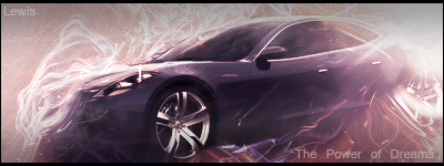
I've been improving my skills today and I came up with this.
Thepowerofdreams.png


I think it's the best i've made up to now, what do you think?

If you're going to say 'Awesome!' or 'It's a pile is *censored.2.0*!' please say why.

EDIT: The stock I used was this: <div class='spoiler_toggle'>Spoiler: click to toggle</div><div class="spoiler" style="display:none;">
sports-car.jpg
</div>
 
I really like the simplicity of it. All the colors blend well. Lighting is great also.
 
I like it, the render blends in with the background. And the lighting's good. Overall 9/10.
 
O EM G! IT'S AWESOME! The car looks perfectly like the picture of the real one! The colors in the backround look nice 2!! Nice!!

Rate: 10/10
 
rebma girl said:
O EM G! IT'S AWESOME! The car looks perfectly like the picture of the real one! The colors in the backround look nice 2!! Nice!!

Rate: 10/10
...It is the same car. He just flipped it.
I think it looks great. Nice lighting and colors.
 
I think it's awesome! I really like the effects of those skinny flame/wave things going around the car ;)
 
It's nice, not a huge fan of the text or scanlines though.

There's something else I don't like about it but I can't put my finger on it, something just looks strange :p
 
What?
Jason didn't be as critical as usual!
That's a plus!
The only thing I don't like is the border being on the right and left, I prefer it just on the top but that's just me. Great work!
I still want you to do a Lego sig because I know you like lego.
 
Back
Top