You are using an out of date browser. It may not display this or other websites correctly.
You should upgrade or use an alternative browser.
You should upgrade or use an alternative browser.
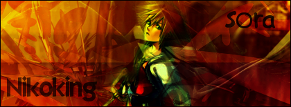
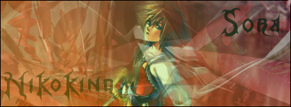
Tried out a tut....
- Thread starter NikoKing
- Start date
Yeah, I couldn't find any fonts that would match sora. So I had to stick to the defaultsxYoh said:Colors/Text don't match with Sora ._.
Ohohoh I had this Kingdom Hearts font in my other computer but I don't know where I got it =/Nikoking said:Yeah, I couldn't find any fonts that would match sora. So I had to stick to the defaultsxYoh said:Colors/Text don't match with Sora ._.
Seriously? *Googles immediatley*xYoh said:Ohohoh I had this Kingdom Hearts font in my other computer but I don't know where I got it =/Nikoking said:Yeah, I couldn't find any fonts that would match sora. So I had to stick to the defaultsxYoh said:Colors/Text don't match with Sora ._.
Heh... thanks. But really, this is not 10/10 workJojo said:Anything with sora is epic win. I like the second one!
100/10 It looks good.
technoxmaniac
Senior Member
2 is better
Lol, I thought 1 was better.technoxmaniac said:2 is better
technoxmaniac
Senior Member
Well I think 2 is better.Nikoking said:Lol, I thought 1 was better.technoxmaniac said:2 is better
Could you give me some reasons? (Since I'm entering just one version I would like to know why 2 is better.)technoxmaniac said:Well I think 2 is better.Nikoking said:Lol, I thought 1 was better.technoxmaniac said:2 is better
technoxmaniac
Senior Member
Well, it's lighter and I can read what it says. lolNikoking said:Could you give me some reasons? (Since I'm entering just one version I would like to know why 2 is better.)technoxmaniac said:Well I think 2 is better.Nikoking said:Lol, I thought 1 was better.technoxmaniac said:2 is better
It doesn't look so messy.
Ok, then that's the one I'll use maybe. I just need some more opinions.technoxmaniac said:Well, it's lighter and I can read what it says. lolNikoking said:Could you give me some reasons? (Since I'm entering just one version I would like to know why 2 is better.)technoxmaniac said:Well I think 2 is better.Nikoking said:Lol, I thought 1 was better.technoxmaniac said:2 is better
It doesn't look so messy.
I think it's all a bit over the top, also the C4D(s) are way too obvious, the text isn't that great and the colours don't even come close to matching the render.
I prefer the first variation, though.
All in all I wouldn't rate it much, but keep trying ^_^
I prefer the first variation, though.
All in all I wouldn't rate it much, but keep trying ^_^
Hey, thanks man. The tut I read said to check out his text tutorial... which was confusing, so I tried out the Kingdom Hearts text on the second one.Jas0n said:I think it's all a bit over the top, also the C4D(s) are way too obvious, the text isn't that great and the colours don't even come close to matching the render.
I prefer the first variation, though.
All in all I wouldn't rate it much, but keep trying ^_^
Maybe you should try some video tutorials on YouTube that show you the use of C4Ds, etc. I think they're more helpful than looking at pictures when you're first trying to learn stuff.Nikoking said:Hey, thanks man. The tut I read said to check out his text tutorial... which was confusing, so I tried out the Kingdom Hearts text on the second one.Jas0n said:I think it's all a bit over the top, also the C4D(s) are way too obvious, the text isn't that great and the colours don't even come close to matching the render.
I prefer the first variation, though.
All in all I wouldn't rate it much, but keep trying ^_^
Make sure you find a decent tutorial though, a lot of them are rubbish. Skip to the end of the video to see what the result is first
Ok, and yeah, I've seen rubbish tutorials I thought looked good back when I was a noob at GIMPJas0n said:Maybe you should try some video tutorials on YouTube that show you the use of C4Ds, etc. I think they're more helpful than looking at pictures when you're first trying to learn stuff.Nikoking said:Hey, thanks man. The tut I read said to check out his text tutorial... which was confusing, so I tried out the Kingdom Hearts text on the second one.Jas0n said:I think it's all a bit over the top, also the C4D(s) are way too obvious, the text isn't that great and the colours don't even come close to matching the render.
I prefer the first variation, though.
All in all I wouldn't rate it much, but keep trying ^_^
Make sure you find a decent tutorial though, a lot of them are rubbish. Skip to the end of the video to see what the result is first
Another tip: Make sure you don't follow tuts entirely. The point of tuts is to show you tips & tricks that you can incorporate into your own unique style, if all you do is follow tuts then you'll never be a good a graphics artist.Nikoking said:Ok, and yeah, I've seen rubbish tutorials I thought looked good back when I was a noob at GIMPJas0n said:Maybe you should try some video tutorials on YouTube that show you the use of C4Ds, etc. I think they're more helpful than looking at pictures when you're first trying to learn stuff.Nikoking said:Hey, thanks man. The tut I read said to check out his text tutorial... which was confusing, so I tried out the Kingdom Hearts text on the second one.Jas0n said:I think it's all a bit over the top, also the C4D(s) are way too obvious, the text isn't that great and the colours don't even come close to matching the render.
I prefer the first variation, though.
All in all I wouldn't rate it much, but keep trying ^_^
Make sure you find a decent tutorial though, a lot of them are rubbish. Skip to the end of the video to see what the result is first
.
It's also all about this right brain/left brain thing. The right side of your brain has a more creative side but the right side of the brain can't read, so while you're reading a tutorial the more creative right side of your brain can't be in control.
Similar threads
- Replies
- 7
- Views
- 68

