How to decorate your house's central room??

michito

Meow meow?
Joined
Jan 10, 2022
Posts
141
Bells
393
Carnival Coins
0
White Lily
White Lily
White Lily
White Lily
White Lily
The problem that has been haunting me on every game since ACWW.... after fully remodeling your house you get 3 new rooms on your main floor, the problem is that unlike the attic and basement, the doors are directly on the floor's walls, meaning you can't put furniture in front of them since 1)it looks bad in most cases 2)you can't access that room.

And because these doors, I never know how to distribute the furniture on that room! 😭😭 And it's the first thing you see when you enter the house to make matters worse... Most of the time I do a + shaped distribution, making 4 small spaces in the corners with a corridor between them so you can still access the other rooms (sometimes I put an item in the middle too), but for some reason I can't get it to work in this game...

Do anyone have ideas of other kinds of distributions? Or pics of other people's rooms (i don't care about the aesthetic), every time I look up house inspo I almost never see pics of the main rooms, just the door-less ones....
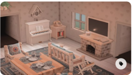
 
Essentially, that room in my house doesn't start until after the first two doors. Well, I do have some shelves and things on the threshold, or what should I call it, where you enter.
I have a couch + low table on the right side and a dining table on the left side and added some accents where they fit (dresser, shelves, plants, chairs and such). I do have to keep it kind of minimalistic since that is two separate areas in one room, though. I say minimalistic, but I probably couldn't fit more stuff in there haha. It just feels minimalistic, because there are so many more things I would like to add, but the clutter would look terrible.
 
I skimmed my personal Pinterest ACNH interior inspiration board for central rooms! Putting the pics below this text so you can use them as inspo :) Some of them are from 1.0, but they are still gorgeous!

Screen Shot 2022-05-20 at 12.12.31 PM.png
Screen Shot 2022-05-20 at 12.12.42 PM.png
Screen Shot 2022-05-20 at 12.12.26 PM.png
Screen Shot 2022-05-20 at 12.12.47 PM.png
1653063357213.png
Screen Shot 2022-05-20 at 12.13.51 PM.png
Screen Shot 2022-05-20 at 12.13.26 PM.png
Screen Shot 2022-05-20 at 12.13.57 PM.png
 

Attachments

  • Screen Shot 2022-05-20 at 12.13.42 PM.png
    Screen Shot 2022-05-20 at 12.13.42 PM.png
    254.5 KB · Views: 175
Last edited:
I skimmed my personal Pinterest ACNH interior inspiration board for central rooms! Putting the pics below this text so you can use them as inspo :) Some of them are from 1.0, but they are still gorgeous!

View attachment 442122View attachment 442123View attachment 442121View attachment 442124View attachment 442127View attachment 442128View attachment 442125View attachment 442129
What are the stairs used in 4th and last pic, please? Love them! How did you get the sort of mini higher level of floor that the stairs join to? Thank you!
 
Essentially, that room in my house doesn't start until after the first two doors. Well, I do have some shelves and things on the threshold, or what should I call it, where you enter.
I have a couch + low table on the right side and a dining table on the left side and added some accents where they fit (dresser, shelves, plants, chairs and such). I do have to keep it kind of minimalistic since that is two separate areas in one room, though. I say minimalistic, but I probably couldn't fit more stuff in there haha. It just feels minimalistic, because there are so many more things I would like to add, but the clutter would look terrible.
Leaving a empty-ish space at the front sounds good! I'm more used to work with rectangular spaces than square ones, so I think that could work, thanks! ^^

I skimmed my personal Pinterest ACNH interior inspiration board for central rooms! Putting the pics below this text so you can use them as inspo :) Some of them are from 1.0, but they are still gorgeous!
These rooms are so pretty, thanks you! Definitely stealing a few ideas from the 2nd and 7th ones :'p

What are the stairs used in 4th and last pic, please? Love them! How did you get the sort of mini higher level of floor that the stairs join to? Thank you!
The stairs are a custom design! I don't remember the exact menu name, but if you select a non-pro design it should let you display it on the floor ^^ I don't have that pattern in hand, but it was super popular when the game came out, I'm sure it will be easy to google.
 
I had this exact same problem, if I’m being honest. The rooms on the left, right, and back didn’t help. I’ve seen a few people just block off the rooms and act like they don’t exist. If you use large items such as the kitchen island, that will cover them. If anything else, the simple panel can act as a closed (or even an open) door if you want it to.
 
I'm probably a minority here, but I actually looove the center room! The fact that you "only" have those nooks and crannies makes it exciting for me. You can do so many little things with the different corners, as shown in Brookie's post, I really like that. My center room is a mix of entrance hall and kitchen, but I wanna give it a makeover soon and might turn it into a lounge/workspace or something. :blush:
 
It helps to think about how you want foot traffic to flow. If you brought friends (not villagers as they meander) to your house, where do you want to lead them to first.
FTR5XGAUUAErSe7

unknown.png
So my first layout was A (an upside down T). I made the back room, a secret room and the flow to that area was more obstructed.

Then I changed to layout B because I wanted it to be more open and have little areas for players to investigate. You can see the shape becomes a bit more chaotic.
 
Last edited:
My first floor has the Keroppi wall and floor as well as the carpet. I have a row of two tables to display the Keroppi clothes with a two spaces for the two shirts. On the walls, my goal is to have posters of all the villagers who have ever lived on my island and in the order that they moved in. I have one wall full of posters and half of the adjacent wall. Since I do have in mind what I would like my final villagers to be and because there's plenty of space, I'm looking for villagers who have been in my towns in prior versions.
 
I had this exact same problem, if I’m being honest. The rooms on the left, right, and back didn’t help. I’ve seen a few people just block off the rooms and act like they don’t exist. If you use large items such as the kitchen island, that will cover them. If anything else, the simple panel can act as a closed (or even an open) door if you want it to.
Yeah I think I have seen people using simple panels to cover half or so of the doors. It looks cute, I think it could work for the back room at least

I'm probably a minority here, but I actually looove the center room! The fact that you "only" have those nooks and crannies makes it exciting for me. You can do so many little things with the different corners, as shown in Brookie's post, I really like that. My center room is a mix of entrance hall and kitchen, but I wanna give it a makeover soon and might turn it into a lounge/workspace or something. :blush:
If you could add different doors to these rooms like in HHD I would like it much more actually.... But the huge black void doesn't look good to me and kind of feels like a waste of space 😔😔 Dunno if they brought back that feature on HHP since I don't have the DLC, but I wish they let you do it on your own home too.

It helps to think about how you want foot traffic to flow. If you brought friends (not villagers as they meander) to your house, where do you want to lead them to first.
FTR5XGAUUAErSe7

So my first layout was A (an upside down T). I made the back room, a secret room and the flow to that area was more obstructed.

Then I changed to layout B because I wanted it to be more open and have little areas for players to investigate. You can see the shape becomes a bit more chaotic.
The images don't display 💔💔 But I have seen the kind of secret rooms very often during ACNL! All my rooms are disconnected from eachother so I don't really have any order; but I think layout B would be better for me, I like things to be accessible easily.

My first floor has the Keroppi wall and floor as well as the carpet. I have a row of two tables to display the Keroppi clothes with a two spaces for the two shirts. On the walls, my goal is to have posters of all the villagers who have ever lived on my island and in the order that they moved in. I have one wall full of posters and half of the adjacent wall. Since I do have in mind what I would like my final villagers to be and because there's plenty of space, I'm looking for villagers who have been in my towns in prior versions.
I put my villager's pictures on the central room too! I'm going with pictures instead of posters because they're smaller, but I got one of the walls full already ^^ I already have my favorite villagers, so I don't think I will get any more pics, but it looks so cute.
 
The problem that has been haunting me on every game since ACWW.... after fully remodeling your house you get 3 new rooms on your main floor, the problem is that unlike the attic and basement, the doors are directly on the floor's walls, meaning you can't put furniture in front of them since 1)it looks bad in most cases 2)you can't access that room.

And because these doors, I never know how to distribute the furniture on that room! 😭😭 And it's the first thing you see when you enter the house to make matters worse... Most of the time I do a + shaped distribution, making 4 small spaces in the corners with a corridor between them so you can still access the other rooms (sometimes I put an item in the middle too), but for some reason I can't get it to work in this game...

Do anyone have ideas of other kinds of distributions? Or pics of other people's rooms (i don't care about the aesthetic), every time I look up house inspo I almost never see pics of the main rooms, just the door-less ones....
What I have done with the living room is make a kitchen–living room combo or a kitchen–dining room combo.

I did this with all four humans’s houses on my first island, Óhana, and you can check it out at the following Dream Address: 2180–2897–5991.
 
I am collecting a few photos. I am placing the photos of the octopus villagers in my kitchen/dining room which is the left room. On the second floor, I'm going to display the photos of my dreamies.
 
I know this isnt much and not all that fancy like those ones you see on pinterest and instagram but hopefully it can help serve as maybe a little inspo [even if it's alittle niche]? Despite the area not being /fully/ complete [i still wanna add little things here or there] i'm overall pretty content with it!
2022052220512700-02CB906EA538A35643C1E1484C4B947D.jpg
 
I know this isnt much and not all that fancy like those ones you see on pinterest and instagram but hopefully it can help serve as maybe a little inspo [even if it's alittle niche]? Despite the area not being /fully/ complete [i still wanna add little things here or there] i'm overall pretty content with it!View attachment 442334
This is gorgeous and totally on the same level as the ones I posted!~ Just a different theme :) Which is helpful because mine were all elegant/modern/chic. I love the table in the middle
 
This is gorgeous and totally on the same level as the ones I posted!~ Just a different theme :) Which is helpful because mine were all elegant/modern/chic. I love the table in the middle
Eee thank you so much 😭💜 it took me so long to get it looking put together.
 
I recently redid my main room to make it more spacious. I've always done a kitchen + dining/living combo but I was inspired to make the kitchen its own room after the update items and clear some space up in my main room. I use the ㅗish layout that most people use, meaning there's a ㅗ open walkway to all the doors. In my newest version I split the back space into a living space and a reading nook, while the wall closest to the entrance has no obstructive views. I posted more photos in my journal entry, here.

387b0cdb-23a6-488f-9b76-25d02a485a6c-jpeg.442692


and this was before when I had my kitchen:

0be84f85-0a26-4677-ae4d-e5bc16acf8b0-jpeg.442697

Another idea you can use to add an extra space to one of your walls, is add a simple panel covering one side of the open door, like in @Brookie post. You can use a door design but I like to use the wood slate simple panel design that it comes with. That way you can use it as a "fake wall" and put stuff in front of it, like a plant or a small cupboard, etc. Another idea is to use the small wood partition or the tension pole shelf item to cover one side of the door. In my experience designing rooms, it tends to look a lot more "natural" if your composition is asymmetrical rather than trying to fit perfectly fitted items in every corner, or perfectly in the centre. So if one side looks "heavier" than the other, it might look more natural.
 
Last edited:
I recently redid my main room to make it more spacious. I've always done a kitchen + dining/living combo but I was inspired to make the kitchen its own room after the update items and clear some space up in my main room. I use the ㅗish layout that most people use, meaning there's a ㅗ open walkway to all the doors. In my newest version I split the back space into a living space and a reading nook, while the wall closest to the entrance has no obstructive views. I posted more photos in my journal entry, here.


and this was before when I had my kitchen:


Another idea you can use to add an extra space to one of your walls, is add a simple panel covering one side of the open door, like in @Brookie post. You can use a door design but I like to use the wood slate simple panel design that it comes with. That way you can use it as a "fake wall" and put stuff in front of it, like a plant or a small cupboard, etc. Another idea is to use the small wood partition or the tension pole shelf item to cover one side of the door. In my experience designing rooms, it tends to look a lot more "natural" if your composition is asymmetrical rather than trying to fit perfectly fitted items in every corner, or perfectly in the centre. So if one side looks "heavier" than the other, it might look more natural.
OH wow, I never thought to have the kitchen in the same space as the living room. That's something to consider. The way you have everything set up looks delightfully homey.
 
This is my central room, I tried to match the blue rose wallpaper and I mainly use black, white, and blue for this area. It used to be monochrome themed before the 2.0 update. Since I love the elegant furniture set, I’ve used the rose wallpaper to match with the furniture style.
72A5DD75-1F8F-4446-A1A7-E28AD01E7462.jpeg
 
This is my central room, I tried to match the blue rose wallpaper and I mainly use black, white, and blue for this area. It used to be monochrome themed before the 2.0 update. Since I love the elegant furniture set, I’ve used the rose wallpaper to match with the furniture style.
View attachment 443055
That looks so cute!!! I am definitely stealing a few ideas from this!!!
 
Back
Top