• Guest, you're invited to help build our new TBT time capsule! It contains three parts, with some of its elements planned to open in 2029 and others not until the distant future of 2034. Get started in 2024 Community Time Capsule: Blueprints.

Island Feedback and Showcase Thread

I've finished redecorating my island this week but as I did, I found out I really have a hard time coming up with ideas for my beaches. I haven't really gone further than the usual "beach bar" idea so if anyone has some free time for a visit I'd love to hear some tips what I can do with these areas, mainly the left & right side beaches.

Also, for the main island I might have gone a bit overboard with items (some areas are getting so laggy :/), so any feedback if you want to trim down some areas or make them easier to walk through will also be helpful 💚

content.jpeg
 
The entrance is simple and pretty. I love it. The Japanese area is nice and I like the forced perspective of the lighthouse. The signs around town are great. I'm a huge fan of custom signs. House decor has always been my favorite to design and I love seeing what others do. I loved your rooms. My only complaint is that there aren't more rooms to explore. 😄 Nice job.

Thank you so much for your feedback. Yeah I finished my house pretty early on, and apart from some small changes to the living room, it's been the same since it was done :D Thank you, I'm particularly proud of my Japanese area, and the fairy area to the right :D
Post automatically merged:

I like your island a lot for how spacious and open it is. However it does also have too much open space at the same time. There are some areas that don't seem to have anything in them. I think maybe they could benefit from putting down some flowers or custom designs.
I would also consider placing something between your trees in your orchard. I wouldnt go with something that blocks off moving between them, but maybe something like the log stakes in the middle of every 4 trees.

You also have some long empty pathways that lead to nowhere such as the left side down the river. I personally would try to form it into a route.

But don't feel your island is bland as I really liked it :)

(Disclaimer: I suck as design)

Thank you so much <3 Yeah it's quite a mixed bag as far as tightly packed and open spaces go. The area that's to the immediate left of the little seating area was mainly for in case we get a cafe/where happened to be best for rolling snowballs :'D I think if I do remodel then for my orchard I'd go for something more like my 2nd island where it's more contained and less kinda spread all over. Yeah that left pathway I wasn't sure what to do with apart from the fact it goes down near my house :'D
Post automatically merged:

@Sheep Villager
You can always reserve that spot for private yoga lessons by yours truly in my many selection of beefy-man looks. But also, it might help if you explain island theme, mood, vibe, general idea of what your island consists of.
--
@TheRevienne
So I checked out your island and the general census was that it's a little bit of everything that leans more on the cute vibe(?) because you use a lot of iron garden furniture, fountains and swing sets.
These are kind of areas I decided to focus on:
feedback_Tarasaigh.png

  1. I like the initial starting point of your entrance but then the horizon to the café/lounge area should be filled. Maybe not densely filled but I notice you like to decorate the edges and I think off-centering the furniture would help. I said play with the negative space so you don't have to clutter the area. It would help make it feel "full".
  2. Museum area is definitely the focal point on your map but I don't think you need those benches. It's just tight and you could probably get away with more flowers there or something.
  3. I liked the area circled in orange but it's kind of bumming that I dont have a ladder to explore. Maybe you could spread that kind of decorating design into your areas that feel empty. It was a really nice area from what I could see.
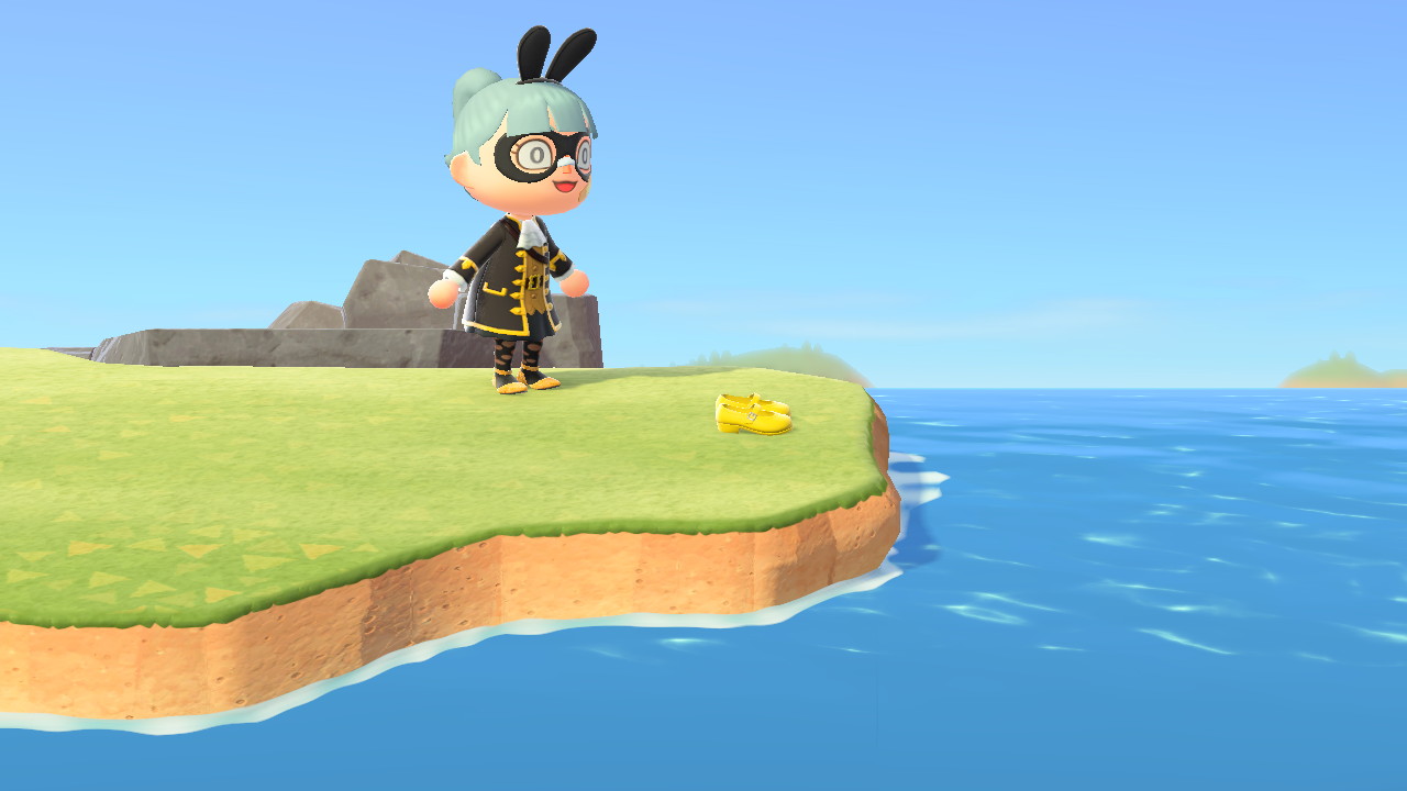
Then some tourist pictures I took for funsies.
Ex2V2xpVoAIwUhO

Who's shoes are these and what happened to the owner?
Ex2V2ymUcAIyL4x

Wow, thanks so much for the detailed feedback :D Yes, the area that's sort of like a cafe seating bit was kind of a 'I don't know what to do with this empty space'. If I do remodel then I want to have a go at doing a larger version of a seasonal clock I've done on my 2nd island with bushes and stuff :D You can actually reach that area, pretty sure it has it in in that version of the DA, but if it doesn't I'll update it today, but I put a Mario pipe at the back of the left beach, near the lighthouse which comes out in the fairy garden :D I found it a pain having to keep getting my ladder out so my lazy self made it easier :D

The shoes and that area in your touristy photos actually has a meaning, I won't go into too much detail as it could be triggering, but in Japan it's a custom to leave shoes when a particular act is done. That particular act has a lot of significance to me, since it's made a big impact on my life, but if you don't know about it, then if you google about Japan and leaving shoes behind, you'll get the meaning<3
 
Last edited:
what do you think of this?
167805778_947842932624817_8107215633794545430_n.jpg


it's my beach relaxing area *based on the part of the beach from the cardcaptors episode: the cave*


recently, i was thinking of tearing it down so i could use that spot for something else... but it's so pretty right now & it was one of my first builds...
Post automatically merged:

i just had a thought... is that gonna grow there? :unsure:
167190913_947317826010661_7360621483118937530_n.jpg
 
Last edited:
2021040115553400-02CB906EA538A35643C1E1484C4B947D.jpg

For thematic reasons I need a snowy drinking area. Does this look tacky though? Too much? Too out of season to ever work?
 
View attachment 365428
For thematic reasons I need a snowy drinking area. Does this look tacky though? Too much? Too out of season to ever work?

I personally really like the colourful versions of the frozen items compared to just the basic light blue, definately in summer with the bright colours on the island this really pops and looks fun! If it were me, I would add some christmas items to the left of that wall separating your snow bar from the rest, this can be like a gradual transition towards the ice theme (thinking about some of the big & small christmas trees in different colours to make it seem like hedges/plants and maybe that pile of presents here and there). :)
 
I personally really like the colourful versions of the frozen items compared to just the basic light blue, definately in summer with the bright colours on the island this really pops and looks fun! If it were me, I would add some christmas items to the left of that wall separating your snow bar from the rest, this can be like a gradual transition towards the ice theme (thinking about some of the big & small christmas trees in different colours to make it seem like hedges/plants and maybe that pile of presents here and there). :)
thanks for the advice!
I didnt really place in December annoyingly as the latest world of warcraft expansion had just released and I was so busy with that haha

I have now put down a thin faded layer of a snow pattern down on the other side of the wall to fade it in/out. I'll message my friend who played a lot during Dec if she has anything I can steal :)
 
I've finished redecorating my island this week but as I did, I found out I really have a hard time coming up with ideas for my beaches. I haven't really gone further than the usual "beach bar" idea so if anyone has some free time for a visit I'd love to hear some tips what I can do with these areas, mainly the left & right side beaches.

Also, for the main island I might have gone a bit overboard with items (some areas are getting so laggy :/), so any feedback if you want to trim down some areas or make them easier to walk through will also be helpful 💚

Just looking at your island now and honestly I've no tips for you. Its a lovely island and one of the better ones I've visited (not on this thread, in general)

Youre not wrong about the beaches being empty. But I've honestly never seen anyone with a beach that looks all that good so don't stress over that. I've concluded it's an impossibility :p

Best spot btw
2021040118230400-02CB906EA538A35643C1E1484C4B947D.jpg
 
Edit: All changed up and mostly fixed.
 

Attachments

  • garden.jpg
    garden.jpg
    254.6 KB · Views: 83
  • redsatinlounge.jpg
    redsatinlounge.jpg
    247 KB · Views: 76
  • transition.jpg
    transition.jpg
    240.7 KB · Views: 77
Last edited:
Just looking at your island now and honestly I've no tips for you. Its a lovely island and one of the better ones I've visited (not on this thread, in general)

Youre not wrong about the beaches being empty. But I've honestly never seen anyone with a beach that looks all that good so don't stress over that. I've concluded it's an impossibility :p

Best spot btwView attachment 365460

Glad you enjoyed it! Yeah I think it's best not to stress to hard about the beaches, maybe one day I'll come across some idea by staring way too much at those insta&youtube amazing islands, lol :d
Post automatically merged:

I think I could use some input about a certain area ...

View attachment 365461This little garden space is right across the Resident Services. While I do think it's cute, I'm considering getting rid of it because I'm not too fond of how the transition between one area to the next is working.

View attachment 365462
This is my Red Satin Lounge. While I do like the concept of it, it is still a little underwhelming. I have ordered some floor lights to go with it and I assume they will add a little something extra, but I'm generally not too attached to it as it is right now. It would probably look better if it was on a cliff, but there isn't enough space there.

My main issue is how these two areas are connected:

View attachment 365463
Left with the black roses is the garden, to the right the lounge.
There is this pathway separating them and I think it looks kind of ... random? The areas just don't really seem to go well together.
I think that though not exactly special, the garden is cuter than the lounge and "garden" is a prominent theme on my island which I would like to utilize especially around Resident Services since this is the more developed part of the island, but since I want to enjoy my villagers singing and playing some music, I want to keep some version of the lounge.

Now I'm thinking about redoing both areas without getting rid of the pathing. The garden as a whole can go, but elements of the theme should still be prominent. I could perhaps move the Red Satin lounge to the spot where the garden is now, but then I wouldn't know what to do with the other space. Furthermore, I think the lounge could deffinitely use some improvement, it is pretty bland right now.
Colors I want to use are mostly balck and of course red for the lounge.

Edit: This might make it more difficult, but I would prefer to not use any custom codes.

Personally, for the fencing around the lounge I would use something else myself, perhaps a pattern of bush-iron/stone fence or imperial fence-bush, etc. then you keep some green in there to blend with the hedges from your garden. Also maybe extending the path below the fence line?

What also might be fun is to search for those custom floor designs to have that "deck" illusion if you know what I mean and use that under your piano until the mic to create a sort of stage?

Thanks for the advice! I spent the last few hours playing around with the area and I think I managed to make it look a little more cohesive, but I'll have to wait a couple of days to fully see the result since I planted new shrubs.
You were absolutely right about the fencing of the lounge, it didn't work the way it was. I have now mixed the spooky fence with the hedge.
 
@Sheep Villager
You can always reserve that spot for private yoga lessons by yours truly in my many selection of beefy-man looks. But also, it might help if you explain island theme, mood, vibe, general idea of what your island consists of.

So you're telling me to invest in putting barbed wire around my peninsula to prevent a muscle yoga invasion? 🤔

Honestly my island is divided in to a lot of sections right now and the peninsula sits just outside any of my dedicated themed areas. I'm interested in seeing how people utilize the small space on it more than getting theme ideas. I just can't seem to make anything work due to how cramped it is.

Also sorry for the massive delay on this response, turns out the notification for your reply got lost in the sea of other notifs.
 
I guess I'll dust off this thread.

People with this peninsula shape, what have you done with yours? I'm at a total loss and can't seem to do anything with it due to how narrow it is. I have a different spot for my lighthouse so I don't want to do that. It barely fits on there anyway.

IFBHdP8.png


Ignore the tiny bit of terraforming on there, that was my last attempt which ended up with me more or less barricading the entire thing off out of frustration.​
I did this
2021040619490300-02CB906EA538A35643C1E1484C4B947D.jpg

Its nothing fancy but I found the best way for my island was to not overly draw attention to it
 
I’m looking for some suggestions of how to improve this area.

F57B9F2A-BC76-43BC-9EB9-1777E166DF6D.jpeg


E2A283A3-2098-4E3E-96AE-C4C7765650A9.jpeg


Originally this was based on Herald’s Rest from Dragon Age Inquisition, but I later changed it to be based on Partys Bar in One Piece. You can find some of its pictures here.

I’m happy with what I have but looking at some bar designs on twitter made me realize it could be better. And then there is the large empty space (i do need some space to walk through but I’d like to make it more filled up too).

Any suggestions or feedback would be much appreciated :).
 
I’m looking for some suggestions of how to improve this area.

View attachment 365724

View attachment 365725

Originally this was based on Herald’s Rest from Dragon Age Inquisition, but I later changed it to be based on Partys Bar in One Piece. You can find some of its pictures here.

I’m happy with what I have but looking at some bar designs on twitter made me realize it could be better. And then there is the large empty space (i do need some space to walk through but I’d like to make it more filled up too).

Any suggestions or feedback would be much appreciated :).

If you wanted to fill out the empty space while keeping it walk-able you could make some transparent scattered coin designs and put them at random spots on the ground since you have the treasure chests around. It would "fill" it a tiny bit. I also think you could fit in a single small table with one chair in the empty space on the lower half of the area. Kind of like a single seating area?

I don't know much about One piece but another idea to make it more lively could be to populate it with displayed clothes. For example, putting a fake bartender behind the counter. If the place in One Piece has a dedicated Bar tending character you could try to find or make a QR of their outfit to display.

The last thing that springs to mind is that the area could benefit from using fences at the edges to separate it from the grass. That would help define the area a tiny bit more and also make it feel less open (and thus less empty).​

Thank you so much for taking the time to reply! I’ll try your suggestions out. :) Good suggestions!
 
I’m looking for some suggestions of how to improve this area.

View attachment 365724

View attachment 365725

Originally this was based on Herald’s Rest from Dragon Age Inquisition, but I later changed it to be based on Partys Bar in One Piece. You can find some of its pictures here.

I’m happy with what I have but looking at some bar designs on twitter made me realize it could be better. And then there is the large empty space (i do need some space to walk through but I’d like to make it more filled up too).

Any suggestions or feedback would be much appreciated :).
Hi, I went and saw some pictures online to get some ideas about how the bar looks. From what I’m seeing the outside of the bar has some fencing across and I see a lot of windmills. I think it would look nice to add a fencing on the border. Maybe barbed wire fence. I would also place a silo in the area surrounding it to resemble a windmill. I noticed on the outside of the bar, there is a life ring on the entrance, I suggest maybe placing one there as well. On top of a stall would look nice I think.

Also to fill in some empty spaces, maybe add another table on the top corner. A good alternative to the mush table is the tea table. It looks great with the mush table, but based on the online pictures, if you’re going for accuracy, I think the tea table looks the most similar to the one at party’s bar.


Sometime when I want to fill space, I also move the stools or chairs I separate them or turn them around just to make it look more messy, or scattered.

It’s looking great so far, love your theme!

Thank you so much for the feedback and taking the time to look at other pictures.

Here are some more pictures. I did want to include more some silos but I have limited spacing. I will see if I can make some more adjustments though since I’d like to have more. :)

4BA65637-5D18-4A86-9A6C-5A30C0BBF132.jpeg


383276F9-A626-4467-8660-8C6A61E5B9D9.jpeg


Great suggestions! I’ll give these a try as well. I actually wasn’t trying for a 100% accurate depiction since when I had done it for the dragon age tavern, i found it quite boring. I didn’t even think of using the tea tables (forgot about them); thanks so much! Those might actually look better. 🙂
 
Dream Address: 6423-1687-6786

I just updated my dream address today if anyone's interested in taking a look. I'm open to suggestions for any part of my island and let me know if I've let my island get too crowded with items & laggy.

One part of my island is still not decorated around Elliott's house. If anyone has any ideas what I should put there or maybe a theme. I've put a bunch of random items to fill the space but it's basically just a mess. I also finally just updated Elliott's tent to a house but I've only decorated one room so far, and now I'm stuck on ideas for the other rooms. The whole area there on the 3rd level has left me uninspired so maybe one of you guys will have an idea.

I circled the area on the map.
IMG_20210402_174109~2.jpg

IMG_20210402_174103.jpg

IMG_20210402_174106.jpg
 
Dream Address: 6423-1687-6786

I just updated my dream address today if anyone's interested in taking a look. I'm open to suggestions for any part of my island and let me know if I've let my island get too crowded with items & laggy.

One part of my island is still not decorated around Elliott's house. If anyone has any ideas what I should put there or maybe a theme. I've put a bunch of random items to fill the space but it's basically just a mess. I also finally just updated Elliott's tent to a house but I've only decorated one room so far, and now I'm stuck on ideas for the other rooms. The whole area there on the 3rd level has left me uninspired so maybe one of you guys will have an idea.

I circled the area on the map.

Hi! I’m not sure how helpful I’ll be since I’m not very good at expressing myself and am stumped on ideas for myself, but I want to try to give you some ideas you can consider anyways.

Since you have a lot of leisurely areas along with some work areas too, have you considered maybe making it centered on more entertainment or some type of business or market place? Maybe a fish market to go with the fishing area below? Though since you already have the main room decorated, Idk if you’d want to start your room decoration by scratch or move the bedroom to upstairs. I am not sure how well the entertainment idea would go with your theme to be honest, but just threw it out there if you want something very different. I’ll post again or edit if I can think of any more suggestions and something better. I still love what you have ☺️ and the relaxing vibe. Good to see Gaston and all my favorite bunnies are doing well as well as your other cute villagers ☺️.

Sorry I’m not really good at designing or giving critique myself 😅.
 
Back
Top