You are using an out of date browser. It may not display this or other websites correctly.
You should upgrade or use an alternative browser.
You should upgrade or use an alternative browser.
Post Your Town Map
- Thread starter fink
- Start date
Carina
Senior Member
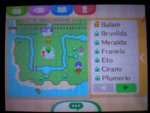
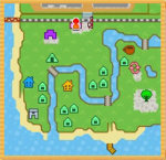
Wow, our maps are nearly identical!
Wow, our maps are nearly identical!
Whoa that is like map d?j? Vu!!!
I love that both if you took the same map but made it different!
Balam Ajaw
Senior Member
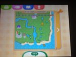
Wow, our maps are nearly identical!
Wow, nice! I love when the Plaza is in the center of the town
mayorclara
20↑ she/her
Had some issues with uploading it here so i'll just use tiny pic, so here it is;
http://tinypic.com/view.php?pic=2zgzri9&s=8
(My apologies for the not so smooth quality of the image!)
I am quite fond of it, and I only had to reset once to get it so that's a plus.
I have pears as native fruits, although I wish I had either peaches or cherries, but I don't really mind that much anymore.
There is also quite a big private beach (where Gulliver somehow always ends up, he must like the quietness of the private beach lol) and when you arrive at the beach after grabbing some golden stags (not really, probably just one because you know, they aren't easy to catch) then you can go straight towards Re-Tail, which is awesome, and a main goal I was looking for when choosing my Layout.
Another feature of my layout I really like is the fact that the town plaza is right in the middle, which just seems logical to me.
So all in all, I am really fond of my layout!
shannenenen
grilled cheese expert
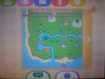
Finally got all my dreamies plot reset into my town and this is my layout ^-^ I wish Wolfgang and Pecan were up by the river, but then again, I think it would start to feel too crowded if they were. I'm in love with this layout! I just wish I didn't have oranges for my native fruit- they're my least favorite in game and irl!
Red Cat
On-and-off member
View attachment 137204
I just resettled my townI love resetting. I promise I'm keeping this one! or not...
Villagers: Opal, Boomer, Freckles, Bettina, Antonio
Moving In: Knox
Mayor Tara of Blossom
I don't see what's so special about that one. Re-Tail, the town hall, and the plaza are far away from everything else, there are a ton of ponds taking up space, and the beach access points are right next to each other which is inconvenient. Maybe there is something about it you really like, but if you've been resetting for maps, I think you can do much better.
yoshiskye1
➸just have fun okay➸
I don't see what's so special about that one. Re-Tail, the town hall, and the plaza are far away from everything else, there are a ton of ponds taking up space, and the beach access points are right next to each other which is inconvenient. Maybe there is something about it you really like, but if you've been resetting for maps, I think you can do much better.
if it works for her, it works for her.
I personally like the map. Retail, the square and the town hall make a cute lil plaza, stuff is nicely spread out and plenty of space for landscaping and PWPs. Plus i'm a sucker for south facing waterfalls just.... so nice
Red Cat
On-and-off member
That is almost my dream map. I love how you can almost run a straight path down from the train station through the plaza and all the way to the dock. The only thing that kills it for me is that pond by the town hall; that thing is really in the way.
So i've been resetting for the perfect map and I dont know about this one...It has one my dreamies ankha and the river layout is good but...I dont like how the mayor and plaza is spread out from retail it also has pears as native fruit (I hate pears!) :/


Orieii
MHA fanatic and collector (*•̀ᴗ•́*)و ̑̑✧
Whaa?? I think her map is PERFECTION ^ U ^)b I especially love how Retail, Town Hall and Plaza are all in the same location <3 I see true potential from your map! I hope you decide to keep itI don't see what's so special about that one. Re-Tail, the town hall, and the plaza are far away from everything else, there are a ton of ponds taking up space, and the beach access points are right next to each other which is inconvenient. Maybe there is something about it you really like, but if you've been resetting for maps, I think you can do much better.
- - - Post Merge - - -
Your map is soooo cute > U <)b I think you got a winner!View attachment 137204
I just resettled my townI love resetting. I promise I'm keeping this one! or not...
Villagers: Opal, Boomer, Freckles, Bettina, Antonio
Moving In: Knox
Mayor Tara of Blossom
That is almost my dream map. I love how you can almost run a straight path down from the train station through the plaza and all the way to the dock. The only thing that kills it for me is that pond by the town hall; that thing is really in the way.
I pretty much do have a parh from the trai station to the town hall. But then a path also goes past police station and retail down towards the cafe and joins the second ramp to the beach.
I actually donw mind that pond by the town hall to be honest. Im just doing some major landscaping at the moment. Lol. And oh really want Benedict Rodney and Jay to move out. Urg.
But this was my first town map that i saw a liked!
What do you guys think of mine? c:

im srsly addicted to resetting because I just think that "I can do so much better than this!" after looking at other people's maps, but I'm scared I won't find a better one and I'll just regret ever deleting the current one. I need assurance omg and I need ideas on where I could put pwps ;-;

im srsly addicted to resetting because I just think that "I can do so much better than this!" after looking at other people's maps, but I'm scared I won't find a better one and I'll just regret ever deleting the current one. I need assurance omg and I need ideas on where I could put pwps ;-;
Red Cat
On-and-off member
What do you guys think of mine? c:

im srsly addicted to resetting because I just think that "I can do so much better than this!" after looking at other people's maps, but I'm scared I won't find a better one and I'll just regret ever deleting the current one. I need assurance omg and I need ideas on where I could put pwps ;-;
I'd keep resetting. All of the structures are scattered in different corners of your town which is inconvenient. Three ponds is a lot and they take up a lot of space, so unless you really like ponds, that's another negative. If you really like the layout and think it is a good one to work with, then keep it, but I'm just pointing out some reasons that you may want to move on from that map.
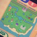
ok so i love everything pretty much about my town apart from the map
my permanent residents are in decent places (dotted in blue, i also don't plot reset), and there's always time to move my other 3 out (dotted in red), but the campsite is one space up from my house and it's really frustrating. i think it looks really ugly on the map?? it looks alright when you're standing near it bc of my paths but the map looks so bad to me that i'm tempted to reset... i wish i never even built the campsite .-.
i have a crap tonne of ponds too, which doesn't bother me at all. i think they help my paths look more structured but at the same time makes the map look extremely cramped and messy. my favourite pond is the one by the train station, and my least favourite is the one by the town hall. sometimes the ponds can ruin the structure of my paths too, making them look really strange sometimes. the most annoying thing is the top half of the map; there's literally only one space for villagers to go there and it makes the bottom half of the map look really terrible...
also the two houses (dotted in yellowy-green) are like a space apart. like the house on the left is one space up from the one on the right, which is annoying to look at on the map. i hate how most of my villagers are so close to me and close together. the house, dotted in white, actually makes the campsite less noticeable but it's far too close to my house for my liking and it's also a villager i dislike...
idk what to do about my map, idk how to make myself feel better about it but i literally cannot reset. i try and bring myself to but i can't ruin all my achievements and idk i'm kinda proud of the progress i've made?? i just don't know how to think positively about it. maybe that the top of the campsite icon is in line with the top of my house ? ? idk

Similar threads
- Replies
- 4
- Views
- 394
- Replies
- 2
- Views
- 507
- Replies
- 19
- Views
- 3K
