You are using an out of date browser. It may not display this or other websites correctly.
You should upgrade or use an alternative browser.
You should upgrade or use an alternative browser.
Screenshots & Video Capture Share Hub for Animal Crossing: New Horizons
- Thread starter Justin
- Start date
ahh i can't, im dead, stop it.
i love your first room! its like viewing a secret movie in a secret alley. totally vibing it
for your mothra and godzilla room, maybe add campfires to depict that devastating destruction they've caused
as for your sea room, it needs more work but i cant pinpoint what exactly.
i'll try a campfire. ty
omg... the first room is incredible.
only feedback i have is maybe trying to design the monster/server room to be see from the thinner side? that way you could have more depth in the frame to place the servers more like a city
not sure how to make it thinner. i'll try to remove some servers to see how it looks or turn em.ty
The dressing room is my favourite! it hits the vibe so well (which floor did you use there?). My only real criticism, and even then, it's 50/50, is that the first photo is a bit too symmetric. It works, but half the time I'm thinking of the vibe it's hitting, the other half I'm thinking about how it's so symmetric
It could be intentional though and still works super well!
ill try staggering the photos. ty
not sure how to make it thinner. i'll try to remove some servers to see how it looks or turn em.ty
o i meant place the director/camera on one of the shorter walls (left or right side if you're looking at your screenshot) and have the set facing that direction, it would give you more depth in the shot.
"ill try staggering the photos. ty" (because I don't know how to quote)
Oh no the photos being entered are fine! Meant more just the lamp posts and cameras and the black screen behind the bench (maybe if there was a 1 square wide thing behind the bench would be cool).
(so what's the tea on the dressing room floor )
)
Oh no the photos being entered are fine! Meant more just the lamp posts and cameras and the black screen behind the bench (maybe if there was a 1 square wide thing behind the bench would be cool).
(so what's the tea on the dressing room floor
o i meant place the director/camera on one of the shorter walls (left or right side if you're looking at your screenshot) and have the set facing that direction, it would give you more depth in the shot.
oh i could try that. i'll remove a couple of servers on the left side and see how it looks. ty.
Post automatically merged:
"ill try staggering the photos. ty" (because I don't know how to quote)
Oh no the photos being entered are fine! Meant more just the lamp posts and cameras and the black screen behind the bench (maybe if there was a 1 square wide thing behind the bench would be cool).
(so what's the tea on the dressing room floor)
i think the black screen is the door the backroom but not entirely sure. I'll probably move the bench a tile to the left to not have it line up with the crosswalk.
HappyTails
I'm Happy Being Myself!
For real, the struggles are real.
Nunnafinga
Senior Member

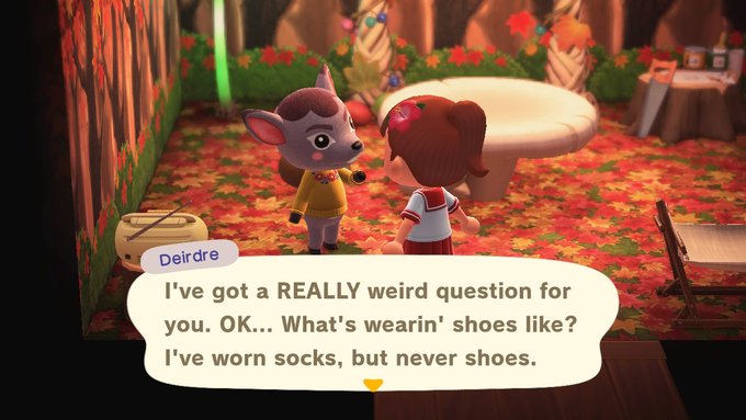
Who needs shoes when you've got hooves.


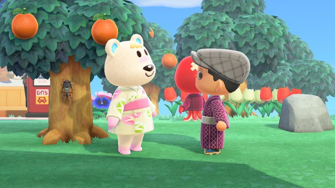
My Able Sisters had a ton of kimonos for sale the other day.
HappyTails
I'm Happy Being Myself!
Even though I have a perfectly good museum right there, I'm just going to let these bugs and fish sit outside. Enjoying their last bit of outside life before they are unceremoniously shoved into the museum.


HappyTails
I'm Happy Being Myself!
Present: Don't mind me, I'm just floating by....
Hanif1807
Caeli 4.0 coming soon
Moved the playground area from the front of the Museum to behind the Campsite. I tried putting up another popcorn machine but Dotty just didn't wanna get out from the place where i wanted it to put to lol

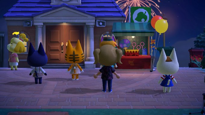
The new bridge ceremony with fireworks were a real treat

Added two new custom fireworks for yesterday's fireworks show; Tornado logo and Dotty's face because she asked me to lol
The new bridge ceremony with fireworks were a real treat
Added two new custom fireworks for yesterday's fireworks show; Tornado logo and Dotty's face because she asked me to lol
Dwayne Johnson
Don't look back in anger
its been a very long time since ive posted in here, think im gonna start getting active again

poor raymond still getting bullied while I was away

gave him some confidence though
poor raymond still getting bullied while I was away
gave him some confidence though
Nunnafinga
Senior Member

Cats like sparkly things.

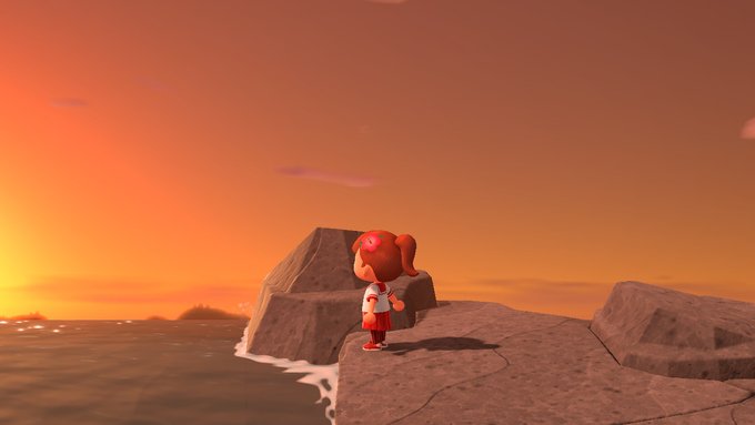
I am a sunset.
This is so creative! I've seen movie theatre and stage theatre rooms but haven't seen an entire movie studio house yet. Love the monster battle action film set one lol and the idea of using villager photos as headshots in the agents office 
Katzenjammer
♫Cat that Jams♫
This comment is a bit late, but I just wanted to say, WOW! These are so great and creative and fun and clever! Thanks for sharing! =^.^=
CrestFallen
Coco Enthusiast
This is actually really really cool! There’s so much effort put in  my only criticism is maybe change the color of the Godzilla moster statue from red to black. Honestly though this is super cool!
This is actually really really cool! There’s so much effort put inmy only criticism is maybe change the color of the Godzilla moster statue from red to black. Honestly though this is super cool!
Ill change it to black and try it out
Similar threads
- Replies
- 35
- Views
- 4K
- Replies
- 123
- Views
- 7K
- Replies
- 2
- Views
- 158
- Replies
- 4
- Views
- 7K