You are using an out of date browser. It may not display this or other websites correctly.
You should upgrade or use an alternative browser.
You should upgrade or use an alternative browser.
shellbell's jpg inventory
- Thread starter shellbell
- Start date


your local goomy
goom?


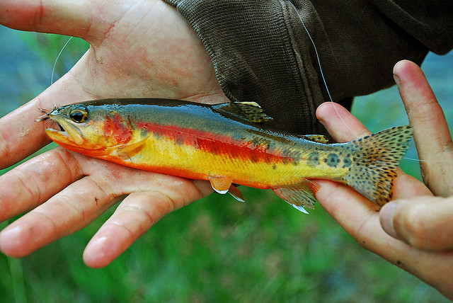
You're very talented! I especially LOVE that golden trout!!!
shellbell
Shell from Bell


Thank you! I couldn't get the reflection and texture quite the way I wanted but it'll do for now.You're very talented! I especially LOVE that golden trout!!!
I don't have much experience painting anythingIkr? I was gonna ask if @shellbell has experience painting fish and bugs.
 Thinking back my track record is I usually only draw once every couple years or so, so I'm not that experienced... Camp Bell Tree has ignited something
- Joined
- May 27, 2017
- Posts
- 3,855
- Bells
- 4,853
- Love Tokens
- 0
- Cupid Coins
- 0
- Heart Dust
- 0
- Island
- TeeheeTiki


Ah, it's interesting how you say you don't have much experience with painting. After I saw your snail, I thought you had more influence of the traditional arts because of the style.
Your fish and bug pieces remind me of a mixture of traditional painting and color pencils.
Your snail was my favorite piece and I love snails, so a bit of bias there. The only critique for your trout, he is looking more on the dry side.
I hope this help a little bit. I'm not great at teaching.
Your fish and bug pieces remind me of a mixture of traditional painting and color pencils.
Your snail was my favorite piece and I love snails, so a bit of bias there. The only critique for your trout, he is looking more on the dry side.
I don't do many still life's and realistic works. I'm more stylized but I'll try to help!

In this example, notice how the highlight is sharper and crisper. You have to use white sparingly to have an impact. Like on your snail, you have a high impact shine on their shell and then you used white as a texture to highlight its.. neck foot, lol.
Then this example, its reflective light is blue. The one above is more subtle which makes hard to see. It's got a more lilac hue. (I will say when you take a photo reference, the image is flattened unless it's some HQ photo you see in NatGeo. Whether you're a hobbyist or professional, exaggerating the image is key) So in this case, I'd use blue as a reflective light since it helps create form.
Also I don't know what program you use, but in Photoshop, blending modes are super beneficial. You'll be playing with opacity too.
If you want to get a bit cheatsy, you can add a small drop shadow to help pop your image out. It's all about the balance of light and dark values.
shellbell
Shell from Bell
he is looking more on the dry side.
Those were my thought too LOLYou have to use white sparingly to have an impact.
I've only ever sketched before, and honestly it's been a while, like, 2009 wow where did the time go. So you're right! I only know the basics of doing things technically in the traditional sense.Ah, it's interesting how you say you don't have much experience with painting. After I saw your snail, I thought you had more influence of the traditional arts because of the style.
I just picked up procreate for the camp, I'm not extremely familiar with all the tools and layer filters or whatnot. There's so much to learn!Also I don't know what program you use, but in Photoshop, blending modes are super beneficial. You'll be playing with opacity too.
Thank you for the tips! I'll definitely be playing around in the program and see if I eventually develop a style.
Also I loved all the graphics you made for the camp! esp. the melon themed stampbook

shellbell
Shell from Bell
I guess this is turning into a dump thread. Critique and tips are welcome. Still not that used to using programs or posting what I drew

I sketched these to try out a more anime-influenced style, I couldn’t quite capture the right feeling of @Mistreil 's OC…
So then I did this:

I sketched these to try out a more anime-influenced style, I couldn’t quite capture the right feeling of @Mistreil 's OC…
So then I did this:
aside from the obvious clean up on lines. I think the sweater it self needs less hard wrinkles, a sweatshirt is usually pretty thick and plush, it doesn’t create as deep wrinkles as something thinner, like a t-shirt. This kinda looks like a tshirt. Also there’s not enough tension on the elbows, looks as if the sleeves are floating over arm.
- Softer shading on fabric
- Less wrinkles potentially?
- Add thickness to the collar (forgot about that :/)
- Add slight bulges around seams
- tighter pulling force on forarms
Used this little guy as a place holder cause I’ve never ever drawn flowers before in my life lol

Some notes on why I didn’t think the first image worked

also i was very confused by the properties of that shirt - material, reflectiveness, thickness, structure, fit. like, what is it??
Some notes on why I didn’t think the first image worked
also i was very confused by the properties of that shirt - material, reflectiveness, thickness, structure, fit. like, what is it??
Last edited:


im gonna be looking at this all day (and thanking you a third time because bless you -- youre amazing) ♥♥♥
i love your notes on the first image (especially "a child?" but all of them. that one in particular speaks to me)!!
i dont have any critiques to offer, but in regards to your clothing folds analysis: this tutorial is pretty handy, if you havent seen it yet!
i love your notes on the first image (especially "a child?" but all of them. that one in particular speaks to me)!!
i dont have any critiques to offer, but in regards to your clothing folds analysis: this tutorial is pretty handy, if you havent seen it yet!
shellbell
Shell from Bell
XDim gonna be looking at this all day (and thanking you a third time because bless you -- youre amazing) ♥♥♥
i love your notes on the first image (especially "a child?" but all of them. that one in particular speaks to me)!!
You say "boy" a lot but the age was ambiguous to me
oo thank you! I haven't see that particular tutorial but it feels good when my thoughts are kinda validated by iti dont have any critiques to offer, but in regards to your clothing folds analysis: this tutorial is pretty handy, if you havent seen it yet!
shellbell
Shell from Bell
did a quick portrait of Asa Butterfield to play around with blending layers and masks. Can I just say wowow! things get done way faster this way.
not bad for a $10 app. very impressed with you procreate

why Asa Butterfield?
because I came across a pic of him when I was researching cute dudes for drawing Mistreil's OC... just look at that face! isn't he adorable??
not bad for a $10 app. very impressed with you procreate
why Asa Butterfield?
because I came across a pic of him when I was researching cute dudes for drawing Mistreil's OC... just look at that face! isn't he adorable??
shellbell
Shell from Bell
@droqen asked me to make a cover image for a game he's making.

Character is traversing a desert
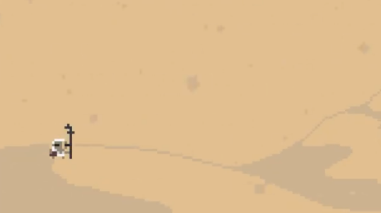
There will be a tent (not pictured)
Wearing a brown mask, a white hooded robe or something, brown gloves/boots/shoes/wraps to protect them from the sandstorm that is constantly blowing
They are carrying this big stupid black staff for some reason? I don’t know why. It is a bit wonky, not perfectly straight.

In their off hand they are carrying a small bag.

Character traits - I guess just… focused? Almost professional, or religious? They have a singular task. Hopeless, but dedicated. Also they’re all covered up anyway. PREPARED.
My pixel art is roughly just based off Rey from SW7
GOAL:
One piece of art I can use for ‘cover art’ for this game.
Should convey loneliness, or being overwhelmed by the desert. Maybe triumph of trying to overcome the desert?
A long journey lies ahead.
There will be a tent (not pictured)
Wearing a brown mask, a white hooded robe or something, brown gloves/boots/shoes/wraps to protect them from the sandstorm that is constantly blowing
They are carrying this big stupid black staff for some reason? I don’t know why. It is a bit wonky, not perfectly straight.
In their off hand they are carrying a small bag.
Character traits - I guess just… focused? Almost professional, or religious? They have a singular task. Hopeless, but dedicated. Also they’re all covered up anyway. PREPARED.
My pixel art is roughly just based off Rey from SW7
GOAL:
One piece of art I can use for ‘cover art’ for this game.
Should convey loneliness, or being overwhelmed by the desert. Maybe triumph of trying to overcome the desert?
A long journey lies ahead.
I wanted to achieve the sense of perseverance through a desolate climate (harsh sun, visibility is low, sand bits blowing constantly)
so I chose a formless person heading towards an incoming sandstorm while you can hardly see the destination/the destination is swallowed by the storm. WHY MUST THEY GO?? idk. but go they shall
Colour palette is mild and doesn't go all over the place in hues. Warm tones, cause... it's a desert and it's probs hot eh?
Value is narrow to give more emphasis on low visibility
Overall looks so blah
...but I suppose that's what deserts are :/
shellbell
Shell from Bell
Finished Asa Butterfield
I'm still surprised how quickly the process can go by utilizing blending layers, masks and other digital only tools

Here is something I did the first time and only other time I've used procreate... oddly enough it was exactly 1 year ago. It took quite a long time, which is probably why I quit trying to draw digitally immediately afterwards
(she's not my grandmother)

I'm still surprised how quickly the process can go by utilizing blending layers, masks and other digital only tools
Here is something I did the first time and only other time I've used procreate... oddly enough it was exactly 1 year ago. It took quite a long time, which is probably why I quit trying to draw digitally immediately afterwards
(she's not my grandmother)


Xara
15 days!! 🎂


Here is something I did the first time and only other time I've used procreate... oddly enough it was exactly 1 year ago. It took quite a long time, which is probably why I quit trying to draw digitally immediately afterwards
(she's not my grandmother)
View attachment 399863
i literally can’t get over all the detailing omg — this looks like an actual photograph of someone!! i can only imagine how long it took you to complete this, but it’s absolutely stunning!

shellbell
Shell from Bell
Thanks! I'm still learning myself on how to use digital programs so maybe you could teach me something too! You're welcomed to DM me if you'd like to talk about technical drawing skillsYour art is amazing! I’d love to see some timelapses of your artI think I could learn a lot from them!
") @shelliest_insta if you prefer instagram
@shelliest_insta if you prefer instagramThank you! I spent way too much effort on her lol ...it was all those wrinkles that was the most time consumingi literally can’t get over all the detailing omg — this looks like an actual photograph of someone!! i can only imagine how long it took you to complete this, but it’s absolutely stunning!
jadetine
✨Hi! I’m Renn💫
- Joined
- Jul 29, 2013
- Posts
- 7,754
- Bells
- 859
- Love Tokens
- 0
- Cupid Coins
- 0
- Heart Dust
- 0
- Switch
- 2676-3129-8012
- Island
- Pokki


I'm just lurking here and subscribed to your insta for the heck of it... You are hiding some serious talent! Sorry for the bazillion like-love notifications, lol.
shellbell
Shell from Bell
LOL totally fine!I'm just lurking here and subscribed to your insta for the heck of it... You are hiding some serious talent! Sorry for the bazillion like-love notifications, lol.
shellbell
Shell from Bell
I was talking to @mocha. on instagram about old/past drawings and went looking for images. I Marie Kondo'd everything away a while ago so I have limited resources to pull from, I only have documented stuff from my previous 2 sketchbooks, circa 2008-2014... the last times I drew seriously for improvement.
Anyway, I stumbled upon 3 instances where I redrew stuff and thought it would be interesting to share.


First image is from 2009. Second is probably 2012? They are 1 sketchbook apart, using the same pencils. Different scanners.
Third image is the reference. Yeah... the image was always that bad quality.
Not much actual differences here except the shading is slightly elevated. I also didn't like the model's face so I altered her >.<


The prompt was "gravity". Coloured using Crayola pencil crayons.
Also 1 Sketchbook apart. First is 2008, second is maybe 2013... which I also never bothered to actually do the colouring :/
I did a week (1hr a day, 5 days) of life drawing during 2012 and it's apparent my figures got better after that


During the holidays of 2013, the power was out all over the province so my friend challenged me to draw a thing a day till power came back. She told me to draw one of her OCs "Alexander" a horned, winged long haired cat.
My original attempt was... something... then 23 pages later (time unknown), I tried again... and not by candle light this time haha.
I particularly enjoy seeing this difference, it reminds me to study more.
BONUS:
I don't have anything from the "beginning" but I remember how I drew when I first started. I've recreated it for you all so you can laugh XD
and maybe inspire you in your art journey.

It was definitely worse than this but I don't remember how LOL
Anyway, I stumbled upon 3 instances where I redrew stuff and thought it would be interesting to share.
First image is from 2009. Second is probably 2012? They are 1 sketchbook apart, using the same pencils. Different scanners.
Third image is the reference. Yeah... the image was always that bad quality.
Not much actual differences here except the shading is slightly elevated. I also didn't like the model's face so I altered her >.<
The prompt was "gravity". Coloured using Crayola pencil crayons.
Also 1 Sketchbook apart. First is 2008, second is maybe 2013... which I also never bothered to actually do the colouring :/
I did a week (1hr a day, 5 days) of life drawing during 2012 and it's apparent my figures got better after that
During the holidays of 2013, the power was out all over the province so my friend challenged me to draw a thing a day till power came back. She told me to draw one of her OCs "Alexander" a horned, winged long haired cat.
My original attempt was... something... then 23 pages later (time unknown), I tried again... and not by candle light this time haha.
I particularly enjoy seeing this difference, it reminds me to study more.
BONUS:
I don't have anything from the "beginning" but I remember how I drew when I first started. I've recreated it for you all so you can laugh XD
and maybe inspire you in your art journey.
It was definitely worse than this but I don't remember how LOL
Dunquixote
The Duke


Your art is amazing! I just saw the one you made for Goomy’s contest and the realistic detail there and in your pieces here are just stunning!  Keep it up! Can’t wait to see more of your art
Keep it up! Can’t wait to see more of your art Similar threads
- Replies
- 2
- Views
- 473
- Replies
- 10
- Views
- 661
- Replies
- 52
- Views
- 3K