• Guest, you're invited to help build our new TBT time capsule! It contains three parts, with some of its elements planned to open in 2029 and others not until the distant future of 2034. Get started in 2024 Community Time Capsule: Blueprints.

Some of my sigs

Swancheez

Senior Member
Joined
May 25, 2007
Posts
149
Bells
1,050
Carnival Coins
0
Well, besides .moof, I did not really see many good sigs


:p

jk, a bunch of 'em were ok, but .moof's....wow.

well, w/e, here are just a few of my sigs. I hope you enjoy!


:)

siggeh.png


siggeh-1.png


Metroid.png


siggehv2.png


siggehv2-1.png


sig-2.png


I made the last one as a request for someone.

And can anyone name the band where the people in the first two sigs are from?
 
dragonflamez said:
zo i herd u liek brushz?
wrong.

the only brushes I ever use are the sparks brush and shards brush, and they are even jsut for displacing.
so no, I do not like to use brushes.

btw, I use GIMP
 
dragonflamez said:
Swancheez said:
dragonflamez said:
zo i herd u liek brushz?
wrong.

the only brushes I ever use are the sparks brush and shards brush, and they are even jsut for displacing.
so no, I do not like to use brushes.

btw, I use GIMP
This explains things.
Im lost, do you like, or no?

you make no sense to me


:p
 
Swancheez said:
dragonflamez said:
Swancheez said:
dragonflamez said:
zo i herd u liek brushz?
wrong.

the only brushes I ever use are the sparks brush and shards brush, and they are even jsut for displacing.
so no, I do not like to use brushes.

btw, I use GIMP
This explains things.
Im lost, do you like, or no?

you make no sense to me


:p
Bah, this is no fun without fish or JJ. >_>
 
dragonflamez said:
Swancheez said:
dragonflamez said:
Swancheez said:
dragonflamez said:
zo i herd u liek brushz?
wrong.

the only brushes I ever use are the sparks brush and shards brush, and they are even jsut for displacing.
so no, I do not like to use brushes.

btw, I use GIMP
This explains things.
Im lost, do you like, or no?

you make no sense to me


:p
Bah, this is no fun without fish or JJ. >_>
I actually saw JJ's stuff...he is prett amazing too, don't know about fish or w/e

would you jsut answer me?
likey?
 
Fish was a really good artist.

Liking the last three, but the first three are kinda blah... Especially the sprite one.
 
I really like the samus one for whatever reason, but yeah the others I find soso.... not bad , but not really great either.
 
The first three really aren't too great, but I like the last three as well. The Luigi one's pretty good...
 
believe me, I agree with most of ya.

first 3=crap, last 3 are some of my best...a style I made up


:)

but ya, thanks for all the comments


:)
 
dragonflamez said:
Swancheez said:
dragonflamez said:
Swancheez said:
dragonflamez said:
zo i herd u liek brushz?
wrong.

the only brushes I ever use are the sparks brush and shards brush, and they are even jsut for displacing.
so no, I do not like to use brushes.

btw, I use GIMP
This explains things.
Im lost, do you like, or no?

you make no sense to me


:p
Bah, this is no fun without fish or JJ. >_>
You rang?
 
JJRamone2 said:
dragonflamez said:
Swancheez said:
dragonflamez said:
Swancheez said:
dragonflamez said:
zo i herd u liek brushz?
wrong.

the only brushes I ever use are the sparks brush and shards brush, and they are even jsut for displacing.
so no, I do not like to use brushes.

btw, I use GIMP
This explains things.
Im lost, do you like, or no?

you make no sense to me


:p
Bah, this is no fun without fish or JJ. >_>
You rang?
well, JJ, what do you think of the sigs?
 
Im'a go real artistic on this. (I don't know how much I can help you because I use PS and you use GIMP)

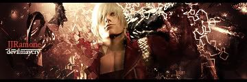
The biggest problem I'm finding is that they're are REALLY 1 dimensional, no depth at all, and that works very little of the time. Take a look at one of my newer sigs.

DMC.jpg


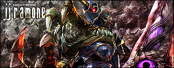
and one of my older ones:

nightmare3.png


What do you think the biggest difference is?

The older one is totally flat and has no depth. I don't know how much I can help you but try to work off that.
 
JJRamone2 said:
Im'a go real artistic on this. (I don't know how much I can help you because I use PS and you use GIMP)

The biggest problem I'm finding is that they're are REALLY 1 dimensional, no depth at all, and that works very little of the time. Take a look at one of my newer sigs.

DMC.jpg


and one of my older ones:

nightmare3.png


What do you think the biggest difference is?

The older one is totally flat and has no depth. I don't know how much I can help you but try to work off that.
you don't think the last three, or at least the mario and luigi ones have depth?
 
Back
Top