You are using an out of date browser. It may not display this or other websites correctly.
You should upgrade or use an alternative browser.
You should upgrade or use an alternative browser.
/tries again.. hopefully
- Thread starter Tyler
- Start date


Furry Sparks
Senior Member
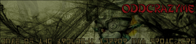
you need to start making your fonts more than a solid color, and the brown text does not match.


ƒish
Retired Staff
I'd make the height a bit bigger for something like that.
you really need to start working on text though, it should look good with it and be visible, if all else fails, just have white text with a black stroke around it, thats visible on any other color, though it won't look good on all of them.
the hylian text around the bottom is a nice touch, but it really needs to have a stroke around it for visibility.
the backcolor should be a more dirty brown, right now it's at white, which is clashing with the darker green.
your name on it should be a bit smaller, in a different color with a stroke on it for visibility, when you have text with nothing constraining it, it makes the picture look flat, which is never good. : (
you're getting better though. : D
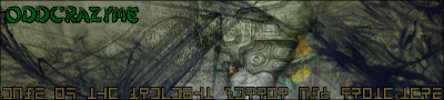
Tyler
Retired Staff

K... I'm gonna fix it now since I have a 2 hour delay and didn't know until 5 minutes before I was gonna leave for the bus stop. >_>
Okay... Not to ask a stupid question but how do you add the stroke. I'm having trouble figuring out how to. >_>
Okay... Not to ask a stupid question but how do you add the stroke. I'm having trouble figuring out how to. >_>
Grawr
Retired Staff

Now, I don't know much about Gimp...but I think he's talking about the Dodge/burn thing....OddCrazyMe said:K... I'm gonna fix it now since I have a 2 hour delay and didn't know until 5 minutes before I was gonna leave for the bus stop. >_>
Okay... Not to ask a stupid question but how do you add the stroke. I'm having trouble figuring out how to. >_>
maybe...
>_<
Furry Sparks
Senior Member
for gimp to add a stroke, duplicate the text layer, make the text black, select it` shrink it by 1-2 pix, and delete the stuff inside.
dragonflamez
God
All of that text is the suck.
Furry Sparks
Senior Member
selection->shrink selection or something liek that.OddCrazyMe said:I'm still lost. How do you shrink it? Cause when I do it it screws something up.