Yays. I really wish other sig makers would actually look there, too. :/bittermeat said:Haha. I just looked over your thread in TBT marketplace, and I was thinking of making you another.nephewjack said:All these make me want another one from you.
If I have time, I can get it done by the end of Friday.
You are using an out of date browser. It may not display this or other websites correctly.
You should upgrade or use an alternative browser.
You should upgrade or use an alternative browser.
[ Bit's Gallery ]
- Thread starter bittermeat
- Start date
Garrett x50 cal
Veteran AC Player
Why does the dog look like a Nazi?
(Not trying offend anyone)
(Not trying offend anyone)
Gnome
the poster formerly known as AverageSean
It's not a Nazi.#Garrett said:Why does the dog look like a Nazi?
(Not trying offend anyone)
bittermeat
Senior Member
lmao#Garrett said:Why does the dog look like a Nazi?
(Not trying offend anyone)
I dunno. Ask Sean, he's the one who wanted it.
Reminds me more like General Pepper from Star Fox.#Garrett said:Why does the dog look like a Nazi?
(Not trying offend anyone)
I love this!bittermeat said:
This is a new one. Walrein!!
Seans looks funny, I like the dog xD
bittermeat
Senior Member

Request for Nephewjack.
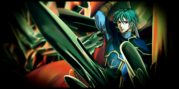
Lighting is a LITTLE too bit dark, so it's hard to see the focal point more clear. I liked how you did the border shading with a soft brush on the Walrein signature, but on this signature you overdid it. The walrein one was perfect, not too little, nor too much. Text is a little hard to notice, it blends in too much. Make it a different color, but one that corresponds to the dark blue. Overall: 7/10. On the positive side, the flow is nice and clean.bittermeat said:
Request for Nephewjack.
bittermeat
Senior Member
It was so hard for me to concentrate with a headache. Yeah, it's too dark. It has too much blackness and the font is unnoticeable. I won't let jack use this one. It's horrible, now that you point the flaws out. Now, I need a simple, good render.Nikoking said:Lighting is a LITTLE too bit dark, so it's hard to see the focal point more clear. I liked how you did the border shading with a soft brush on the Walrein signature, but on this signature you overdid it. The walrein one was perfect, not too little, nor too much. Text is a little hard to notice, it blends in too much. Make it a different color, but one that corresponds to the dark blue. Overall: 7/10. On the positive side, the flow is nice and clean.
bittermeat
Senior Member

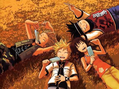
A new one that adorkable x requested.
CC.
kalinn
Senior Member
hmm i wanna CC.bittermeat said:
k, i think the render should come out of the background more
it looks too dark, it needs to be a lil brighter, (and maybe increase the contrast a lil bit)
and the render looks a lil over sharpened.
idk.. but when i see candy i think bright and happy, and this signature is rather dark-ish.
6.5/10
Well, the colors are alright, but the lighting once again is bad :\... Like Kalinn said, this render seems bright and not dark, so don't have a dark lighting to it. If this helps, do a new layer filled with white at around overlay 60 - 80% Opacity. That will make it brighter. Also, you should do some dodging tools on the focal point, helps it stand out more.bittermeat said:
A new one that adorkable x requested.
CC.
Oh yeah, and also lower down the sharping, the render looks way too oversharpened and it has a low quality feel to it.
bittermeat
Senior Member
I just started using Planetrenders. A lot of the time, I get images like these off of photobucket.SAMwich said:
Do you mind sending me the picture you used there? I can't find a good one of them eating the blue Ice lollies.
Also, do you have a certain site you use for pictures?
EDIT:
Thanks for the CC, everyone.
Here =)

http://i625.photobucket.com/albums/tt335/brandonjacobp/Signature_31.png

(And this is just a brighter version).
Entei Slider
Occasionally in drawers
Can I use the evee evolution one.
I know this may sound funny since you said it to me, but your sigs are getting repetitive. They all feel oversharpened and overshaded, although it's hard to notice, but I have a pretty close eyes for mistakes. Try out some different techniques for your signatures, like using some blur or smudge tricks. Maybe that will make your sigs better, and 7/10 for your recent signature. I know it's not shaded, but it's sharpened.
EDIT: The adorkable signature looks better with the lighter shading, a neat 9/10 for that.
EDIT: The adorkable signature looks better with the lighter shading, a neat 9/10 for that.
bittermeat
Senior Member
Yup, I thought it was pretty silly of me to say that to you, and then do it myself. I'm going to try to get a new concept going and maybe have something done by this weekend. I need to observe more signature techniques and such. Maybe, try some tutorials (which I usually hate doing).Nikoking said:I know this may sound funny since you said it to me, but your sigs are getting repetitive. They all feel oversharpened and overshaded, although it's hard to notice, but I have a pretty close eyes for mistakes. Try out some different techniques for your signatures, like using some blur or smudge tricks. Maybe that will make your sigs better, and 7/10 for your recent signature. I know it's not shaded, but it's sharpened.
EDIT: The adorkable signature looks better with the lighter shading, a neat 9/10 for that.
I will try to lay off the sharpening. xp
bittermeat
Senior Member
Sorry, double post.

A new one I made for nephewjack. CC, please.

A new one I made for nephewjack. CC, please.
Similar threads
- Replies
- 2
- Views
- 383
- Replies
- 6
- Views
- 2K