bittermeat
Senior Member
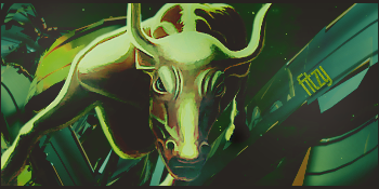
A request for Fitzy. It was hard for me with this one, because the render had a light glare.

Seems too flat. Not enough light. Coloring looks off... 6/10bittermeat said:
A request for Fitzy. It was hard for me with this one, because the render had a light glare.
Your sigs are awesome. There all have one of the best depths i have ever seen..bittermeat said:
A request for Fitzy. It was hard for me with this one, because the render had a light glare.

Wow. Really nice.bittermeat said:
Goldeen<3
I was trying to make it look like a goldeen swimming through a tunnel of coral, into deep dark waters.bittermeat said:
...bittermeat said:
Goldeen<3
I appreciate it.Zexion said:...
.....
Im shocked. This is really good. Maybe one of the best sigs I have ever seen.
Comparing this to your other sigs, you perfected the flow on this one. Amazing job. The lighting is sextastic, the only flaw I see is the not needed negative side, it just doesn't match with the bright lighting goldeen has, overall 9/10.bittermeat said:
Goldeen<3

I hope I can keep it up without getting carried away with effects. Thanks for your support!Zexion said:You just keep getting better and better. I cant believe how good your recent sigs have been.
I sure do.ricano4life said:Do you still take requests?


Nice, where do you get your C4Ds? o:bittermeat said:

My last signature for a while. After I remodel my gallery, I'll be back up and running. For now, I'm going to take a break. Anyways, this was for ricano4life.
Um, planetrenders and photobucket.Master Crash said:Nice, where do you get your C4Ds? o:
Ohh, i never thought about Photobucket *smacks head*bittermeat said:Um, planetrenders and photobucket.Master Crash said:Nice, where do you get your C4Ds? o:
xo
Not bad, the photo filter is eh though. Try improving on the light source a bit more, overall 9/10. The C4Ds you use are excellent, I'll be sure to check out photobucket (I've never looked there for C4Ds before =0 )bittermeat said:

My last signature for a while. After I remodel my gallery, I'll be back up and running. For now, I'm going to take a break. Anyways, this was for ricano4life.