You are using an out of date browser. It may not display this or other websites correctly.
You should upgrade or use an alternative browser.
You should upgrade or use an alternative browser.
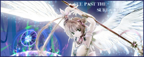
Cardcaptor Sakura avi and sig
- Thread starter watercat8
- Start date
Draco Roar
Senior Member
Nicely made!
the_lone_wolf
Senior Member
Impressive most impressive.
fullofmyself
Senior Member
Font is bad
Font color is unreadable
Color is bad
Border is bad for this type, i guess.
Background is just... ugly, doesn't match the render at all.
Really blurry
Look up good tutorials
Font color is unreadable
Color is bad
Border is bad for this type, i guess.
Background is just... ugly, doesn't match the render at all.
Really blurry
Look up good tutorials
I knew about the font, I just didn't really care at the end, and in my comp It looks really clear so IDK how it's blurry.fullofmyself said:Font is bad
Font color is unreadable
Color is bad
Border is bad for this type, i guess.
Background is just... ugly, doesn't match the render at all.
Really blurry
Look up good tutorials
ahh its really good!watercat8 said:Also, if anyone wants me to put their name on it and they can use it as their avi and sig, I really wouldn't mind. XD
can I? : D
Sure, want your user name on it?cryindarkness said:ahh its really good!watercat8 said:Also, if anyone wants me to put their name on it and they can use it as their avi and sig, I really wouldn't mind. XD
can I? : D
YOUGETPWND
Senior Member
alil big but lovely work Good Job
Thanks Chubb, I've been trying to improve my skills (but apparently when I do people accuse me of cheating....) >_>chubsterr said:I like the avatar watercat looks pro
Similar threads
- Replies
- 54
- Views
- 652

