You are using an out of date browser. It may not display this or other websites correctly.
You should upgrade or use an alternative browser.
You should upgrade or use an alternative browser.
Screenshots & Video Capture Share Hub for Animal Crossing: New Horizons
- Thread starter Justin
- Start date
Nunnafinga
Senior Member

Yes,this is particular to the breed:Only Dalmatians can achieve a state of Zen and levitate.
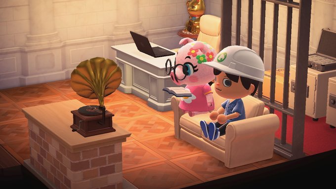
An exciting evening spent with Aunt Gala reading Shakespeare and listening to Glenn Miller records on the Victrola.
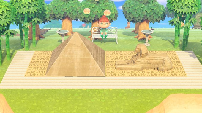
Little Egypt(...very little)
Dunquixote
The Duke
Today, when I visited Kiki, I went a little afk and didn’t talk to her right away. I come back and found her singing in front of her music player. I’ve seen her singing outside by a music player before, but never inside her house.


She is so cute!
She is so cute!
Le Ham
now please I will accept the money-payment
decided to snap this in the middle of tracking down this balloon. Overhead view of Savannah's riverside house/yard and snippet of the open countryside beyond
Clay sitting on a life ring by the shore. He had asked me if anyone actually knows how to use life rings. I suppose they're little different from inner tubes, but I've never had to use one myself, so...

I've officially given up on greetings: a series
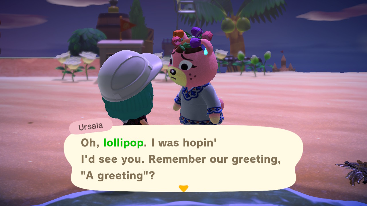

sorry to post twice, but I think I had a stroke of genius with this one
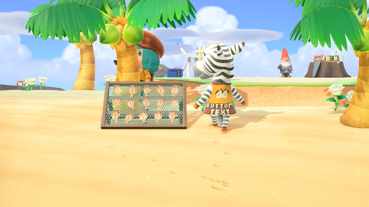

Clay sitting on a life ring by the shore. He had asked me if anyone actually knows how to use life rings. I suppose they're little different from inner tubes, but I've never had to use one myself, so...

I've officially given up on greetings: a series


Post automatically merged:
sorry to post twice, but I think I had a stroke of genius with this one

Last edited:
Nunnafinga
Senior Member
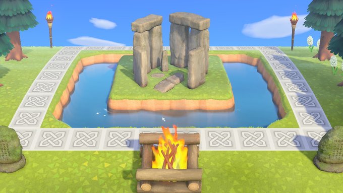
I've been working on my second island,Starbug.I had this Stonehenge laying around so I thought I'd do something with it.
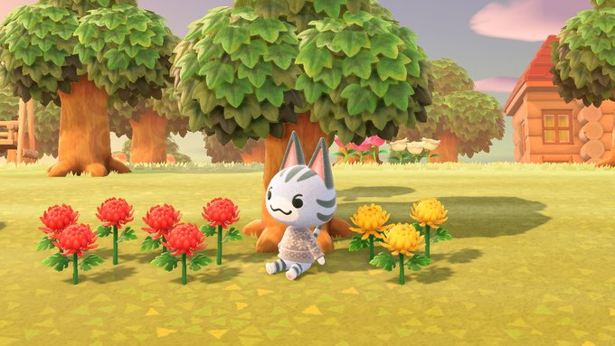
Gratuitous cute kitty pic.

So it's football season again and my Arizona Cardinals are actually kinda good this year so I busted out my Kyler Murray K1 jersey and cap.They might not make the playoffs but at least they're fun to watch now.
Imbri
Resident Night Mare
I've been waiting and waiting, and Flora finally visited her relatives!

I almost forgot to share this. Some of you may have seen that I built a tank for the tankless creatures prompt in Starry Snaps fair event. Look where Aurora decided to sit while I was building. These villagers, man... They really do pick the worst spots every time


Livia
Always ignored
My heart pond


Nunnafinga
Senior Member
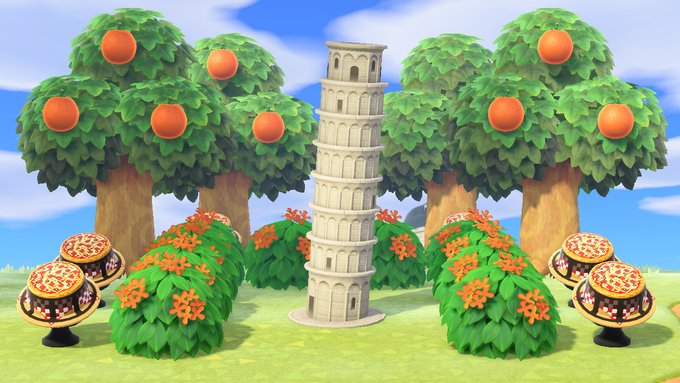
The Leaning Tower of Pizza

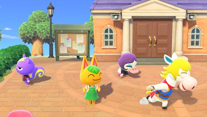
I'm not sure why my villagers are running around holding Swiffers or whatever feather duster looking thing that is.Of couse Tangy the ham knows the camera is on and gets right in the middle of it all.
This is Pudge's favorite spot and now he causes frequent blockades.
Might wanna lower your volume on this, lol
I hope no one learns her catchphrase.
Might wanna lower your volume on this, lol
I hope no one learns her catchphrase.
Le Ham
now please I will accept the money-payment
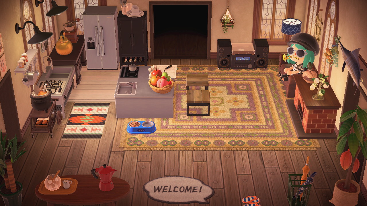
Interior design is probably not my best thing, and I had a very picky concept for this room, but I'm happy with how this image feels. It's like, old and a bit dusty, but also super cozy at the same time. Maybe just need a less-flashy kitchen mat... or a second white deck. Maybe stick to all neutrals, get the food bowl in white or smth idk. I think in the beginning I wanted blue as an accent color, but that's probably just not gonna work with what I've already got
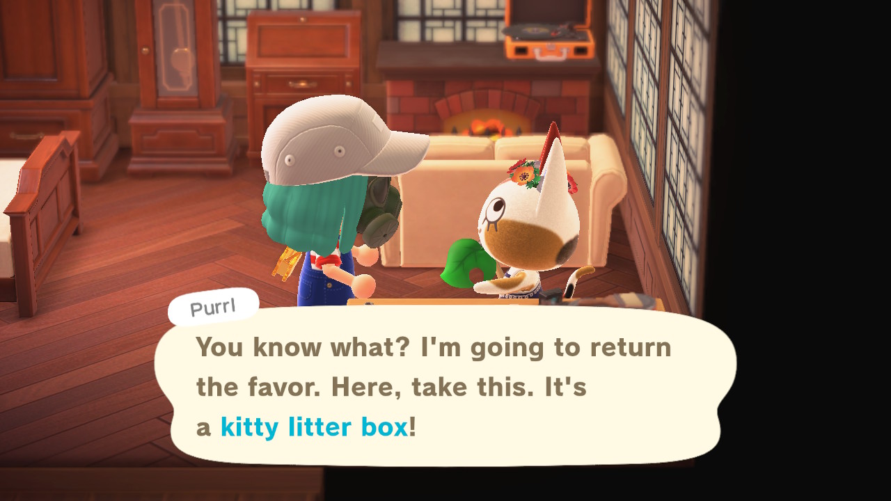
Ouch.
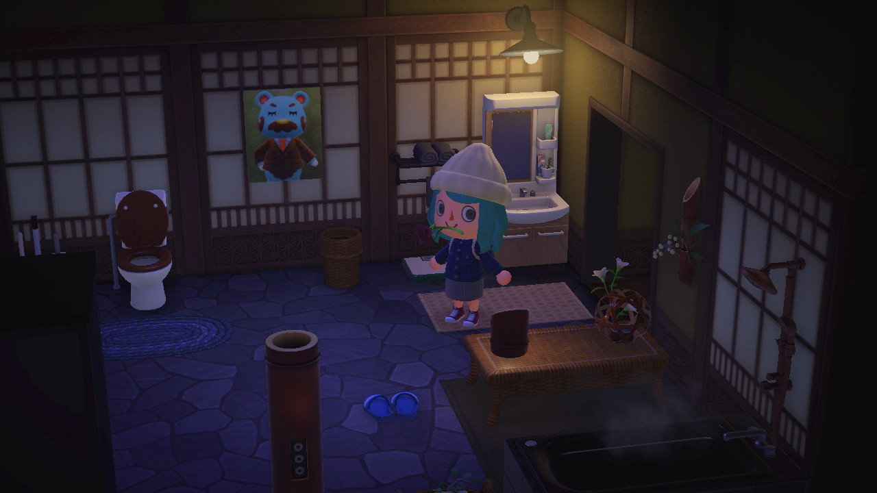
Friend sent me a poster of her current least favorite villager and I think he blends right in with my bathroom
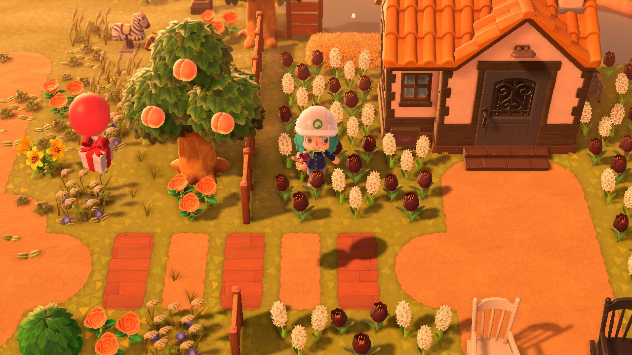
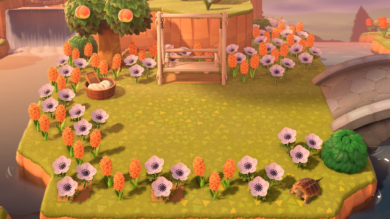
Another design area I'm kinda proud of, at least in terms of finally finding a good other flower to pair with white windflowers. Feels very riverside-y. Also happy the white bench color fits. Ooh, maybe I should add a little more dirt path in front of the swing so it looks more used?
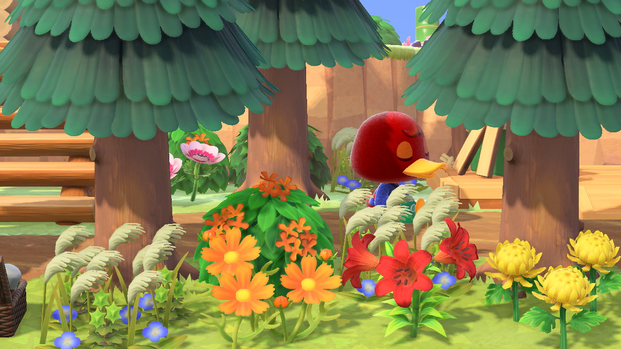
Bill practicing mindfulness in the woods
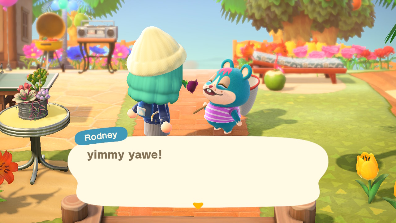
And finally, the obligatory cursed Rodney pic because why else do I post here
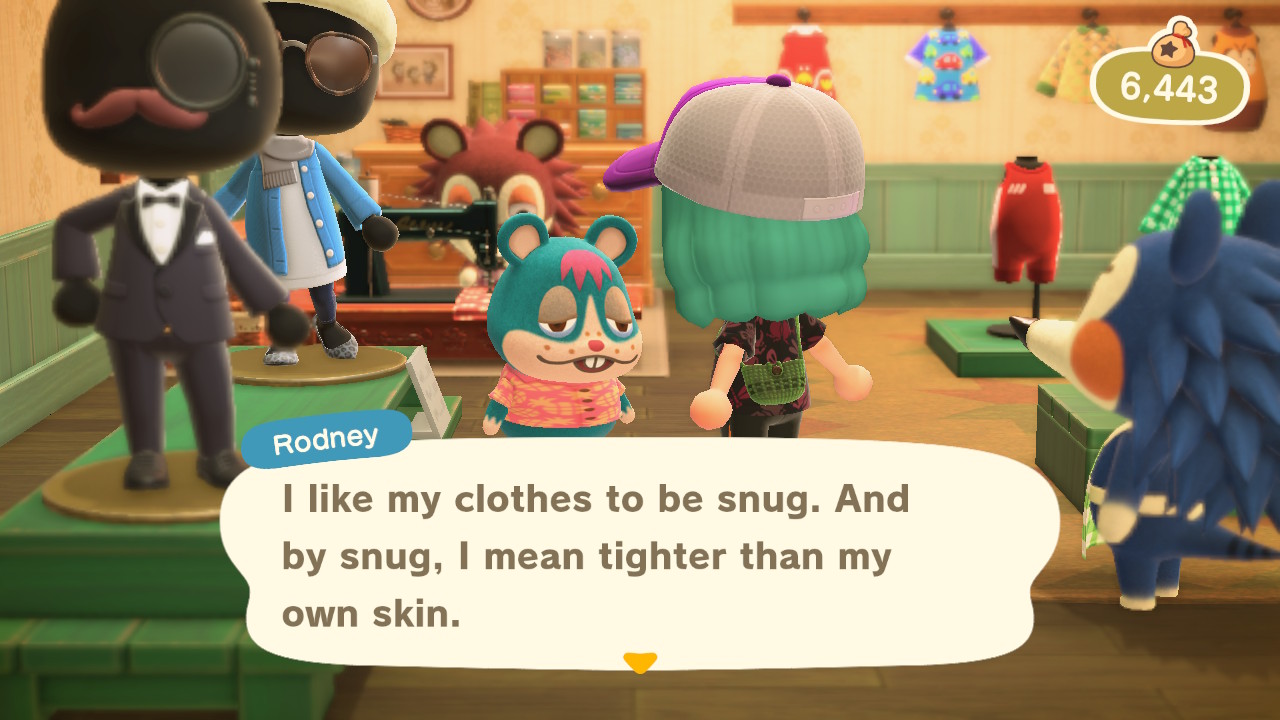
(Btw, Melba officially crocheted that bag for me and I love her)

Ouch.

Friend sent me a poster of her current least favorite villager and I think he blends right in with my bathroom

Another design area I'm kinda proud of, at least in terms of finally finding a good other flower to pair with white windflowers. Feels very riverside-y. Also happy the white bench color fits. Ooh, maybe I should add a little more dirt path in front of the swing so it looks more used?

Bill practicing mindfulness in the woods

And finally, the obligatory cursed Rodney pic because why else do I post here

(Btw, Melba officially crocheted that bag for me and I love her)
Similar threads
- Replies
- 7
- Views
- 252
- Replies
- 10
- Views
- 497
- Replies
- 22
- Views
- 699


